Hello Bar Product Updates: Meet Hello Bar’s New Interface
I hope you enjoy this blog post. If you want Hello Bar to grow your leads, click here.
Author:
Michael Wicker
Published
August 15, 2018
Hello Bar has been live and kicking since 2010. It’s seen tens of thousands of users. It’s built hundreds of thousands of pop-ups. It’s generated millions of leads and ushered just as many click-throughs.
But in all this time, there’s one thing that Hello Bar has yet to do – dedicate time, energy, and resources towards self love & self care.
Just like all of you take a bubble bath, treat yourself to a fancy meal, or relax by the beach or in front of your favorite Netflix show every now and then, Hello Bar needs to put itself first once in a while.
And we’re excited to announce that we’ve done just that. Hello Bar has gone to the salon and gotten a whole new ‘do. It’s hit up the mall and picked up some new pieces to spruce up its look. And it’s caught up with the times and trends – might we even say, it’s ahead of them?
Cutting to the chase, Hello Bar is feeling confident. It’s feeling rested, renewed, and ready to take the digital world of the storm. It’s feeling brand new.
And, in many ways, it is.
It’s my great pleasure to announce that Hello Bar has undergone a transformation – and not one of those fake photoshopped before-and-afters.
Check it out.
Here is Hello Bar’s editor, as you have likely seen while designing pop-ups and bars for your site:
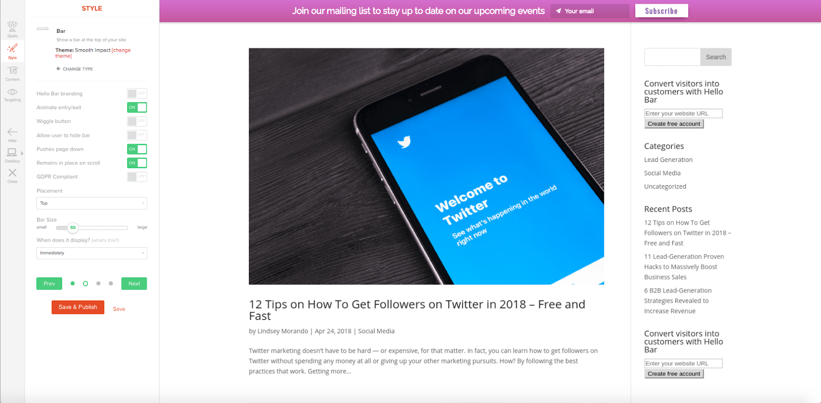
This design has served us well, enabling the creation of millions of pop-ups and bars. But like all great things, it can always be better.
So, we set out to design a new and improved pop-up and bar editor. We wanted to accomplish 3 main things with this redesign:
- Make it super simple to design a site feature using Hello Bar
- Provide more guidance and tips during the design process
- Setup Hello Bar to be as intuitive as possible – we don’t want anyone getting lost along the way!
As I’ve mentioned before and will, without doubt, mention again, we test all of our site features on our own site and on Neil’s blog before shooting them out to all of you.
We do this for a few reasons – mainly, that we want you to be as successful as possible. If we’re going to recommend a strategy or a tool, we’d better know for a fact that it will work (and that it will be super easy to use).
I’ve personally created an uncountable number of pop-ups and bars on Hello Bar. Many of you have reached out with your pain points in using Hello Bar, and trust me, I know what you’re talking about.
Our color picker was hard to use. Not being able to choose where the image landed into your pop-up was rough. At times, the organization of our editor drove me bananas.
I get it. And that’s why I challenged my team to build better, smarter, and simpler.
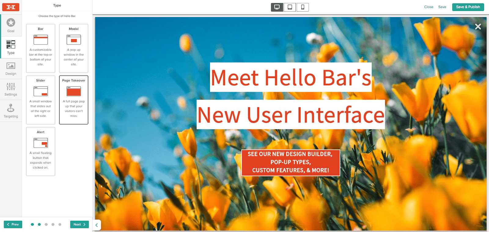
So here it is! Our new & improved editor. Isn’t she pretty?
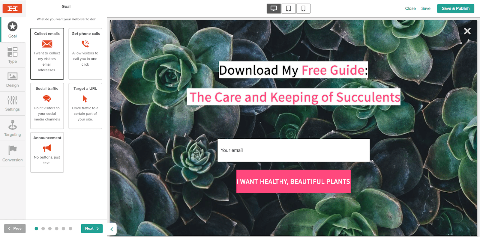
Ok, so maybe the changes aren’t super noticeable right off the bat. This might resemble a “spot the differences” photo for some of you. But not to worry, I’m going to unpack all the new features and shifts for all – no scrutinizing from your side required!
Let’s start at the beginning – might as well follow the same order our builder follows, right?
Pop-up Goal
We’ve kept our goals the same – collect emails, get phone calls, drive social traffic, target a URL, or make an announcement. While metrics for goals should always be changing, there’s no reason to change the underlying thought process.
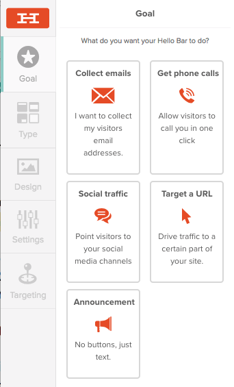
We did, however, think it was time for some new pop-up options! Drum roll, please…
Pop-up Type
Alerts are here! Ding, ding, ding! But actually – our new alert pop-ups act as a bell, giving your site visitors an auditory cue that you’ve got an awesome offer for them.
These little guys slide in from the side of your site, much like our Slider pop-ups (but more polite, they actually use the doorbell before coming in!).
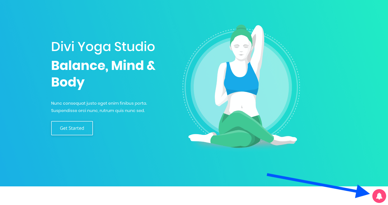
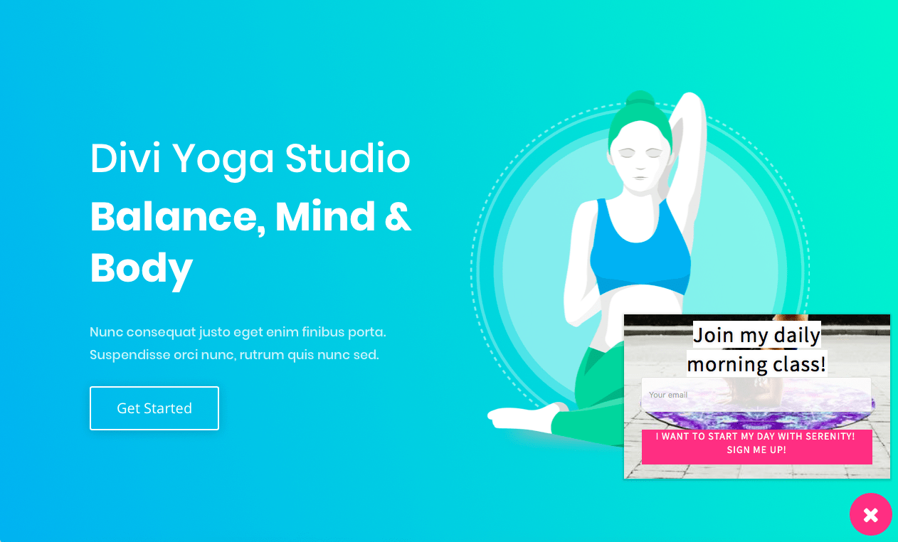
Sure, they can be a little obnoxious. They definitely ring loud and proud. But they work really well. We tested them out on Neil’s blog and increased the number of leads we collected by 60%.
That’s right – our conversion attempts were saved by the bell! (Don’t worry, my team cringed just as much at that one as you surely are, right now).
Not sure how to make use of these new pop-ups?
Here’s how we saw the best results from using these alerts:
- Implement them on only one page of your site. You don’t want to have endless ringing when a visitor clicks through your site – this tool really only works once before its annoyance factor kicks in.
- Be sure the alert won’t slide in to cover a chatbot that you have installed already, or that you won’t have multiple noises coming from your site. If you have a landing page with a video that plays instantly when the site loads, the bell probably won’t pair well with this. If your site is all walk and no talk (noise-wise, of course), then implementing the bell could do really well to gather the attention of your visitors.
- Set the alert to display after a number of seconds have passed. You don’t want to scare off your visitors with a pop-up right away – we found the best results by having our alert pop-up appear after a visitor was on our site for at least 10 seconds.
Bell not your style? Not to worry, we’ve added plenty more.
For example, when you log in to your Hello Bar account to set up a new pop-up, you’ll now see a product tour to share tips & tricks as you get started. We’ve add in nuggets of knowledge throughout these tips to make sure they are instructional and educational. We’re best in the world at marketing, so why not share that talent with you in real time suggestions in our app?
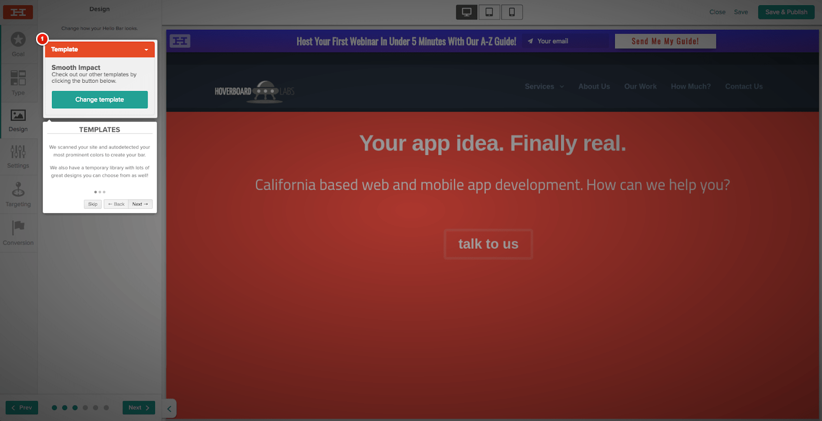
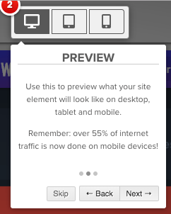
Speaking of best in the world… We now have all the customizable fields needed to re-create Neil’s pop-ups for your very own site!
Neil’s Top Bar:

Our Top Bar:

Pop-Up Design:
With this updated, you can now…
Change the height of your CTA Button and your pop-up’s text fields.


Adjust the edges of your button – round it or square it, either way, you know have the ability to whip these into whatever shape you want!
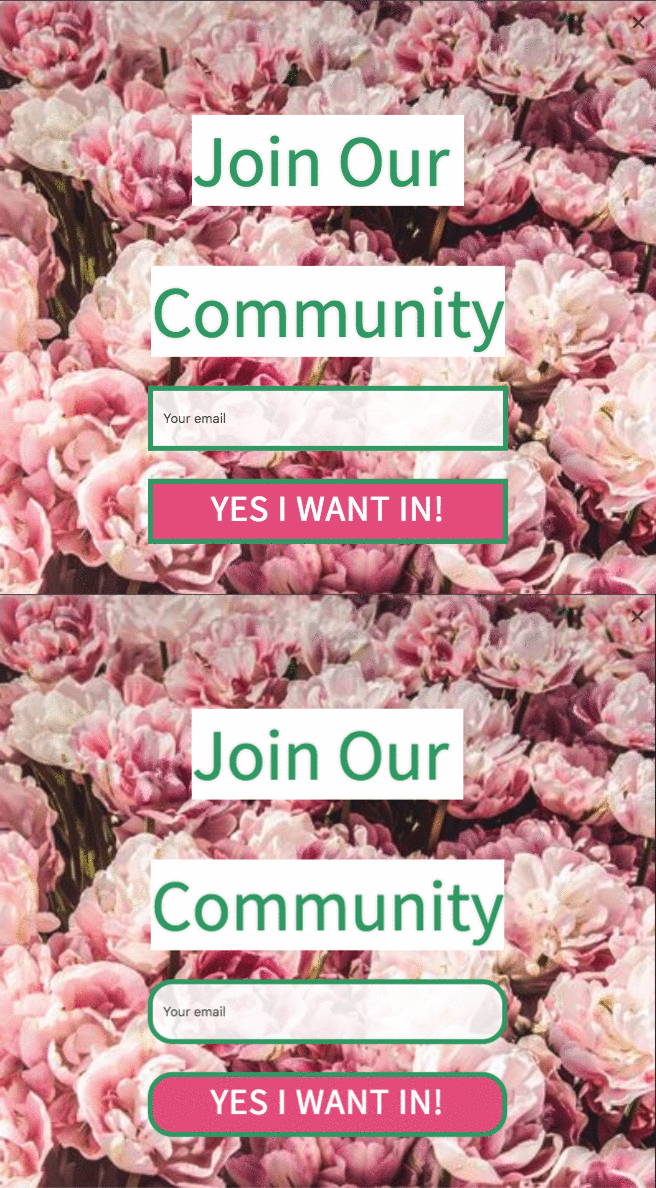
Control the opacity of your images and pop-up features.
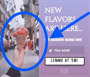
Place your image exactly where you want it on your pop-up.
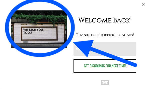
Pop-Up Settings:
On our Free plan, you can now allow your site visitors to hide your elements. No more annoying pop-ups that drive your visitors crazy. They can close your pop-ups and enjoy easy access to the amazing content on your site – no persistent pop-ups to distract them!
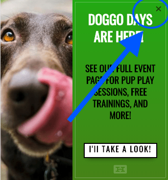
Pop-Up Targeting:
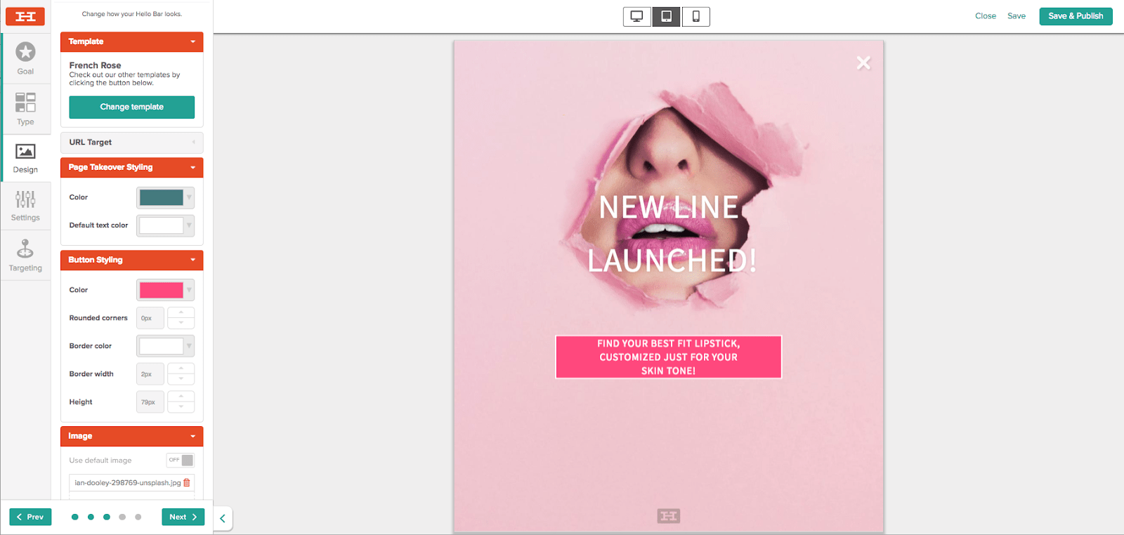
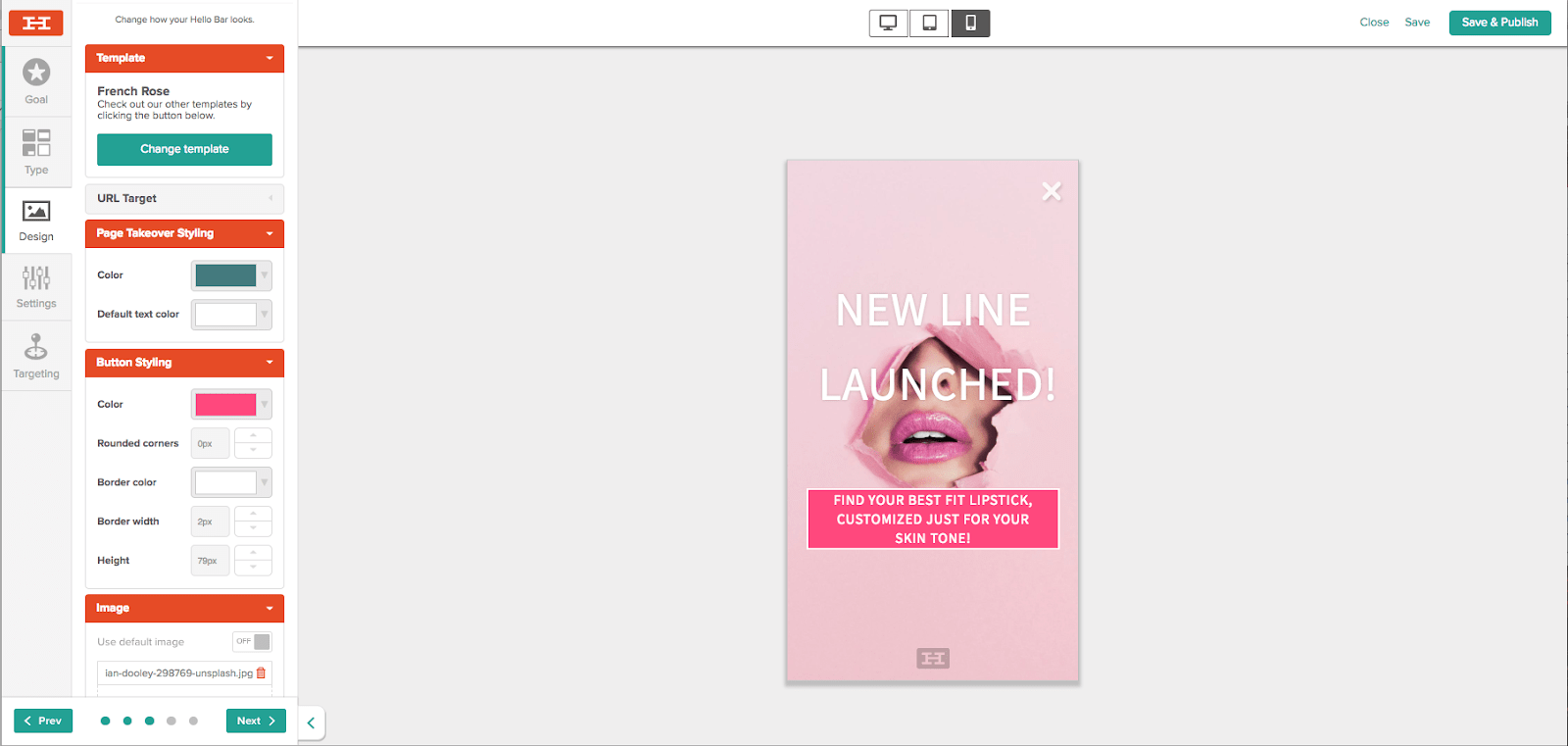
We also have new and improved device views, adjusted for the most popular and standard tablet and phone sizes. You’ll be able to see your pop-ups just how your site viewers will, meaning you’ll have complete control over your users’ mobile experience.
Updated Tablet View:
Updated Mobile View:
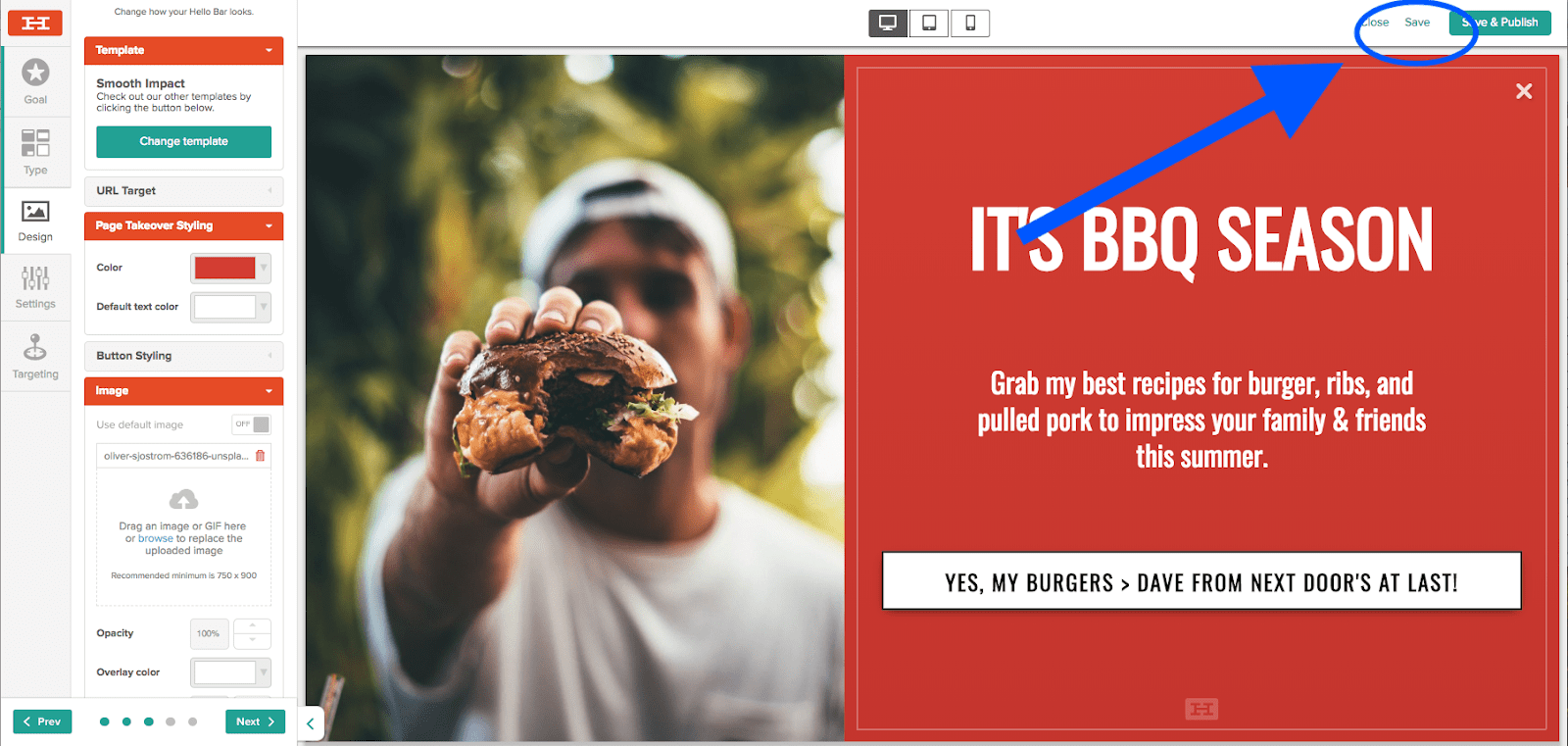
Save & Publish:
Last, but not least, you can finally save as you go – no need to finish it all at once, you won’t be forced to choose between publishing right away, or losing all of your hard work!
Well, that’s a wrap! All the brand new, shiny features of Hello Bar are right in front of you! But to get the real feel for our new deal, you’ll have to log in and see for yourself.
Make an awesome new pop-up that you want to share? Share it on social media and tag us for a special surprise!
And stay tuned – this is just one makeover of many more to come. We’ve already got some killer new features, templates, and more up our sleeve… just you wait, this is just the beginning 😉

