I hope you enjoy this blog post. If you want Hello Bar to grow your leads, click here.
Author:
Michael Wicker
Published
November 5, 2019
I hope you enjoy this blog post. If you want Hello Bar to grow your leads, click here.
Author:
Michael Wicker
Published
November 5, 2019

Hello Bar is made to help you optimize your site and engage your users, so that you can continue selling to users and driving them to the content that you want them to see.
So, what exactly is Hello Bar? How can you use it to help optimize your site? And how can you make sure you’re getting the most out of your subscription? Let’s take a closer look.
A hello bar is a–you guessed it—bar that sits at the top of your site on any given browser window, greeting people as they enter your site. It can be used for any number of things: saying “hello,” as the name implies, collecting emails, notifying customers of deals, and plenty else.
If you collect user information, you can then engage your users with email marketing tools like ConvertKit, Mailchimp or Sendgrid.
If you’re simply alerting your audience of an offering, you can direct them to that web page with a button click.
Hello Bar, then, is a software plugin that can be used to create these hello bars (or top bars), as well as several other pop-ups to help you engage with your users.
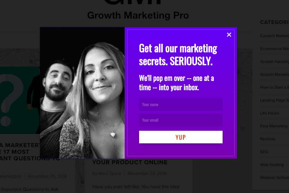
Hello Bar creates pop-ups that look a little something like this:
 Look familiar?
There are a few different features that make Hello Bar great.
Hello Bar lets you choose where you want your pop-ups to appear. Unlike some built-in site pop-ups (ahem, Squarespace), Hello Bar customizes your pop-up location and allows you to place different types of pop-ups on different pieces of content.
Why is this important?
Well, for starters, you can write copy that will appeal to the user on that very page. This means that if you’ve written an article on marketing dashboards, you can feature a Hello Bar pop-up that advertises a free marketing dashboard template in exchange for an email address. If you’ve written about how to do a math problem, you might insert a pop-up that offers your tutoring services. You get the picture.
How do you make sure that this all works out? By creating headlines and CTAs that stick. A simple “Join My Mailing List” probably isn’t going to cut it in this saturated internet world, so make sure that you are creating a unique message that resonates with your readers.
Creating a solid, catchy headline and CTA will drastically improve your results, no matter what deliverable you are trying to incite. Make sure that your copy is short and to the point, so that the reader doesn’t have to wade through too much (metaphorical) muck to get to the meat of the action they need to take.
Not only can you customize the copy of your headline and CTA, but also your pop-up design. Hello Bar comes with a ton of different design options that make it easy to appeal to your customers. You could spend hours going through all the different design options available, but they also offer a way to speed through this step.
Hello Bar’s templates and color auto-detection allow you to make smart design decisions without spending hours on the pop-up. All you have to do is log in, select which template works for you, allow the system to auto-detect colors, and watch your Hello Bar form instantly before your eyes. It is that easy.
In addition to these features, you can also adjust the way that your CTA appears, and which colors might work best for your messaging. An animated toggling CTA can improve conversion rates drastically, as can using the correct colors for your audience. So choose wisely, and have fun while you’re at it.

If you’re in the business of growth marketing, you know that A/B testing is essential to the success of any business endeavor. Your Hello Bar’s success is not exempt.
There are tons of different options for your copy, CTA, design, color schema, and more—it’s tough to know exactly which combination will work, and where it will do the best job it can do. A/B testing can help solve this dilemma and make your design process a whole lot easier moving forward. Plus, it can be a whole lot of fun.
When you are setting up your A/B tests, make sure you keep this very important principle of testing in mind: Test only one element of your pop-up at a time.
Looking to experiment on the headline copy? Do it! But that means that that should be the only thing that changes amongst the different versions of your copy. Try to keep the other elements of your design—the CTA, the coloring, the format—the same, so that you know you really are just testing the efficiency of one element. Once you’ve found copy that works, for example, you can move on to testing 3 different colors. Then three different CTAs. You get the picture.
The success of your Hello Bar will come down to making sure that you are putting the right message in front of the right people in the right place. To do this, you need to implement targeting, aka using filters to create the audience that sees your Hello Bar.
There are a couple of ways to do this:
Ultimately, all these adjustable features will allow you to create the best, most effective HelloBar for your site. Now let’s take a look at what all of that is good for.
Hello Bar is good for… a lot. You can use it to do all sorts of things, but when you get down to it, there are 2 main categories of usage: generating leads and communicating a message to your customers.
First, it’s worth considering what you are looking to achieve. Do you need to capture more emails and grow your newsletter audience? Are you looking to increase your social media following? Do you have a sale or discount going on that you need to draw attention to? OR are you simply looking to drive your users to a page or piece of content? Whatever it is, you can use Hello Bar to do it.
Generating leads is essential to your business. It’s how you can engage with your customers long after they’ve left your site, and ultimately, it’s how sales happen. Generally, capturing leads means capturing a user’s email (did you know that Users are 45 times more likely to engage with marketing via email vs. social media?).
One of the most effective ways of capturing leads is dangling what marketers call a “lead magnet.” A lead magnet is something that you dangle in front of your readers, offering it in exchange for their email. This can be anything: more knowledge on the topic you are supplying information on, a discount on their next purchase, or something more robust, like an e-book.
Offering these lead magnets through a Hello Bar allows you to control which users are seeing which lead magnet you are offering, as well as when they see that message. If you are offering something of use to your readers, this is an almost surefire way to get results.
You can also use Hello Bars to inform your users about a sale and drive traffic toward a page of your choosing. This will allow you to make sure that your best deals don’t go unmissed. It is also a great way to counteract a high bounce rate on your site. By directing users toward a new page (particularly if they show exit intent), you can keep them on your site that much longer and reap further rewards of their visit.
Did you know that Neil Patel’s site gets 11% of its leads from Hello Bar? That means 11% of his revenue is a product of this plug-in. Pretty impressive.

Neil does this by doing all the things we discussed above, in some very clear steps:
Once you see the leads trickling in, you can start targeting them with email marketing. This is a surefire way to improve your results and get those conversions flowing.
Hello Bar may seem intimidating at first. But I can speak from experience in saying that it *will* do wonders for your business.
Want to learn more? Read Growth Marketing Pro’s Hello Bar review!
Bio: Mark Spera is a marketing guy, a pizza enthusiast, and San Francisco resident. He worked with Bay Area tech startups until he founded Growth Marketing Pro and built it into a 6-figure passive income business in 18 months.