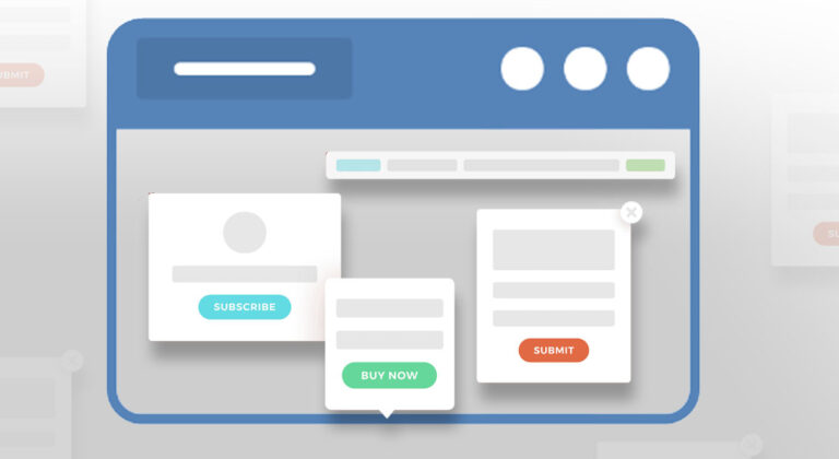
Ways to Use Calls to Action (CTAs) in Your Marketing Strategy

I hope you enjoy this blog post. If you want Hello Bar to grow your leads, click here.
Author:
Ryan Bettencourt
Published
July 2, 2024

A call to action is undoubtedly one of the most powerful marketing tools available to businesses and organizations.
It is an essential element in any effective marketing strategy, as it can help you increase conversions, drive sales, and boost brand awareness.
Moreover, if you use personalized action phrases, they can be up to 202% more effective.
But unfortunately, many companies and marketers don’t have a CTA strategy for their campaigns and business.
In this guide, we discuss some call to action phrases examples that you can use in your marketing to increase conversions and ROI.
What Is a Call to Action in Marketing?
A call to action is an important component in marketing that prompts the audience to take a specific action. It provides instruction intended to provoke an immediate response. It usually includes a verb, such as “buy,” “subscribe,” “register,” or “download.”
Calls to action are common in both digital and traditional advertising forms like print, television, and radio. However, they’re most commonly recognized and utilized in online marketing through websites, emails, social media, and digital advertisements.
The Role of a Call to Action
The primary role of a call to action is to convert potential customers into leads or customers by guiding them through the sales funnel.
Here are the core functions of an effective CTA:
- Encourage Immediate Action: A CTA reduces hesitation and encourages action by explicitly telling the audience what to do next. For instance, “Sign Up Now” prompts users to register.
- Provide Clear Instructions: CTAs offer clarity by providing clear instructions on what the user should do next. This is especially important in a digital environment loaded with information that can easily distract users.
- Enhance the User Experience: A well-placed call to action can improve the overall user experience by providing a seamless pathway to follow. For example, after reading an article, a CTA might guide the reader to “Read Related Articles” or “Share this Post.”
- Measure Success: Calls to action are measurable. You can track how many users clicked on a CTA. This helps you understand the effectiveness of a marketing campaign and make necessary adjustments.
Soft Call to Action vs. Hard Call to Action
CTAs can be categorized into two main types: soft CTAs and hard CTAs, each serving different purposes, depending on which stage a user is of the buyer’s journey.
A soft CTA is less direct and often used to build relationships and engage the audience without pushing for an immediate sale.
Examples include:
- Learn More
- Find Out How
- Discover Our Services
- Read Other Related Articles
Soft CTAs are typically used in the awareness and consideration stages of the buyer’s journey.
On the other hand, a hard call to action is more direct and assertive. It’s aimed at driving immediate action that leads to conversions.
Examples include:
- Buy Now
- Sign Up Today
- Register Now
- Get Started
Hard CTAs are typically used in the decision and action stages of the buyer’s journey.
That said, strategically implementing effective calls to action allows businesses to significantly improve their marketing outcomes and achieve their objectives more efficiently.
How Many Words Should a Call to Action Be?
When it comes to word count, the sweet spot for calls to action is typically two to five words. This ensures a perfect balance of clear instructions and conciseness. This word count makes it more likely to capture the audience’s attention and prompt immediate action.
For example, effective CTAs like “Buy Now,” “Sign Up,” or “Learn More” are short yet powerful. In some cases, slightly longer CTAs may be appropriate if they provide additional context or value, such as “Download Your Free Guide” or “Get Started Today.”
However, the general rule is to keep it as brief as possible while maintaining clarity and impact.
How to Create a Call to Action Strategy?
Creating a CTA strategy begins with understanding your target audience.
Once you know your ideal customer, you can create a CTA that resonates with them and speaks to their needs.
When creating your CTA, be sure to keep the following in mind:
Use Multiple CTAs
Make a list of call to action phrases examples and use them strategically throughout your marketing campaign.
Then, try using different CTAs on your various marketing channels to see which ones perform the best.
You can also use A/B testing to optimize your CTAs for conversion further.
For instance, if you only have one CTA, like ”Contact us for more information”, it might not be sufficient for all the stages of your marketing funnel.
In that case, you could use different CTAs for each stage, such as ”Download our free e-book”, ”Get a free consultation”, or ”Sign up for our newsletter”.
Be Concise
Your call to action phrases should be short, sweet, and to the point.
They should be easy to read and clearly state what you want your target audience to do.
Suppose you’re emailing a newsletter with a CTA that reads ”Click here to read more about our latest offers”.
In that case, it would be more effective to say ”Check out our latest offers simply”.
Personalize Call to Action Phrases
Website personalization has become increasingly important in marketing and for a good reason.
Consumers are bombarded with generic content, and they’re more likely to respond to personalized messages.
Make sure your CTA is relevant to the recipient by using their name or other personal information.
You can also segment your audience and create different CTAs for different groups.
For example, if you’re selling a new product, you might create a CTA for first-time buyers and another for existing customers.
The best call to action phrases for first-time buyers might be something like, “Try our new product risk-free for 30 days.”
On the other hand, the best call to action phrase for existing customers might be, “Get 20% off your purchase when you buy now.”
Make It Actionable
The CTA should tell your target audience exactly what they need to do.
Use action words like ”download”, ”sign up”, ”learn more”, ”get started”, etc.
Your CTA should be clear and concise.
It should tell the reader precisely what you want them to do without ambiguity.
For example, “Download our free guide to increasing website traffic” is more effective than “Read our latest blog post.”
Similarly, for complex cloud services like DaaS (Desktop-as-a-Service), a CTA such as ‘Discover Our DaaS Solutions’ clearly invites users to learn more about these advanced offerings, making the action straightforward and appealing.
You can check out these 50 powerful call to action phrases to find the ones that work best for your content.
Use a Responsive CTA Design
Besides the call to action words, the design of your CTA button is also important.
It should be prominent and visible enough so that users can see it and click on it easily.
Furthermore, it should be designed responsively to ensure that it looks good on all devices, including mobile phones and tablets.
Finally, the design of your CTA button should match the overall style and tone of your website.
For example, if your website has a modern design, your CTA button should also have a modern look.
Similarly, your CTA button should have a classic look if your website is more traditional.
Make Your CTA Button Stand Out
Your CTA button should stand out from the rest of the elements on your website and landing pages.
The best way to make your CTA button stand out is to use a contrasting color.
For example, if your website has a light color scheme, you can use a dark CTA button.
Conversely, if your website has a dark color scheme, you can use a light CTA button.
Another way to make your CTA button stand out is to use a different font than the rest of the elements on your website.
It will help draw attention to your CTA and increase the likelihood of users clicking on it.
Create a Sense of Urgency
Scarcity makes people act. That’s a psychological principle.
You can prompt your target audience to convert by creating a sense of urgency if they don’t want to miss out on the opportunity.
For example, if you’re running a sale, you could use a CTA like ”Hurry, sale ends soon!” or ”Shop now while supplies last”.
Words like ”last chance” and ”limited time only” can also create a sense of urgency and encourage people to act.
You can also use countdown timers on your website or promotional emails to show users how much time they have left. This will prompt them to make a quick decision and convert.
Creating a sense of urgency also quickens the sales cycle.
Place the CTA Strategically
You can use the best call to action words and still not get any traction if they’re not placed in a practical location.
The best location for your CTA depends on what kind of device your users are viewing it on.
If they visit your site from a desktop computer, you might want to place the CTA above the fold or in a sidebar.
It means that users won’t have to scroll down to see it.
For instance, you can use bars, modals, and sliders by Hello Bar to show CTAs to your customers.
These pop-ups are easily customizable and highly effective.
Another way to say call to action is to keep it in the margin.
When the visitor scrolls down the page, the signup button goes along.
Similarly, you can place the CTA in the utility navigation.
It is the section of the navigation that contains links to things like your blog, contact page, and FAQ section.
You can also use scroll boxes, which are popups that show up when the user scrolls to a particular part of the page.
They’re less intrusive than other types of popups and can be very effective.
Offer an Incentive
Offering an incentive in a call-to-action (CTA) can significantly boost engagement by providing potential customers with an extra reason to take the desired action. An incentive can be a discount, a free trial, exclusive content, or a bonus item.
Incentives can drive higher conversion rates and attract new customers who might be hesitant to make a purchase or commitment without the added benefit. It also builds brand loyalty by offering upfront value and creating positive initial customer interactions.
Examples include a discount like “20% off your first purchase!” or a trial period like “Get a free one-week trial of our premium plan.” These incentives create a sense of immediate value for the user, making them more likely to act.
To boost engagement and increase customer satisfaction, remember to keep the incentives relevant and valuable to the target audience.
By strategically offering incentives in your CTA, you can attract more prospects and convert them into paying customers.
Highlight the Benefits
Your audience is more likely to click on your CTA when they know what they can get out of it. This differs from just offering an incentive as it highlights the specific benefits of the incentive being offered.
Let’s say the incentive is a free consultation. You can go the extra mile by stating its benefits. For example, financial planners can offer a free consultation to help analyze a client’s financial situation for sound financial planning or business consultants can provide a free session to analyze a company’s challenges.
A free consultation won’t be perceived as valuable, despite being free, if it doesn’t address the pain points of your target audience or offer a benefit or two.
Give your audience a reason to avail of your incentive to increase conversions and boost engagement.
The image below shows a prime example of how to highlight the benefits of an offering.

Image via Clutch
Provide Reassurance
Your audience may have doubts or concerns preventing them from taking action or making a purchase from your company.
To address this, your CTA should provide reassurance in the form of guarantees, trust signals, and clear, supportive language that reduces fears and builds trust among your audience.
Clear, reassuring CTAs can create a more positive user experience, thereby increasing conversion rates and brand loyalty.
Examples of reassurance in CTAs are “30-day money-back guarantee” or “No credit card required.” These examples reduce any potential risks perceived by the user.
A money-back guarantee shows the user that they have nothing to lose. Meanwhile, not requiring a customer’s credit card upon signup lowers the commitment requirement, making it easier for users to take the first step.
A/B Test Your CTA
This strategy is important to optimize the effectiveness of your CTA and drive higher engagement rates.
This method involves selecting an element of your CTA that you want to test, creating two or more variations, and then testing them simultaneously with different segments of your audience.
A/B testing your calls to action allows you to identify which version performs better, allowing you to make data-driven decisions to enhance your CTA’s impact.
Here are some elements you can A/B test:
- Text
- Color
- Size
- Placement
- CTA button design
One example is testing a “Buy Now” CTA button against a “Shop Now” button to see which prompt encourages more clicks. Another example is testing the colors red versus green to see which is more attention-grabbing for your audience.
Once you’ve set up your variations, use an A/B testing tool to distribute them evenly among your users. Then, track key metrics, such as click-through, conversion, and engagement. It’s important to test one element at a time to accurately isolate its effect on performance.
After gathering sufficient data, analyze the results to determine which CTA version outperforms the others. Implement the winning variant across your marketing channels, and continue testing periodically to adapt to changing user preferences and behaviors.
Call to Action Examples for Sales
If you’ve not created CTAs for your website or marketing material before, you can take inspiration from action phrase examples.
Here are some action phrase examples for different niches.
Real Estate Call to Action Phrases
If you have a real estate business, you can use any of the following CTA phrases to increase conversions:
● “Looking to buy a new home? We can help you find the perfect property.”
● “Thinking of selling your home? We’re here to help.”
● “Ready to make a move? Let us help you find your dream home.”
● “Need help finding the right investment property? We can assist you.”
You can create a list of 50 powerful call to action phrases real estate and use them in different marketing materials, such as your website content, newsletters, etc.
Health and Wellness Call to Action Phrases
Health and wellness businesses can use the following phrases:
● “Get started on your fitness journey today!”
● “Start feeling better with our help.”
● ” Transform your life with our proven methods.”
● “Take the first step to a healthier you.”
Fitness Call to Action Phrases
Businesses in the fitness industry often must use slightly more creative call to action phrases, as people are generally already interested in fitness and health.
However, you can use any of the following:
● “Get in shape with our help!”
● “Achieve your fitness goals with our assistance.”
● “Get fit and feel great with our guidance.”
● ”Get your subscription today to get in shape for the summer.”
Event Planning Call to Action Phrases
Here are some call to action phrases for events you can use:
● “Planning an event? We can help!”
● “Get the perfect venue for your event with our help.”
● “Let us take care of the details so you can enjoy your event.”
Types of Call to Action For Your Business Website
Since you’ll likely have several types of visitors on your website, you’ll also need numerous types of calls to action to achieve your goals.
For example, you’ll need a different type of call to action to convert visitors into leads, then to customers, and lastly, to advocates of your brand.
You’ll need the right blend of the following types of calls to action to optimize your marketing strategy.
Lead Generation
Lead generation CTAs are designed to capture your website visitors’ contact information and turn them into potential customers. These CTAs often offer something valuable in exchange for information, such as an e-book, whitepaper, or free trial. They also help facilitate targeted marketing efforts.
Here are some examples of lead generation CTAs:
- Download Now: Encourages visitors to download a resource
- Get Your Free E-Book: Offers a free e-book in exchange for an email address
- Start Your Free Trial: Invites users to try a service for a week or two at no cost
Form Submission
These calls to action guide users to complete and submit forms on your website. This includes contact forms, survey forms, or sign-up forms.
These are essential for gathering detailed information from visitors for several purposes, such as capturing leads and gaining valuable insights into customer preferences and behavior.
Here are some samples of form submission CTAs:
- Submit: A straightforward CTA to submit a form
- Sign Up Today: Encourages users to register for a newsletter or service
- Request a Quote: Invites visitors to inquire about pricing, leading them further along the sales funnel
Social Sharing
Social sharing CTAs prompt visitors to share your content on their social media platforms. This helps in increasing the reach and visibility of your website’s content, including videos and blog posts.
Adding a social sharing CTA button also enhances brand awareness and credibility and generates organic traffic through social media.
Below are some examples of social sharing CTAs:
- Share This Post: Encourages readers to share blog posts or videos
- Tweet This: Suggests sharing content on Twitter
- Pin It: Invites users to share images or infographics on Pinterest
Purchase
Purchase CTAs are geared towards driving sales by encouraging visitors to buy a product or service. These CTAs are direct and persuasive, aimed at converting visitors into customers.
By creating a sense of urgency and simplifying the purchasing process for users, purchase CTAs directly increase sales and revenue. They make it easy for visitors to complete their transactions, thereby maintaining brand loyalty and enhancing customer satisfaction.
Here are some examples of purchase CTAs:
- Buy Now: Directs users to the checkout page
- Add to Cart: Encourages adding items to the shopping cart
- Get Started Today: Invites users to initiate the purchasing process
Event Promotion
Event promotion CTAs drive registrations for webinars, workshops, conferences, and other events. These CTAs often highlight the benefits of attending the event.
By increasing event attendance and engagement, these CTAs help build a community around the brand and provide networking and learning opportunities for attendees. They can also generate excitement and anticipation for upcoming events.
Consider the following CTAs when promoting your events:
Register Now: Invites users to sign up for an event
Join the Webinar: Encourages participation in an online seminar
Reserve Your Spot: Suggests booking a place for a limited-seating event
Content Discovery
Content discovery CTAs guide visitors to explore more content on the website, enhancing their engagement and time spent on the site. These CTAs help in promoting related articles, videos, or resources.
By keeping visitors engaged on the website longer, content discovery CTAs promote deeper exploration of content and help educate the audience about the brand. They can improve the overall user experience and encourage repeat visits.
The following are some of the most commonly used content discovery CTAs:
Read More: Directs users to additional articles or blog posts that are relevant to the one they’re currently reading
Watch the Video: Encourages viewing video content
Discover Our Services: Guides visitors to learn more about the offerings
Customer Support
Customer support CTAs assist visitors, enhancing their experience on the website. These CTAs can lead to live chats, help centers, or contact forms.
By improving customer satisfaction and support, these CTAs reduce frustration and confusion, build trust and reliability, and ensure that visitors have access to the information and help they need.
They can also resolve issues quickly, leading to a better overall perception of the brand.
These are the customer support CTAs you’ll find on the best websites:
Chat with Us: Provides instant access to live support via chat
Contact Us: Directs to a contact form or support page where you can find the company’s contact information
Get Help: Guides users to a help center or FAQ section
Common Call to Action Mistakes to Avoid
Calls to Action (CTAs) are a critical component of any successful marketing strategy. They guide potential customers toward the next step in their journey.
However, even the most well-intentioned CTAs can fall flat if certain pitfalls are not avoided.
In this section, we’ll explore some common mistakes marketers make with calls to action and provide actionable tips on how to avoid them. You don’t have to make the same mistake others did.
Using Ambiguous or Generic CTAs
One of the most frequent errors is using vague or generic CTAs that fail to communicate a clear action or benefit to the user. CTAs like “Click Here” or “Submit” don’t provide enough information about what will happen when the customer takes action. This ambiguity can confuse users and decrease the likelihood of engagement.
Here’s how you can write specific CTAs to increase conversions:
- Use action-oriented language.
- Clearly state the benefit or outcome of clicking the CTA.
- Tailor the CTA to the context of the page and the user’s journey.
Overloading Pages with Excessive CTAs
Having multiple CTAs on a page can be beneficial by offering different actions for users to take. However, having too many CTAs can overwhelm visitors and dilute the focus.
This confusion can lead to decision paralysis, where users take no action at all. A cluttered page with multiple competing CTAs can also create a negative user experience because it shows poor aesthetics and user interface.
Here’s how not to overload your pages with calls to action:
- Limit the number of CTAs to two per page.
- Prioritize the most important action you want users to take.
- Ensure each CTA serves a distinct purpose and doesn’t compete with others.
Placing CTAs Where Users Can’t Easily See Them
CTAs that are placed in hard-to-find locations significantly reduce their effectiveness. If users can’t see the CTA, they can’t interact with it. Poor placement can lead to missed opportunities for conversions.
Some ways to increase the visibility of your CTAs include:
- Placing CTAs above the fold where they’re immediately visible
- Using contrasting colors and design elements to make CTAs stand out
- Positioning CTAs in strategic places, such as at the end of blog posts or near product descriptions
Failing to Differentiate Primary and Secondary CTAs
When you don’t distinguish between primary and secondary CTAs, users may be confused about what action is most important. They may not understand the hierarchy of actions you want them to take.
This differentiation enables users to understand the intent behind the action, thereby increasing conversions and boosting user experience.
Here’s how to avoid this mistake:
- Use visual hierarchy to differentiate primary CTAs, including bolder colors and larger buttons.
- Make primary CTAs more prominent than secondary CTAs.
- Ensure that the primary CTA aligns with your main conversion goal.
Neglecting the Sales Funnel Stage
Using the same CTA for all users, regardless of their stage in the sales funnel, can be ineffective. Different stages require different approaches.
It’s essential to create a sales funnel that addresses the needs of users at each stage. This includes using the right CTAs. For instance, a user in the awareness stage may not be ready to make a purchase.
Tailor your CTAs to a user’s stage in the sales funnel by:
- Tailor CTAs to the specific stage of the sales funnel (awareness, consideration, decision).
- Provide relevant offers or actions for each stage. For example, informational downloads for awareness and product trials for decision.
- Segment your audience and create targeted CTAs for each segment.
Lacking a Clear Value Proposition
CTAs that don’t communicate a clear value proposition won’t be as effective in converting users. People need to know what they will gain by clicking. With a clear benefit, users may feel motivated to take action.
Showcase your value proposition by:
- Clearly stating the benefit or value of taking action
- Using persuasive language to highlight the advantage
- Making sure the value proposition is directly related to the user’s needs and interests
Failing to Refresh or Update CTAs
Calls to action can lose their effectiveness over time. The best call to action examples should resonate with your audience and reflect current marketing goals. Regularly updating CTAs ensures they remain relevant and engaging.
Here’s how to ensure your CTAs are regularly updated:
- Regularly review and update CTAs.
- Test new designs and copy to see what works best.
- Align CTAs with current campaigns, offers, and market trends.
Designing CTAs That Disappear Into the Background
CTAs should stand out visually so they’re not overlooked. Effective design ensures that CTAs catch the audience’s eye and draw attention.
To make your calls to action stand out, you must:
- Use contrasting colors to make the CTA stand out against the background.
- Ensure the CTA button is large enough to be noticed but not too large to make it awkward.
- Incorporate design elements like arrows or whitespace to draw attention to the CTA.
Not Customizing CTAs for Specific Marketing Channels
Different marketing channels require different approaches. This applies not just to CTAs but to content format and messaging as well. For example, a CTA that works well in an email might not be suitable for a social media post.
Customizing your CTAs to match the specific nuances and user behaviors of each marketing channel can significantly improve your conversion rates.
Here’s how to customize your CTAs according to the marketing channel:
- Customize CTAs to fit the specific channel.
- Consider the context and user behavior usually seen in each channel.
- Adapt the language, design, and placement to match the platform’s best practices.
Overlooking Mobile Optimization for CTAs
With more than 96% of internet users using their mobile devices, CTAs that aren’t optimized for mobile are missing out. This can lead to poor user experience and lower conversion rates.
Optimize your calls to action for mobile by:
- Designing CTAs that are mobile-friendly, with large, easily tappable buttons
- Ensuring CTAs are responsive and look good on various screen sizes
- Testing CTAs on multiple devices to ensure functionality and appearance
FAQ
Q1. What does a call to action mean?
A call to action is a prompt urging users to take a specific action, such as downloading a whitepaper, signing up, or making a purchase.
It’s designed to drive engagement and conversions and guide users toward a desired outcome. A call to action can be placed on websites, blogs, social media posts, and other marketing materials.
Q2. How do you write a call to action?
To write an effective call to action, here are some strategies to keep in mind:
- Use clear and concise language.
- Use multiple CTAs.
- Personalize CTA phrases.
- Make it actionable.
- Use a responsive CTA design.
- Make your CTA button stand out.
- Create a sense of urgency.
- Place the CTA strategically.
Following these steps can significantly boost user engagement, drive conversions, and ultimately help you achieve your website’s goals.
Q3. What is the importance of calls to action?
Calls to action (CTAs) help businesses encourage users to take the action they desire. For example, they can be used to direct users to sign up for your newsletter, read your latest blog, or make a purchase.
They help increase engagement and improve user experience, ultimately driving conversions and helping you achieve your business goals. Calls to action make it easy for visitors to know what the next steps are.
Q4. What is a call to action example?
Here are some call to action examples that prompt users to take action:
- “Subscribe Now” on a newsletter signup form
- “Shop Now” button on an ecommerce site
- “Get Started” for signing up on a service platform
These CTAs aim to direct user behavior effectively toward desired outcomes.
Q5. What is the best type of CTA for your website?
The best type of CTA for your website depends on your specific goals. For lead generation, use “Download Now” or “Sign Up”; for sales, “Buy Now” or “Add to Cart”; and for engagement, “Share This Post” or “Learn More.”
Tailor your CTA to align with your primary objective. You should also find the right balance of calls to action to optimize results.
Final Words
Using creative call to action phrases is an effective marketing tactic to get more visitors to subscribe, sign up, or make a purchase.
When developing a call to action, businesses should consider what they want their audience to do and then craft a phrase to encourage them to take that action.
Some compelling call to action phrases include “sign up now,” “learn more,” and “add to cart.”
It’s best to use the best call to action quotes according to your industry.
More importantly, make sure that your call to action is relevant to the content on your page and that it’s placed in a spot where visitors will see it.


