How LeadQuizzes Used Hello Bar to Generate $52,223 in Revenue and Capture 37.96% More Leads

I hope you enjoy this blog post. If you want Hello Bar to grow your leads, click here.
Author:
Ryan Bettencourt
Published
January 24, 2019
Over the past year, we added Hello Bar to our website, LeadQuizzes. During that period, it helped us increase our lead capture by 37.96% and generate $52,223 in revenue!
Want to learn how we did it?
Before we dig into the specifics, here’s why we started using Hello Bar in the first place.
At the time, we had just rolled out a new product. Naturally, we were looking for ways to effectively promote it, with the aim of generating more leads and sales.
The two main problems we were trying to solve with Hello Bar were: (1) how to increase our lead capture, and (2) how to drive more sales. In addition, along the way, we decided to use it to promote some of our cornerstone and high-converting pieces of content.
To deal with the challenges we were facing and achieve the business goals we set for ourselves, we ran a total of 3 Hello Bar campaigns. Each campaign had a different goal (or at least a different approach to the common goal of increasing lead capture and growing revenue):
- A campaign to promote our new product using Hello Bar, with a quiz as a lead magnet designed to collect emails and also drive new signups
- An exit-intent pop-up campaign to increase lead capture and grow our email list
- A slider pop-up campaign to increase lead capture and promote content
In this post, we’re going to share all the nuts and bolts of our Hello Bar campaigns.
You’re going to learn how we at LeadQuizzes used different types of website pop-ups, A/B tested them to maximize conversions (a 7.1% Hello Bar click-through rate doesn’t sound bad, right?), combined them with quizzes to segment and get to know our audience, and eventually managed to boost our overall lead capture and revenue.
Let’s jump in.
Case Study #1 – How We Generated $52,223 in Revenue Using Hello Bar with LeadQuizzes
At first, we started using Hello Bar because we wanted to promote the new beta version of our LeadQuizzes exclusively to marketing agencies on our website.
For those not familiar with our software, LeadQuizzes is a tool that lets you set up quizzes (without a developer) to capture more leads and learn about your audience from your website traffic and ad campaigns.
As our new software was still in beta at the time, we didn’t want just everyone to see it just yet. So, we used a Hello Bar to make sure we were promoting to our most experienced and savvy customer audience.
Additionally, we were looking to learn more about our potential users. For this purpose, we set up a quiz asking our audience who they were and what they cared about.
To be sure people saw our quiz, we started by setting up a Hello Bar top bar that sat at the top of our website with a click goal that led people to our quiz page. The initial Hello Bar we used looked like this:
![]()
In order to optimize our results, we took advantage of Hello Bar’s A/B testing feature and set up several different variations of this top bar. After a couple weeks of testing, our winning variation was converting at 1.7%. This conversion rate was not bad, but we knew we could do better.
So, we decided to test out Hello Bar’s leading feature option, which lets you ask your visitors a question, then displays a custom response based on their answer. By changing to this leading question feature and switching up the copy we used on our buttons, we increased our conversion rate from 1.7% to 5.4%.
A/B testing was extremely critical in improving the performance of our pop-up (though it will be explored in much more detail during our second campaign, so stay tuned if you want to learn more about it).
The final version of our pop-up looked like this:

With this bar, we first asked our visitors if they are a marketing agency or consultant. If they answered “Yes”, we would then ask them if they’d be interested in trying out our new LeadQuizzes 3 software (the 2nd step).
![]()
After they clicked “Yes” on that last prompt, we could’ve taken the usual route and led them straight to our pricing plan or one of our special offers to try and secure a sale right away.
Instead, we used our Hello Bar at the top of our website to guide them towards our quiz, qualify them for our beta software, and then direct them to a signup page.
Here’s the quiz we built with LeadQuizzes that we used after our Hello Bar:

In the quiz, we first asked our audience what they wanted to achieve with LeadQuizzes.
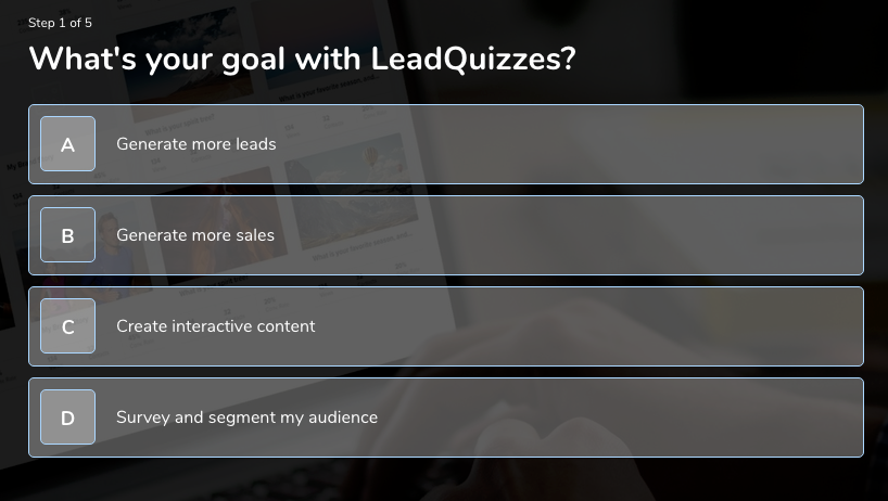
This enabled us to find out what they were looking to achieve with our software, so we could improve our messaging and product development.
It was also important to us to learn who our audience members were, so the second question was “What best describes you?”.
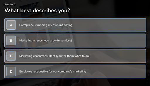
Here, we listed the answer options that best describe our core target audience and that allow us to better understand the breakdown of that audience (even if this specific quiz would be slightly more tailored towards agencies).
The quiz contained a total of 5 steps and anyone could complete in under a minute. As they say internet users nowadays have shorter attention span than goldfish, it’s important to keep it short and concise. The shorter the quiz, the more likely people are to complete it. This is also true of forms, surveys, and most other means of obtaining user data.
Finally, in the last step, the takers were asked to leave their name and email address in order to request early access to LeadQuizzes 3.

If they did qualify, we took them to a sales page to sign up for the beta version of our software.

The results?
The quiz we linked to had a 53% completion rate, brought in 2,400 new leads, and gave us a much better understanding of who our website audience consisted of and what are their business goals. We could not have driven so much traffic to the quiz without the use of Hello Bar.
Ultimately, the Hello Bar + quiz combination has brought us 2,431 new contacts and $52,223 in revenue.

Next, we wanted to focus on increasing our lead capture with an exit pop-up!
Case Study #2 – How We Increased Our Lead Capture by 37.96% in Just 1 Month Using Hello Bar with LeadQuizzes
The Starting Point
Since the main goal of this Hello Bar campaign was to increase the number of leads and grow our email list, I’ll first briefly introduce you to the “before” state of our lead capture. As a reference for our tests, we pulled out the analytics for a 4-month period prior to this campaign’s start.
We decided to implement the Hello Bar exit intent pop-up on the LeadQuizzes website in November, so we analyzed the data for the previous four months leading up to November (July, August, September, and October) and found out that our average lead capture rate for that period was 2.16%.
The Execution
For the purposes of this campaign, we designed a 2-step lead capture process. First, we used a Hello Bar exit intent pop-up to grab our audience’s attention and catch them before they could leave our site. We linked that exit intent pop-up to a different quiz that we created in LeadQuizzes.
Once we set up our Hello Bar pop-up, we first A/B tested several pop-up variations so as to make sure we got the Hello Bar click-through rates (CTR) as high as possible. This meant tweaking the text we used on the pop-ups, along with some aspects of the pop-ups design.
After achieving what we considered the optimal CTR (somewhere in the range of 7%), we A/B tested our quiz to maximize the quiz conversions and make sure it completely aligned with the final pop-up version.
But let’s take a small step back first. In order to set up an exit intent pop-up, we needed to make sure it led to a highly engaging and interactive piece of content that would guarantee a high lead capture. So, we created an online quiz.
1. Create a Lead Generation Quiz to Use as a Target URL
Before we even started setting up our first Hello Bar pop-up, we had created a quiz titled “Can You DOUBLE Your Website Conversions?”. Our intention was to use the quiz as a target URL for our exit intent pop-up, so we needed to make sure it was properly set up before embarking on the Hello Bar project.

The quiz we created consisted of 8 questions (our own experience has shown that the ideal number of quiz questions is 8-10) and 2 outcomes which depended on the answers provided by the respondents.
Our quiz had 3 purposes:
- Find out how our website visitors currently go about their lead generation efforts
- Determine whether our quiz maker software could help them increase their conversions
- If our software indeed could help them, then introduce them to LeadQuizzes
To obtain the necessary information, we asked questions like “How much website traffic do you receive per month?”, “How many leads are you getting each month?”, “Do you use pop-ups to capture leads?”, “What type of impact would doubling your website conversions have?”, and so on.
All these questions were with the aim to learn more about our potential users, capture their contact information, and sell them on our product LeadQuizzes.
Once they answered all our questions, we asked them for their contact information:
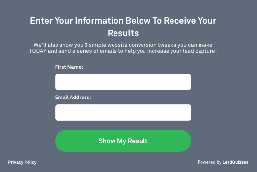
From there, we created a sales page in LeadQuizzes telling them how we could help them increase their lead capture with a quiz:

And next, they would click through to start their free trial.
If you’d like to learn more about how we created the quiz we used in our Hello Bar campaign, feel free to check out this comprehensive quiz maker guide.
2. Set Up and Test Different Exit Intent Pop-up Variations
All in all, we tested 5 entirely different exit intent pop-up variations using Hello Bar, shutting off the weakest-performing one each week.
We divided the pop-up testing phase into three rounds, gradually narrowing down the key elements of our final pop-up version after each.
Exit Intent Pop-up A/B Testing Round 1 (testing 3 pop-ups at the same time)
To begin, we set up 3 different variations with entirely different copies and images.
Pop-up 1
Here we included:
- Copy (leading in with a double question)
- Free advice as an incentive
- No image
- CTA containing the trigger words “free” and “now”

Result: 2.7% CTR
This pop-up was shut off after a week.
Pop-up 2
Here we included:
- Copy (leading in with a question)
- Neil Patel testimonial
- Free personalized report as an incentive
- Default Hello Bar image

Result: 3.1% CTR
This pop-up was shut off after a week.
Pop-up 3
Here we included:
- Copy (containing an attention grabber at the beginning)
- Doubling conversions as an incentive
- Custom image
- CTA directly inviting the visitors to take the quiz
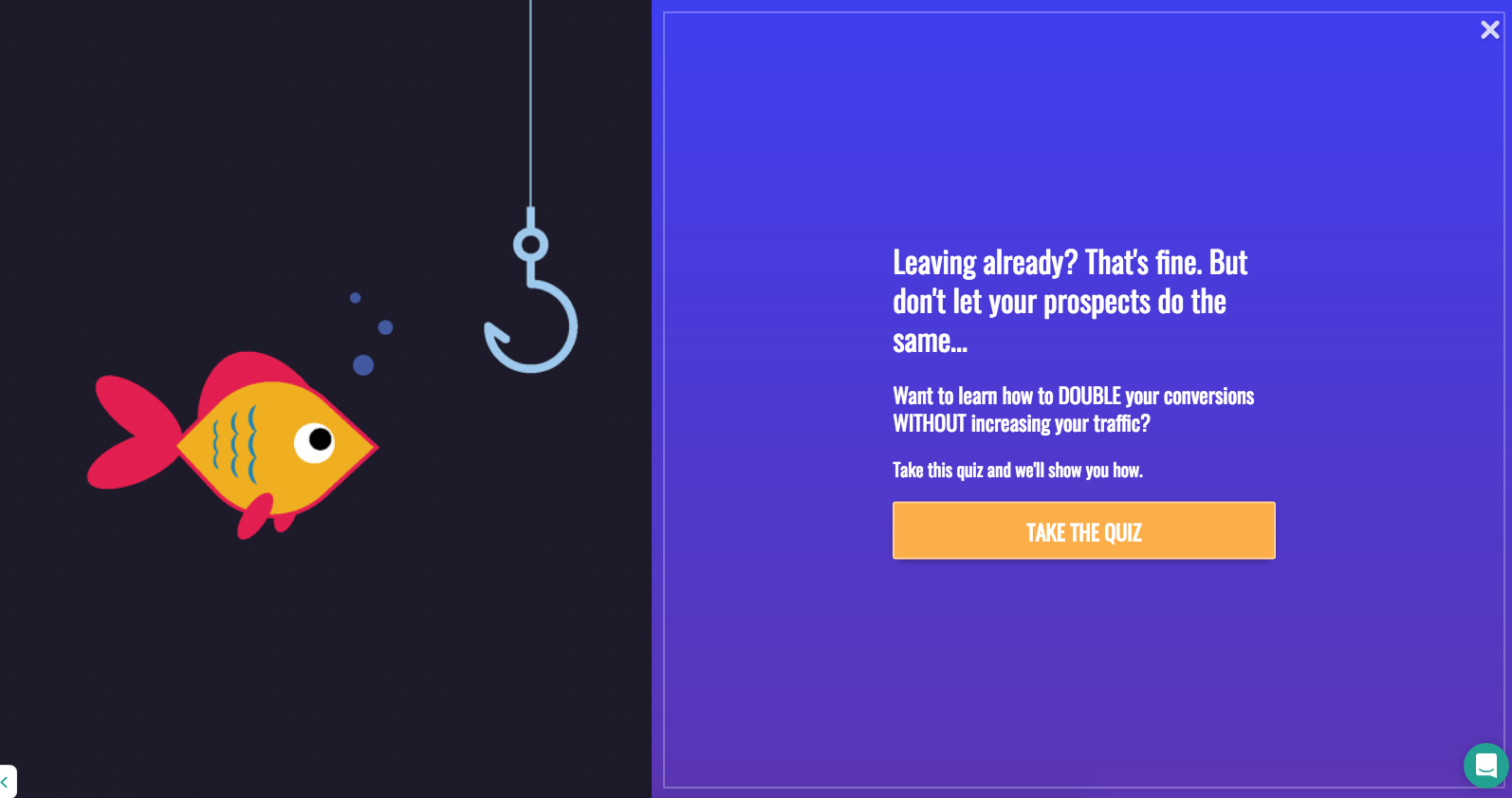
Result: 4.3% CTR – this was our highest converting pop-up variation
So, after testing a pop-up with no image at all, a pop-up with the default Hello Bar image, and a completely customized pop-up with custom copy and image, we got the best results with the last one.
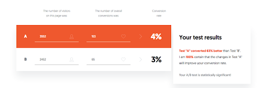
Our Pop-up 3 performed 59% better than Pop-up 1 and 39% better than Pop-up 2.
Before shutting any of the variations off, we used Neil Patel’s A/B Testing Significance Calculator to make sure our tests were statistically significant.
Exit Intent Pop-up Testing Round 2 (testing Pop-up 3 against two additional variations)
In the first phase of our exit intent pop-up testing, we managed to determine what works best for us – an attention grabber at the beginning along with a completely custom image and copy, while setting clear expectations for what was to come on the quiz.
So, we tried to replicate this pattern on the two subsequent variations that we tested against our Pop-up 3.
Pop-up 4
Here we included:
- Copy (leading in with a question)
- Free personalized report as an incentive
- Custom image
- CTA containing the trigger word “FREE”
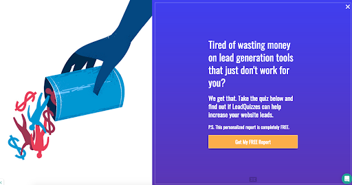
Result: 2.6% CTR
Pop-up 5
Here we included:
- Copy (leading in with a stat)
- Up to 15x more leads as an incentive
- Custom image
- CTA containing the trigger word “FREE”

Result: 6.4% CTR
Okay, I have to admit the inspiration for this one came from Hello Bar’s own exit intent pop-up:

Exit Intent Pop-up Testing Round 3 (testing different Pop-up 5 variations)
Once we got ourselves the winning pop-up version, we continued A/B testing it so as to try and get the CTR up at least a bit more.
This time, we decided to keep the pop-up outline essentially the same, while slightly changing some minor elements and A/B testing the pop-up variations against each other.
That being said, for some variations we tried using different colors (button and/or background), changing the CTA copy, font size, slightly rewording the pop-up copy, and so on.
All in all, we tested 3 additional variations of the same pop-up and got the following CTRs – 6.3%, 5.8%, and 7.1%. Just to remind you, the original version of the pop-up had a 6.4% CTR.
Here’s the winning pop-up’s stats in Hello Bar:

And the remaining variations and their respective conversion rates:

So, down below you can see the 7.1% CTR final exit intent pop-up version we’ve been using to capture leads on our website ever since.
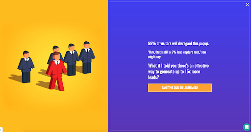
What we changed (and why it worked):
- The original “Tell me more” CTA was changed into “Take this quiz to learn more”.Why did this work? Because the new CTA was more honest about what the user could expect once they click the button.With the new variation, it was clear that they will have to take the quiz once they click the button, while the original one only set vague expectations (this, I believe, had also contributed to higher quiz conversion rate).
- We slightly reworded the pop-up copy. While the original said “What if I told you you could generate up to 15x more leads using quizzes?”, in the variation, we changed that question into “What if I told you there’s an effective way to generate up to 15x more leads?”.Why did this work? Well, the original immediately revealed that our secret lead generation method is online quizzes.There is no “mystery” involved. The variation, on the other hand, only reveals that there’s that secret, highly-effective method of lead generation. But in order to find out more, you need to click the button and take the quiz.
- Finally, we used a slightly darker CTA button color, but there’s no reliable way to check whether it had any substantial impact on the CTR.
We’ve been using this pop-up on our website ever since, with its CTR fluctuating between 6.8% and 7.7%.
3. Optimize the Quiz to Maximize Conversions
After we managed to get the Hello Bar CTR as high as possible (at around 7%), we decided to optimize the quiz we originally created for this project to make sure it completely aligns with our pop-up and to try and maximize the quiz conversion rate. Afterall, if we get someone to take the quiz, we want to be sure we can capitalize on that.
During the one month period that we focused on optimizing our conversion rates on Hello Bar, we had the following conversion rate on our quiz:

Achieving a high Hello Bar CTR allowed us to focus on A/B testing our own quiz. So, we created another quiz variation, which we A/B tested against the original quiz. The changes we made were put in place to make sure our quiz aligns with the final pop-up copy and CTA.
What we optimized:
- Changed the wording in certain places, including the title (using the word “leads” instead of “conversions”, for example)
- Added an extra answer option to certain questions (we figured out that some of our users may not have their traffic and leads data or simply aren’t willing to share it, so we added the “I’m not sure” answer to allow them to progress through the quiz without necessarily providing such data)

After we optimized the quiz, we started A/B testing the two variations (Original and Variation 1), using them as a target URL for our new pop-up. You can see the results down below:


By making a few seemingly very insignificant changes (listed above), we managed to get the conversion rate for Variation 1 up to 29% from the original 24%. So, from then on, we started using only the new quiz version with our pop-up.
The Result
Let’s just go back to our starting point for a moment. Before we initiated this Hello Bar campaign, our 4-month lead entire-website capture rate average was at 2.16%.
The result after using the Hello Bar exit-intent pop-up for exactly one month?
Our lead capture in November went up to 2.98%.
That’s a significant 37.96% increase compared to before we started using Hello Bar.
Case Study #3 – How We Used Slider Pop-ups to Capture Leads and Promote Our Content
Unlike exit-intent pop-ups, which take over and dominate the entire page, slider pop-ups are a bit more subtle. As their name suggests, they appear by discretely sliding in from one of the corners of the page.
Here’s a screenshot of one of our slider pop-ups to give you a sense of the scale of the slider on a full page:
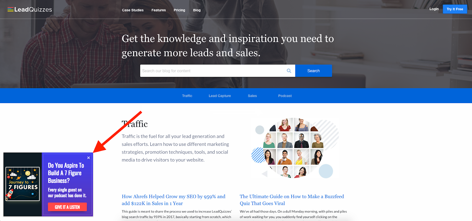
During this project, we experimented with the Hello Bar slider pop-ups in several ways. We tried using slider pop-ups to capture leads through the same quiz described above, promote our podcast, and bring more traffic to blogs that were most likely to convert visitors into customers.
Lead Capture
First, we tried the same thing we did with the exit intent pop-up – using it to increase our lead capture. With the slider pop-up not being as prominent as the exit intent one, it left us more room to experiment, so we tried several different approaches.
As we were testing two types of pop-ups at the same time (exit intent and slider), in order not to overwhelm our site visitors, we targeted the slider pop-ups to only be seen by our blog visitors, while the exit intent one was shown on both the blog and the main website.
We tested slider pop-ups with a default Hello Bar image:
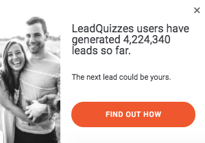
CTR: 0.8%
With no image at all:
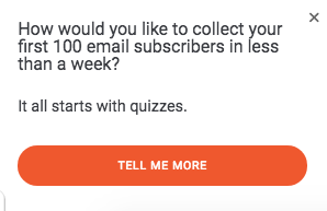
CTR: 0.8%
We also asked the vectorized Eminem and Lionel Richie look-alikes to jump in and help with our lead capture:

CTR: 1.7%
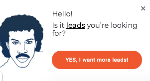
CTR: 2.8%
Since the results we were getting using slider pop-ups to capture leads still were not nearly as good as the ones we were getting with the exit intent pop-up, we decided to explore other possibilities with the slider pop-ups.
So, we turned to promoting some of our important pieces of content.
Podcast Promotion
First, we decided to try using slider pop-ups as a part of our Journey to 7 Figures podcast promotion. With the slider pop-up below, we managed to get a 1.2% CTR.

As Hello Bar lets you set whether a visitor is able to hide a pop-up or not, we tested both settings with this particular slider pop-up. Even though we got a better CTR when we disabled our visitors from hiding the pop-up (3.7%) as opposed to allowing pop-up minimization without taking action (1.2%), we still decided to let them hide it.
The reason is that we didn’t want to affect our blog visitors’ time-on-page and bounce rate. The fact is that people often get annoyed by pop-ups (no matter how non-intrusive they are), so it’s only fair to give them an option to hide it if they are not interested in what we’re promoting.
In one month of using this pop-up to promote our podcast, it amounted for 20.69% of the entire podcast main page traffic.
Agency Training Promotion
In addition to our podcast, we also tried using slider pop-ups to promote some of our cornerstone content.
Our agency training is one of the most comprehensive pieces of content we have and presents a great resource for marketing agencies, so we tried using pop-ups to bring more traffic to it.

With the pop-up above, we managed to get a 0.8% CTR.
Overall, the slider pop-ups weren’t very effective for us in terms of lead capture but we learned that they can be great assets when it comes to moving people around your site and sending them to your more desired pages.
Conclusion
To sum up, here’s a brief recap of our results and everything we learned after using Hello Bar for over a year:
- Using a Hello Bar at the top of our website helped us generate $52,223 in revenue by driving leads to a quiz that qualified visitors and sent the right ones to a sales page.
- Using a Hello Bar exit-intent pop-up on our website increased our overall lead capture by 37.96%.
- Quizzes are an outstanding way in combination with a Hello Bar to learn more about your potential customers.
- Slider pop-ups can be used to capture leads but for us were more effective in promoting our content that was most likely to lead to sales.
- It’s essential to A/B test your lead generation. If we didn’t test, it would have been easy to give up and say it didn’t work.
Now even though we had the advantage of coming from a strong marketing background, keep in mind that you don’t actually need to be an expert marketer to use Hello Bar.
In fact, they have an entire team of marketing experts ready to coach you on how to best use Hello Bar with your website.
Now it’s your turn!
What do you think about our tests? Do you have any ideas of how we could have improved our results with Hello Bar? What’s the first step you will try on your website?
Leave a comment below and let me know 🙂
Author Bio:
Jeremy is the cofounder of LeadQuizzes, a quiz and survey software built for marketers to increase their leads and learn about their audience. Their users have generated over 4.7M leads and 73.9M questions answered. He is frequently featured in Entrepreneur and he and his team have won numerous awards and accolades.


![[Case Study] How Hello Bar Increased Best For Bride’s Lead Gen By 261% In One Month (That’s 643 New Leads Per Month!) 35 How Hello Bar Increased Best For Bride’s Lead Gen By 261% In One Month](https://www.hellobar.com/wp-content/uploads/2019/04/case-study.png)
![[CASE STUDY: JKINIS SWIMWEAR] How This Small Business Collected 103 Emails In 30 Days Without Spending $ on Ads! 36 [CASE STUDY: JKINIS SWIMWEAR] How This Small Business Collected 103 Emails In 30 Days Without Spending $ on Ads!](https://www.hellobar.com/wp-content/uploads/2019/03/How-This-Small-Business-Collected-103-Emails-In-30-Days-Without-Spending-on-Ads-pdf.jpg)