Lead Capture Pages: Essential Guide and 5 Pro Tips to Get Leads

I hope you enjoy this blog post. If you want Hello Bar to grow your leads, click here.
Author:
Ryan Bettencourt
Published
July 16, 2024

For many entrepreneurs, lead capture pages become an afterthought. They’re relegated to a bottom-tier priority level. That’s a mistake.
Leads are valuable. They don’t have dollar signs hanging over their heads, but they can turn into customers if you nurture them correctly.
First, though, you have to attract them. Lead capture pages enable you to bring more leads on board so you can market to them more efficiently. Collecting email addresses and other personal information enables you to have more direct contact with each lead.
But how do you design a lead capture page? And what should it contain? That’s what we’re going to cover today. Plus, we’re going to show you how you can use Hello Bar to streamline your lead capture process.
Lead Capture Form Statistics and Curious Facts

Lead capture is a little different from lead generation.
Lead generation refers to the entire process of optimizing your website for conversions and leads. Lead capture, on the other hand, is the actual moment when someone converts into a lead.
We’ll get into more details later, but here’s what you need to know right now.
The average conversion rates across all industries is about 3.3% and a bit lower for e-commerce websites at 2.5%-3%.
Facebook does better with a conversion rate of 9.21%, while paid search sits at around 4.8%. Email marketing usually falls between 2%-5%, and cold calls have a success rate of 4.82%.
Also, generating traffic and leads is a big challenge for marketers, with 15% of them saying it’s their top problem.
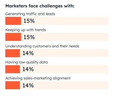
Image via HubSpot
If you’re frustrated by your difficulty in capturing leads, you’re clearly not alone. Lots of businesses struggle to acquire leads. But instead of wallowing in your morning coffee, let’s do something to improve your lead capture and get more qualified leads!
Important Questions About Lead Capture Pages

Before we get into the nitty-gritty of lead capture pages, let’s cover some basics so we’re all on the same page. It’s frustrating to read an article about a topic, then get lost in the unfamiliar jargon.
We have some specific questions we want to call out, but first, we want to define the word “page.” It’s evolved over the years as websites have become more nuanced and varied. Interactive elements have broadened the definition of the word “web page,” making it confusing for newcomers.
If you visit Hello Bar’s homepage, you’ll see a standard page.

Let’s say, though, that it’s your first visit to the page. You decide not to fulfill the call to action (CTA) on the homepage, so you go to click your browser’s X button.
At that point, an exit popup will appear:
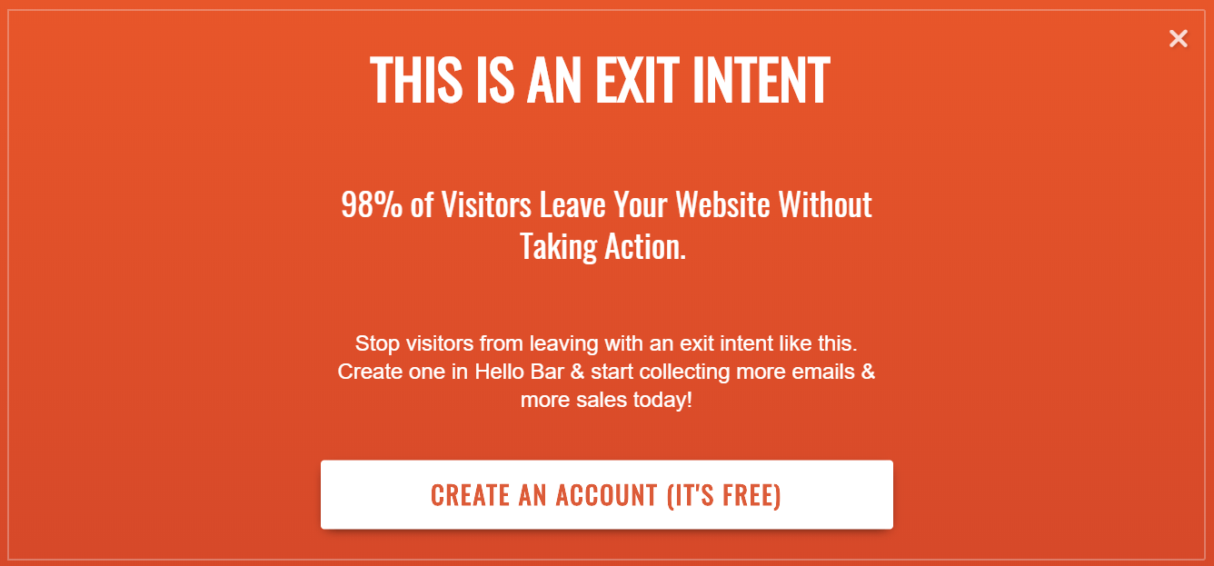
It’s inviting you to re-engage. In some ways, this is a page in itself.
Popups, sliders, and even top bars can qualify as pages when used correctly.
What Is a Lead Capture Page?
A lead capture page is any page or element on your website that asks a user to enter information. In other words, it’s a form field along with a submit button.
For instance, if you’re using Hello Bar to capture leads, you might decide to design a top bar. In it, you’ll include a headline, one or more form fields, and a CTA.

“Get free weekly coupons” is the headline, the form field asks for the user’s email address, and “Sign up now!” is the CTA.
Simple, right?
Your form might also ask for the user’s name, phone number, and other information. However, simple forms tend to work best. You want as few fields as possible to reduce friction.
In other words, if a user thinks it’ll take too much time to fill out the form, they’re likely to abandon it entirely.
What Is a Lead Capture Form?
A lead capture form is the actual form you want your users to fill out. Again, it can ask for any information you want (whether required or optional), but you want to require as little info as possible.
The form field could be huge, such as on a standalone page or a page takeover:
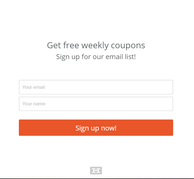
Or it can be much smaller, such as on a slider or a top bar.
Regardless of the size you choose, the lead capture form needs to command attention. For instance, we could spice up the example above with just a few small changes within the Hello Bar software.
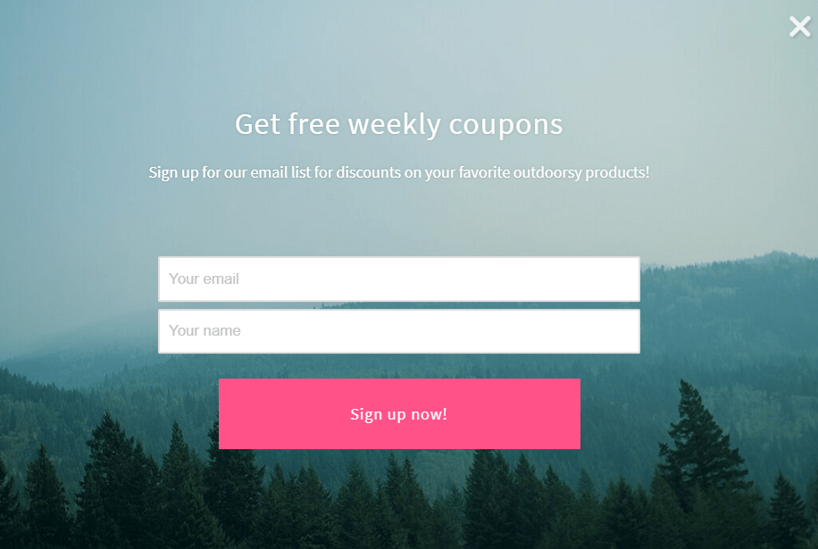
To go from the first form to the second took only three clicks and a few words of type.
How Does a Lead Capture Page System Work?
A lead capture system works just like this:
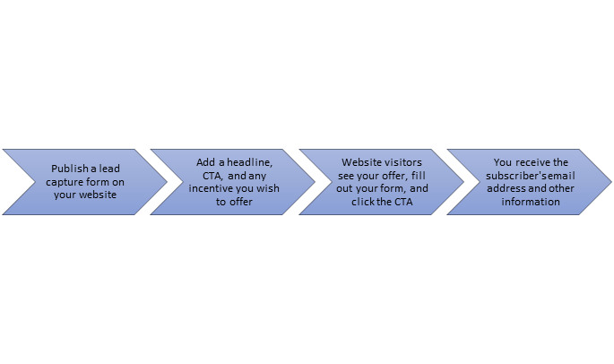
It’s a simple four-step process.
You supply the form as well as the headline, CTA, and form fields. When people sign up, they get added to your email list database. Easy, peasy, right?
From there, you can use your email system to segment your list, set up autoresponders, and design drip campaigns. Those are all great things, but they’re beyond the scope of this article.
Benefits of a Great Lead Capture Page

To succeed in business, you have to think like a consumer. What thought processes occur when people need to make decisions about their personal information, money, and other assets?
First, there’s a question. Does the consumer want what the business is offering. Does he find it valuable?
Then the wheels start turning. If the consumer’s interested, he starts thinking about the ways in which he could benefit from the offer.
Next, the lightbulb moment — also known as Eureka! The consumer makes a decision and decides to convert.
Finally, there’s action. The consumer signs up for the email list, buys the product — whatever.
Great lead gen pages take the consumer through every step of the process and help the consumer make the “right” decision. To convert.
Essential Lead Capture Page Guide That Will Increase Any Website Conversion Rate
A great lead capture page epitomizes several qualities:
- Enticing headline that evokes curiosity, need, urgency, or some other emotion.
- Attractive offer – a lead magnet – that makes parting with personal information worth the benefit
- Call to action that encourages the user to click
- Design that appeals to the consumer, matches the brand, and sends subtle signals to convert
When all of those qualities come together, you get a lead capture landing page that converts. However, the specifics vary from one business to the next.
An e-commerce business that sells outdoor gear will have a different audience from one that sells women’s clothing and jewelry like Swarovski necklaces, earrings, etc. That’s obvious.
But this also means that those audiences will expect different aesthetics, offers, and copywriting. If you don’t anticipate those expectations, you’ll fail to meet them.
With those facts in mind, let’s look at our top tips for creating lead capture pages that convert.
Use a Powerful and Engaging Headline on Your Lead Capture Pages
Writing great headlines is the first skill to master. It’s what your visitor first sees upon reaching your lead capture landing page.
A headline like this, for instance, probably won’t win you any new leads:
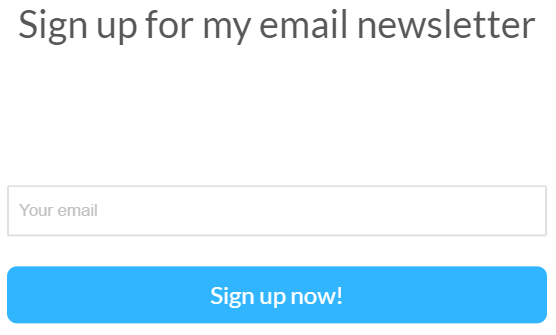
It’s pretty boring, right? What email newsletter? What does it contain? Why should I care?
This headline doesn’t mention anything of value to the user.
But what if we went with something like this:
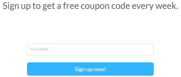
Now we’re talking. The user understands that signing up for the email newsletter will entitle him or her to a free coupon code every single week.
That’s incentive.
Try using unfamiliar or unusual words in your headlines to spark even more interest. For instance, we might change up the wording a bit to look like this:
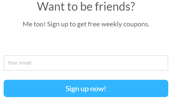
It has a little more personality, which might improve conversions. If we had these two signup forms, we’d A/B test them to see which worked better with our audience.
Optimize Your Lead Capture Form to Increase Conversions
You can’t just focus on the headline. Every element of your lead capture form — including the form fields themselves — need to invite conversions.
For instance, we could try something a little funky for the email address form field:

Maybe it will increase conversions and maybe it won’t. But we want to find out!
Use an Eye-Catching and Relevant Image or Video on Your Lead Capture Forms
Imagery can have a huge impact on conversions. An image attracts the eye, engages more of the senses, and can even trigger emotions.
Let’s say that we run an office supply store. We want people to sign up for our email list so we can market everything from file folders to fountain pens.
To incentivize signups (which we’ll cover in a bit), we might offer a free e-book or guide. Our lead capture forms could look something like this:
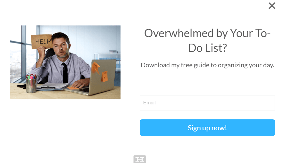
We’ve added an image that supports the headline. Our target audience needs to get organized, so we chose a stock photo of a worn-out professional.
It helps connect the user with the offer. A consumer who’s overwhelmed by their to-do list might look at that image and think, “Hey, I feel like that 10 hours out of every day.”
Then they’ll sign up to get our free organization guide.
Add Past Customer Reviews and Testimonials to Increase Social Proof
Social proof can also help boost conversions on your lead capture pages.
For instance, over at Neil Patel Digital, we use lots of testimonials to demonstrate our expertise. Quotes from major companies help sell the idea that we really know what we’re talking about.
Which we do.
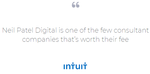
You don’t need a testimonial from Intuit, though, to boost conversions. Ask your current customers to provide their honest reviews of your product or service. Then, put the quotes on your lead capture pages.
If you work with big names or companies, you can also use logos to provide social proof. We do that at Neil Patel Digital, too. For smaller businesses, a practical approach might be to create a logo using an online logo maker.

See those logos along the bottom of the screenshot? They’re subtle cues to the user who might be on the edge. Thanks to those logos, they might click the “Work With Us” CTA.
Use Trust Badges on Your Lead Capture Page to Make it Look More Trustworthy
Trust badges are logos or signifiers that tell your prospects that you’ve done something to secure security, safety, or quality. For instance, if you run an e-commerce store, you might put a badge denoting that you have an SSL certificate on your lead capture pages.
That way, customers know you encrypt their personal information.
You could also use a trust badge to show that you’re GDPR compliant. This is especially important to generate leads because you want your prospects to know that you’re following the EU’s new rules for data protection and usage.
Hello Bar makes it easy to remain GDPR compliant. After you sign into your account and create a Hello Bar, you can click the button for GDPR compliance.
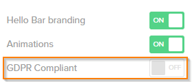
You can then configure your settings accordingly and let the world know that you’re protecting subscribers’ personally identifiable information.
Work on Your Lead Capture Page Copywriting to Make it Compelling
Solid copy is always an asset. When you write better copy, you’re more persuasive and endearing.
Practice copywriting every day. It doesn’t just have to be your lead generating activities. Write better product descriptions, blog articles, and landing pages. The more you practice, the better you’ll get.
Establish Yourself as an Authority on Your Lead Capture Page
There are several ways to signal authority on your lead capture pages:
- Show your Twitter followers
- Show your Facebook followers
- Show an email subscriber count
- List your academic credentials
- Mention the number of customers or clients you have
- Describe extraordinary results you’ve gotten
Authority signals help potential leads feel more comfortable with you and your business.
Create an Irresistible Offer With an Awesome Lead Magnet
Remember our earlier example about the organization guide? We used an image and a lead magnet to compel visitors to sign up for our email list.
You can do the same by producing your own lead magnet.
A lead magnet is nothing more than an incentive for people to convert. It provides something of value in exchange for your visitor’s email address.
Your lead magnet might be a guide or e-book. It could be a checklist, calculator, spreadsheet template, or toolkit.
You can even use a coupon, discount code, or discounted bundle as your lead magnet. These are particularly effective in the e-commerce market.
When your subscriber submits the form and confirms their email address, you send along the lead magnet. It’s that simple. You can A/B test different magnets to see which one is most attractive to your audience.
For instance, one audience might prefer a detailed educational video. Another might like a cheat sheet or swipe file. Try as many as you want so you don’t miss out on collecting leads who might otherwise have converted.
Use a Great Call to Action on Your Lead Capture Pages
The CTA seals the deal. The worst thing you can do is use a bland, boring CTA that everyone has seen before. “Submit” is probably the worst offender.
You want your user to feel satisfaction when clicking that button. This is why leading questions prove so effective on lead capture pages.
WIth Hello Bar, for instance, you can use leading questions to guide the visitor toward the conversion.
For instance, maybe we sell fitness gear. We have a lead magnet, such as a guide to getting stronger in 30 days or less, but we want to prime my audience.
We could use a leading question like this one:

The answer is almost always going to be “Yes.” I’ve made it easy.
You can increase the chances of your user clicking “Yes” by adding negative or even absurd wording to the “No” answer:

Unless you’re an Olympian, you’re probably clicking “Yes.”
Top 5 Pro Tips to Optimize Your Capture Pages

We’ve given you a lot of information here, but there are a few more tips we can impart. These are more granular than the advice above, but they’ll help you improve your conversion rates and gain more subscribers from your lead capture pages.
1. Make Your Lead Capture Page Permalink Short
The permalink is the URL you use for your lead capture pages. It might look like this:

A shorter permalink is easier to remember. Plus, it’s not overwhelming. You probably wouldn’t remember a permalink that looks like this:

It’s too long and confusing. And don’t even get me started on messy permalinks like this:

Alphanumeric salad isn’t your friend.
2. Make Your Capture Page Short and Sweet
You don’t want to pack too much information into your lead capture pages. Anything that distracts from the offer and CTA will likely lower your conversion rate.
Earlier, we shared a screenshot from Neil Patel Digital that features logos of brands we’ve worked with. As a reminder, we’ll share it again:

Notice that we reduced the opacity of those logos. They’re there, but they don’t overwhelm the senses.
If we included them in color (especially since every logo uses different colors), they’d distract from the CTA. That’s the last thing you want.
3. Use Bullet Points
We can’t stress enough that white space is your friend. White space (also called negative space) is the blank area around each element on a web page.
Large amounts of white space give the viewer room to breathe — visually speaking, that is.
It’s kind of like the difference between a big wall of text and a lot of short paragraphs. The former is more imposing and intimidating because you know you’re going to have to work hard to get through all that text.
There are shortcuts to creating white space even if you want to share a lot of information. Bulleted and numbered lists are my go-to choice.
Take a look at these two examples side by side:

Both of these examples include the same information. Which would you rather read?
Even though it’s just psychological, users prefer the example on the right because it’s less intense. The eye has room to breathe between points. Plus, there are fewer words without removing any essential information.
4. Eliminate All Distractions That Might Steal Attention from Your Opt-in Form and Call to Action
If an element on your lead capture page won’t contribute to conversions, remove it.
You don’t need navigation on a lead capture page. The last thing you want is for prospects to click away from your form.
Similarly, you don’t need to recount your brand history or add images just for the sake of it. Keep these pages lean and streamlined.
5. Constantly A/B Test Variables from Your Lead Capture Page to Improve Conversion Rates
We’re big fans of A/B testing, but not just because Hello Bar makes it so easy. We’re fans because it allows us to collect actionable data from our existing web traffic.
If we know that 80 percent of our website visitors prefer one form over the other, we can launch that form without any qualms. We know it’ll work because we’ve tested it on our own audience. That’s key.
FAQs
Q1. What is a lead capture page used for?
You use a lead capture page to capture leads, in other words, to collect information from potential customers to convert them into paying customers. When you create a lead capture page, you’re designing a special part of your website where visitors share their contact details, like email addresses.
Q2. What is the difference between a lead capture page and a landing page?
While all lead capture pages are landing pages, not all landing pages are lead capture pages.
A lead capture page specifically collects leads by asking visitors to fill out a lead capture form. Conversely, a landing page can do more, like promote a product, get people to sign up for a free demo, or share a free ebook.
Q3. What is another name for a lead capture page?
A lead capture page is also called a lead generation page or a capture page. You use these pages in your sales funnel to collect leads to nurture into qualified leads, turning them into customers.
Q4. What is an example of a lead capture?
You might see a form field asking for an email with an attention-grabbing headline like, “Get Your Free Ebook on Healthy Eating Tips!” This lead capture form offers a free ebook in return for potential customers’ contact info.
Q5. What should a lead capture page include?
An ideal lead capture form includes the following primary elements:
- Attention-grabbing headline.
- Compelling value proposition.
- Short lead capture form with few form fields.
- Social proof, like customer testimonials.
- Eye-catching visuals, like images or video
- A strong call to action.
Conclusion
Lead capture pages are tricky. A single out-of-place element can tank the conversion and leave you without a lead.
There’s an upside, though. Lots of businesses have experimented with lead capture pages and forms, so you have lots of data upon which to rely.
This article includes tons of actionable advice that you can use as a starting point.
We’ve defined lots of key terms you need to know and provided advice on headlines, form fields, CTAs, social proof, trust badges, and other elements of a great page.
Then you have our top five pro tips for optimizing your lead capture pages for conversions.
Following the guidelines in this article will help you get off to a solid start. However, your work’s not done yet.
Conducting A/B testing is essential for refining your lead capture pages. If you’re not testing different elements of your pages, you’re missing out on a treasure trove of data.
Even a single altered word can increase your conversion rate. Maybe that only means five new signups every week, but after a year, you’ll have 260 fresh leads you wouldn’t have acquired otherwise.
Makes sense, right?
So set up your lead capture pages using Hello Bar, then start testing.
What’s your favorite word to use on your lead capture pages and increase conversions?


