Exit Intent Popup: Set Up Yours in Under 5 Minutes With These 13 Tips

I hope you enjoy this blog post. If you want Hello Bar to grow your leads, click here.
Author:
Ryan Bettencourt
Published
July 16, 2024

An exit intent popup could provide you with a massive increase in leads, more revenue, and an insane amount of information about your target audience. Don’t believe me? You should probably read this article to discover how exit popups work and why your business might need them.
When marketers hear the word “popup,” they get tense. It’s understandable. We’ve all seen bad exit popup examples.
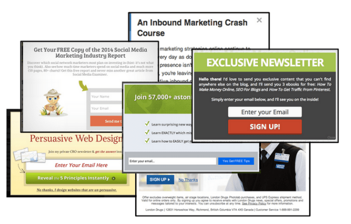
We’ve all heard of fad diets, too, right? That doesn’t mean you shouldn’t eat healthy foods. It just means you shouldn’t overdo it. When used correctly, they can be powerful marketing tools to help you capture leads and boost sales.
What is a Popup?
A popup is a window that appears over your existing site. These days, it’s usually not a separate window — if you’re using the right software — but an overlay that provides some sort of announcement.
Popups can be any size. You’ve likely seen the small popups — sometimes called modals or sliders — that appear on a website soon after you visit.
They usually want you to do something, such as take a quiz or activate a visible discount. Many ask you to sign up for the website’s email newsletter, often in exchange for a lead magnet or free stuff.
What Is an Exit Intent Popup?
An exit intent popup is a special form of popup that appears on a website when the visitor tries to leave. The mouse movement toward the top of the browser window triggers the exit intent technology, and suddenly, the exit popup appears.
It’s also called a page-takeover popup because it consumes the entire user’s screen. Here’s an exit intent popup example from Hello Bar:
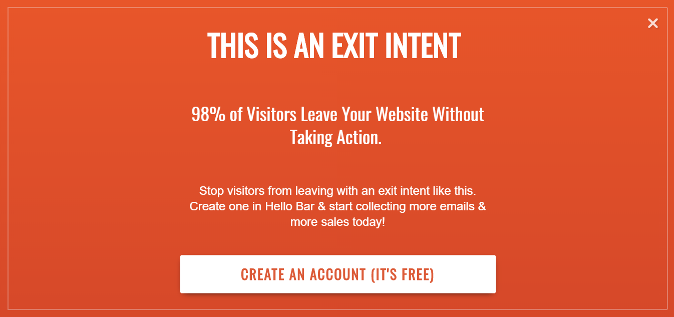
Exit intent popups work by using exit intent technology to detect when a visitor is about to leave your site. These triggers can include mouse movements toward the top of the page or rapid scrolling up, indicating the user wants to leave.
This critical moment is your last chance to engage visitors before they leave. These popups can help you reduce bounce rates and boost conversions.
For example, if you run an online store, you might use an exit popup to offer a 10% discount code. This could turn abandoning visitors into loyal customers.
Why Are Exit Intent Popups Different From Regular Popups?
Think about how you use a website. You’re looking for information, interested in buying a product, or just surfing around. Either way, you click on a web page because you want something from it.
Traditional popups usually appear as soon as you arrive on the web page or soon after. You haven’t really gotten your bearings yet.
That doesn’t mean other popups can’t work — they can — but they’re often ineffective because they irritate the viewer. The reader thinks, “All I wanted to do was check out this site.” It’s an interruption.
Exit intent popups, by contrast, appear when the visitor is ready to leave. That’s the key distinguishing feature. The fact that they take over the entire page provides another differentiation. They’re more likely to capture the viewer’s attention as long as they’re well-designed and contain good copy (but more on that later).
Why Should You Use Exit Popups on Your Website?
As you must have picked up, exit intent popups are your last chance to engage visitors before they leave. But one of the best things about this marketing technique is that even if visitors don’t interact with your popup, you haven’t lost anything; they were leaving anyway.
That aside, here are some of the key benefits of using exit popups:
1. Reduce Bounce Rates
Exit popups can significantly lower your bounce rates. Showing visitors information that’s likely to pique their interest just as they’re about to leave gives them a reason to stay and explore more of your site.
This effectively cuts your bounce rate and increases your chances of conversion.
2. Boost Email Subscriptions
Growing your email list is crucial for nurturing new leads and building customer relationships. And exit popups are excellent tools for this.
For instance, you might offer a newsletter signup with a promise of exclusive content or special offers: “10% off your first order when you join our VIP list.” This approach can turn abandoning visitors into long-term subscribers.
3. Increase Sales and Conversions
For e-commerce sites, exit popups can be a powerful way to save potential sales. You can offer a limited-time discount code or some free stuff to encourage visitors to complete their purchase.
This last-minute incentive can be the nudge a hesitant customer needs to finalize their order, making it a great tool for boosting sales and conversions.
4. Gather Valuable Feedback
Use exit popups to ask visitors why they’re leaving. This gives you direct insights into what might be missing from your site or product offering.
For example, a SaaS company might ask, “What stopped you from signing up today?” with multiple-choice answers. This feedback can help you improve your website and offerings to serve your potential customers better.
Exit Intent Popup Best Practices
Speaking of not overdoing things, here are five crucial best practices that can help you maximize the impact of your exit intent popup strategy.
1. Craft a Compelling Offer
Your exit intent popup needs to provide immediate value to visitors. And that’s why you need to create an irresistible offer that addresses their needs or solves a pressing problem.
This offer could come in the form of a discount code, a free sample box, or exclusive content.
For instance, if you run an ecommerce store selling fitness equipment, you might offer a free workout guide in exchange for a visitor’s email address.
This approach works because it gives site visitors something valuable related to their interests, increasing the likelihood of conversion. The point to remember is that exit intent popups convert best when they offer something your audience wants.
2. Use Attention-Grabbing Headlines
It’s not far-fetched to say that your headline is the most important element in your popup. And this is the case since it’s the first thing visitors see when your exit intent popup appears.
As such, your headline needs to be concise, compelling, and relevant to grab their attention quickly.
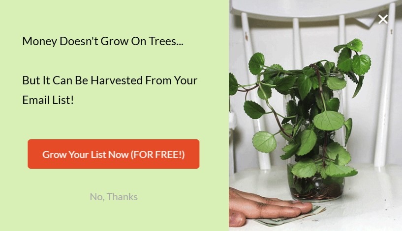
Try using “power words” that evoke a type of emotion or curiosity. That way, you can compel your site visitors to take the desired action. Here’s an exit intent popup example from Hello Bar with an attention-grabbing headline:
3. Keep Your Design Clean and On-Brand
Your exit intent popup should align with your website’s overall design and branding. Use colors, fonts, and imagery that match your site’s aesthetic to create a seamless experience for visitors.
That aside, it makes sense to avoid cluttered designs that overwhelm users. Instead, opt for a clean, simple layout that directs attention to your main message and call-to-action (CTA) button.
4. Optimize for Mobile Users
With almost 60% of all website traffic coming from smartphones in 2024 (the highest on record), optimizing your exit intent popups for mobile devices is non-negotiable.
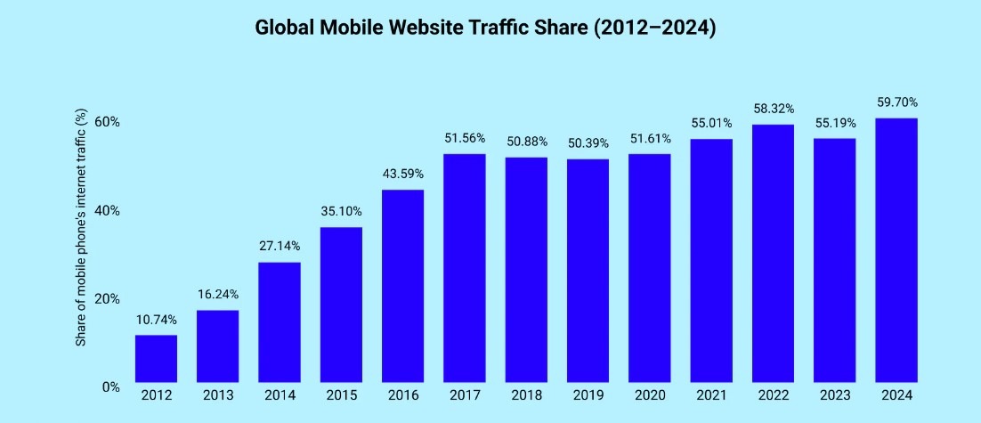
Image via Oberlo
Adjust your design and copy to fit smaller screens without compromising readability or usability.
Also, consider using different exit intent triggers for mobile device users since they can’t hover a mouse cursor. You might activate the popup when a user scrolls up quickly, indicating they’re about to leave the page.
5. Implement Smart Targeting
Don’t show the same exit intent popup to every visitor. Instead, use targeting options to display relevant messages based on user behavior, location, or other factors.
For instance, you could show different popups to first-time visitors versus returning users. New visitors might see an offer for a welcome discount, while repeat visitors could be invited to join your loyalty program.
You can also target based on the particular page a user is viewing. Infusing a personalized touch like this can significantly increase your conversion rates.
13 Actionable Tips to Set Up Amazing Exit Intent Popups That Will Highly Increase Conversions
There are ways to make your exit intent popups more effective. Maybe you’ve used them in the past, but they didn’t generate positive results.
It happens more often than you think.
In most cases, it’s because the marketer misused the exit intent popups. This is a nuanced marketing practice that deserves careful consideration.
1. Use Specific Exit Intent Popups for Specific Website Pages
Sure, you can push exit intent popups live across your entire site, but you’ll invariably leave money on the table. Why? Consumer intent.
People visit specific web pages for different reasons.
Visitor A finds one of your informative blog posts via Google search. He or she wants to solve a specific problem.
Visitor B lands on one of your sales pages via a Facebook post. He or she is looking for the product you’re selling.
Completely different intentions, right? If they go to click away, they need completely different exit intent popups.
Visitor A might appreciate an invitation to join your email list with a free gift from you.
Visitor B might like a discount code on the product he or she was viewing.
2. Design Exit Intent Popups That Match Your Website Style
Exit intent popups should capture your viewers’ attention, but they need to match your website’s brand. Otherwise, people will wonder if they’ve accidentally clicked on someone else’s page.
That’s never a good thing.
Try to tie your exit intent popup’s design to the rest of your website via at least one feature. It could be color, unique and fancy font choice, imagery, a logo design, or something else entirely.
3. When Using Pictures on Your Exit Intent Popups, Select High-Quality Professional Photos
We’ll talk about using Hello Bar to insert images into your exit intent popups later on, but first, we want to impress upon you the importance of quality. A low-resolution, poorly composed photograph will turn off visitors, no matter how compelling your copywriting is.
Stock photographs work fine. If you have a pro photographer on site at your business, ask him or her to capture a few frames for use on your website. Either way, make sure they’re clear, relevant to the popup’s offer, and pleasant to look at.
4. Use Powerful Words in Your Exit Intent Popup Headlines
Words matter. In fact, they can mean the difference between a conversion and a miss.
Check out these two headlines:
- Sign up for our mailing list and get free access to our next webinar.
- Snag a spot in our next webinar and join our extremely popular email newsletter.
See the difference? In the second headline, we’ve used unusual verbs and adjectives to create excitement and describe why the visitor will benefit from signing up.
5. Use The Right Copywriting Techniques
Brush up on copywriting tips and best practices if you want your exit intent popups to convert visitors. As we said, words matter, and you want your visitors to feel compelled to act.
Persuasion is the name of the game. You have to paint an irresistible picture for your audience so they won’t want to click away.
Let’s look at a couple of exit popup examples. Here’s a bland, fairly generic exit intent popup.
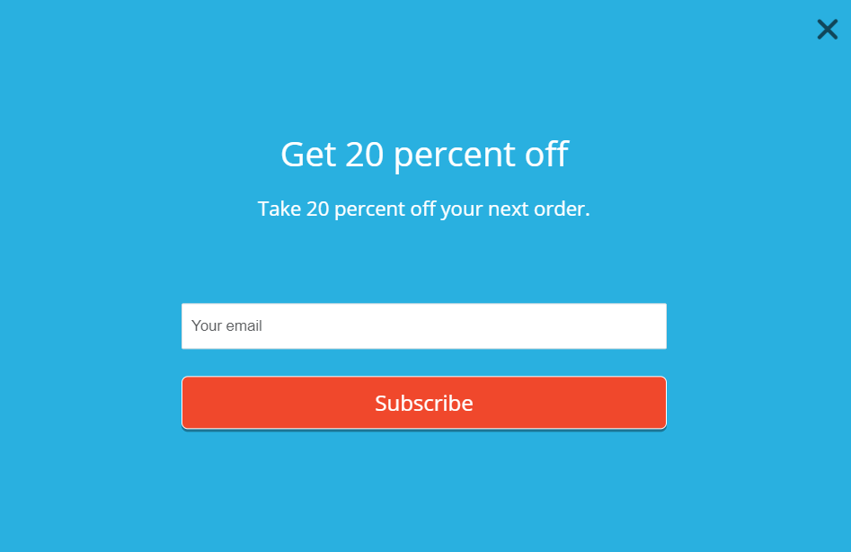
We’re going to change something up using only our best copywriting tricks. Let’s see how it transforms the exit intent.
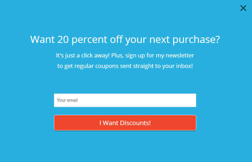
Which one is more enticing?
We didn’t add an image, change the colors, or adjust the fonts. We changed only the copy.
Like we said, words matter.
6. Use Strong Verbs in Your Exit Intent Popups’ Calls To Action
Using the exit popup example above, we could improve it even further by focusing on the call to action. That’s the orange button people will click to sign up.
The call-to-action phrases you choose can have a huge impact on conversions. A bland or irrelevant CTA will just irritate your visitors.
Let’s add a strong verb to the exit intent and see how it looks.
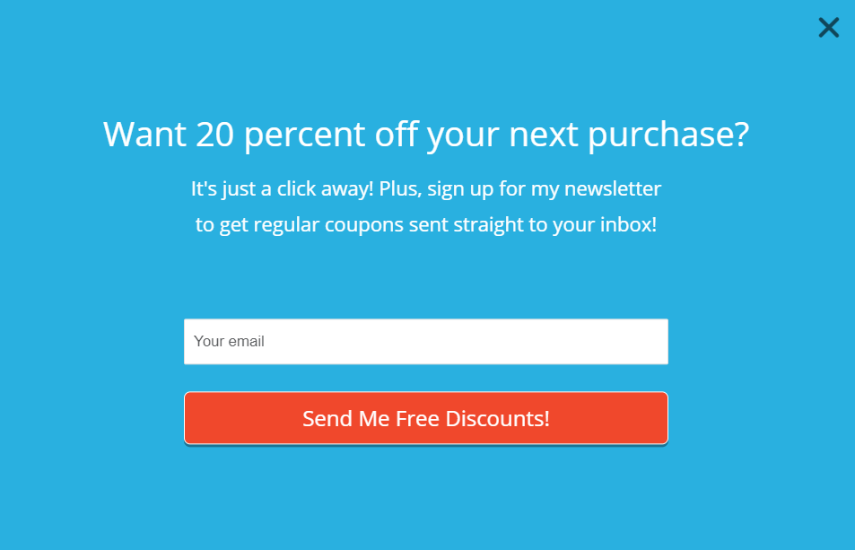
Instead of saying, “I want discounts,” we’re saying, “Send me free discounts!” That’s a big change because it uses a verb that puts the onus on me, the marketer, to do the heavy lifting.
7. Make Your Exit Intent Popup Call To Action Button Impossible to Miss
Contrast is essential when creating your calls to action. You want them to pop — pardon the pun — on the screen.
Use color, drop shadows, display fonts, and other visual elements to make your CTA distinctive. The more it shines, the more clicks you’ll get.
8. Help Your Visitors Decide Using 2 Options: An Awesome Option and a Clearly Not-Great Option
A little psychology goes a long way. Everyone knows that a button on an exit intent popup doesn’t actually constitute a life choice. However, you’d be surprised at how well this trick works.
Present your audience with an awesome option—for example, a lead magnet that promises to solve a huge problem.
But don’t stop there. Offer them another option. Perhaps one that makes them uncomfortable.
9. Use a Sense of Scarcity and/or Urgency in Your Exit Intent Popups
Another psychological tactic that works extremely well is scarcity and urgency. If people feel anxiety about missing out on a great opportunity, they’ll likely click. You can use a countdown timer to create this sense of urgency.
For instance, let’s say you’re holding a webinar in two weeks. You’re offering free registration, but only for 48 hours. People will want to register now rather than miss the opportunity for free admission and regret it later.
10. Leverage Seasonal and Trending Topics in Your Exit Intent Popups
You can boost engagement and relevance by aligning your exit intent popup with current events, seasons, or trending topics. This strategy keeps your offers fresh and timely, potentially increasing their appeal to visitors.
How do you do this?
Create a calendar of seasonal events, holidays, and industry-specific occasions relevant to your business. Then, design popup campaigns around these themes. For example:
- During tax season, an accounting software company might use an exit popup offering a free tax preparation checklist or a small business invoice template.
- A fitness equipment retailer could create New Year’s resolution-themed popups in January, focusing on health goals.
You can also tap into current trends or viral topics. Monitor social media and news outlets for themes that resonate with your audience. Then, quickly create popups that reference these trends in a relevant way.
For instance, if a popular TV show is trending, a fashion e-commerce site might create an exit popup showcasing outfits inspired by the show’s characters.
11. Optimize Your Exit Intent Popup Loading Speed
A slow-loading popup can be just as bad as no popup at all. If your exit intent popup takes too long to appear, your visitor might already be gone. Aim for a loading time of less than a second. This ensures your message catches the visitor’s eye before they leave.
To speed up your popup, compress any images you’re using. Minimize the use of complex animations or effects. Also, consider preloading your popup when the page loads, so it’s ready to display instantly when triggered.
Speaking of speed, another way to make your exit intent popup more effective is to delay the appearance of the ‘X’ button (exit button) for 2 or 3 seconds.
Many people subconsciously cancel exit popups the moment they surface. Delaying the cancel button for a very short period can stall this reflex reaction and compel visitors to pay more attention.
12. Throw in Some Social Proof into Your Exit Intent Popups
People trust other people’s experiences. Leverage this by including social proof in your exit popups. This could be customer testimonials, the number of satisfied customers, or trust badges from well-known brands or certifications.
For instance, an e-commerce site might include a message like “Join over 50,000 happy customers!” in their exit popup. Or a SaaS company could showcase the logos of its notable clients.
Infusing social proof like this can build trust quickly and convince hesitant website visitors to take the desired action.
13. Use Gamification in Your Exit Intent Popups
Engage visitors with an element of fun and interactivity by incorporating gamification into your exit popups. This approach can significantly increase engagement and conversion rates by tapping into people’s natural love for games and challenges.
Create a simple game or interactive element within your popup. For example, you could use a “spin the wheel” feature where visitors can win different discounts or prizes. Or, implement a scratch-card style reveal for special offers. Another option is a quick quiz that leads to a personalized recommendation or offer.
Here’s a discount exit popup example we got when browsing the Oddballs website.
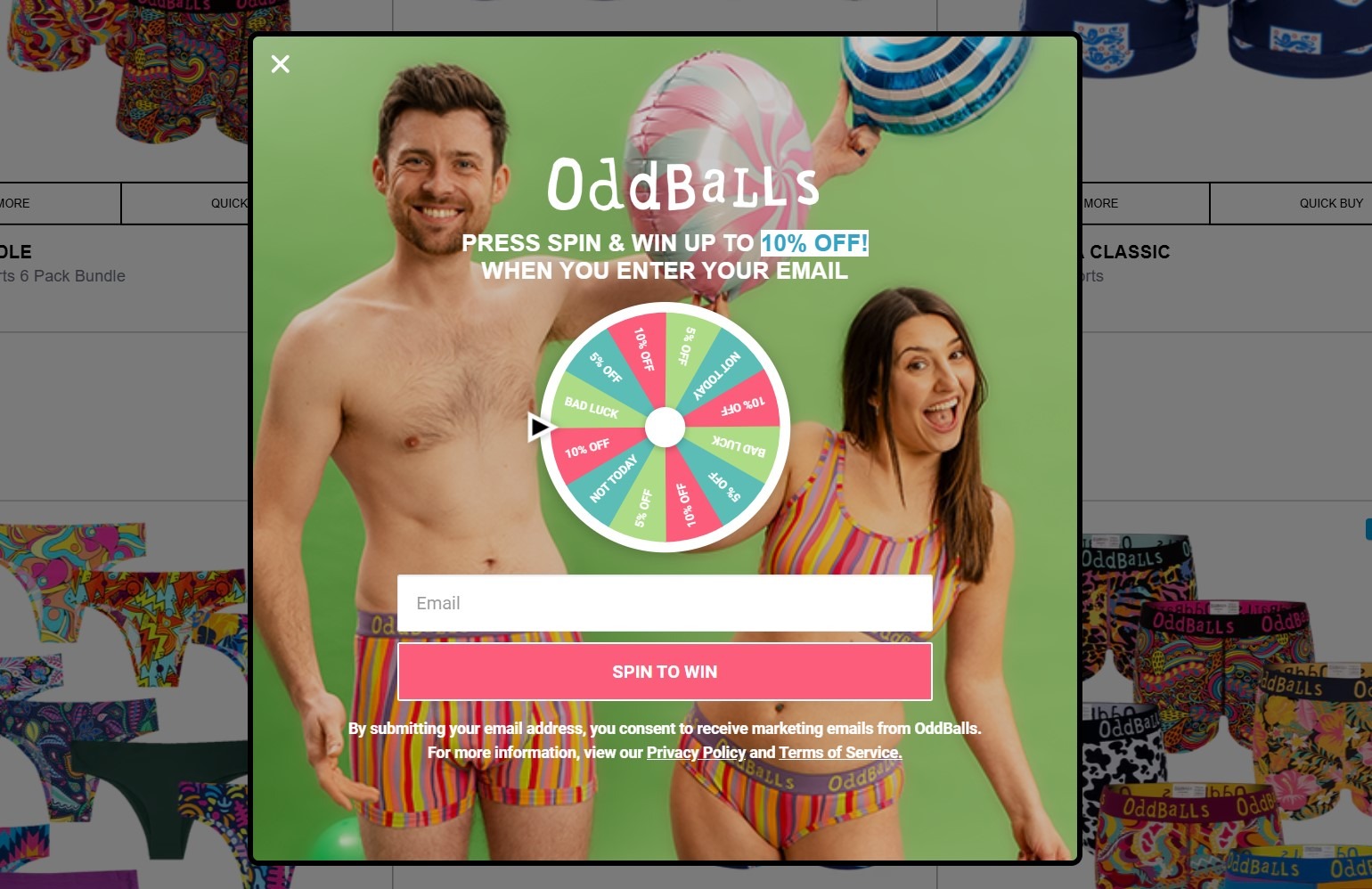
Image via Oddballs
Do You Want to Use the Best Exit Intent Popup Software?
We might be a little biased, but we’re pretty sure Hello Bar is the best exit intent popup software available. We focus specifically on helping our customers improve conversions through effective popups.
It might sound like a little thing, but it can mean huge boosts in revenue.
You don’t even have to take a risk. Sign up for free, test out the software, and decide whether it meets your needs. We’re confident you’ll want to keep it going on your site, especially since we’ve built in free tools like automatic A/B testing.
But what about the time commitment? Marketing does take time, but you can create exit intent popups and get them up and running in five minutes or less. Here’s how.
How to Set Up Your Own Amazing Hello Bar Exit Intent Popup In Under 5 Minutes
Let’s get an exit intent popup set up in less than five minutes.
First, sign into your Hello Bar account.

On the screen that appears, choose your goal. For the purposes of this example, we’ll use the “Grow Your Mailing List” goal.

From there, just fill in your headline and CTA. You might have to think about the wording for a few seconds, but it shouldn’t take long.
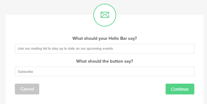
You then get to customize your page takeover. If it doesn’t appear as a page takeover at first, just select “change type” on the left side of your screen and select the page takeover option.
You can choose from a bunch of different styles, and then customize them to your liking. Use your brand’s colors, fonts, and other specifics to make it recognizable. The drag-and-drop editor makes it easy to create professional-looking popups without any coding knowledge.
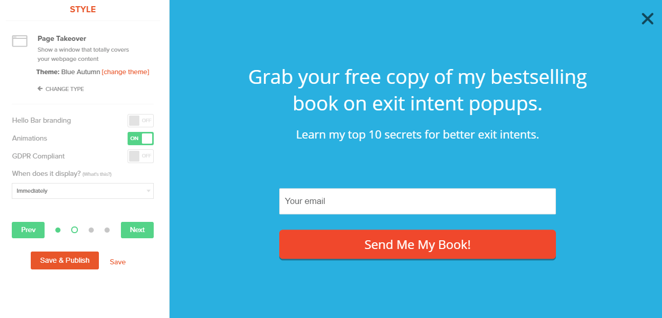
When you’re done, click “Save and Publish.”
If you haven’t already, you’ll install the Hello Bar script on your website. It’s just a line of code that goes in the <head> portion of your website.
And you’re done! We timed it. Even with taking screenshots, we set up this exit intent popup in 4 minutes and 38 seconds. Not bad for a slam-dunk marketing tactic.
4 Awesome Exit Popup Headlines That Are Proven To Help Increase Conversions
If you’re struggling with headline writing, don’t feel bad. You’re not alone. It’s tough to come up with a unique, persuasive headline, especially on the fly.
Fortunately, writing headlines doesn’t have to be such a slog if you have a formula you can use to make the progress go faster. The following four formulas are excellent for boosting conversions.
1. Sign Up for Our Newsletter and Get an X% Discount (or Free Shipping) on Your Next Purchase
Use this headline formula when you know that your audience is motivated by saving money. You have a budget-conscious consumer on your hands, so you want him or her to sign up for your mailing list and get instant savings.
You can also use this strategy for compelling instant purchases. Instead of saying “Sign up for our newsletter….”, you could say, “Buy within the next 24 hours and get…”. It works just as well.
2. Grab This Free [Your Lead Magnet] And Get Rolling With [Desired Outcome]
We love this formula because it has built-in unusual language and allows you to communicate both a current benefit and a future benefit.
Not only does the consumer get your lead magnet, but he or she can expect specific results from using your lead magnet. It’s an incredible way to boost conversions.
3. Want “Desired Outcome” in “Desired Time Frame”?
Here’s that urgency we talked about above. You don’t have to offer something for a limited time to create urgency. You can use your target customers’ urgent desires to persuade them.
- Want to lose five pounds in one week?
- Want to 10X your sales in six months?
- Want to learn to speak a foreign language in five weeks?
See how that works? Just make sure you can deliver on the promise.
4. Join Thousands/Hundreds/Millions of [Your Niche Community]
If you have a large mailing list, use that asset to your advantage. People like to join their peers — they don’t want to feel like they’re “the first.” Consequently, you can eliminate an obstacle by demonstrating that lots of their peers have already have joined your mailing list.
It might look like this:
![Exit Intent Popup: Set Up Yours in Under 5 Minutes With These 13 Tips 14 Join Thousands/Hundreds/Millions of [Your Niche Community]](https://www.hellobar.com/wp-content/uploads/2018/07/2018-07-30-07_52_04-Window.png)
It’s a very simple thing, but it can make people think twice about clicking that “X.”
Best Uses of Exit Intent Popups With Examples
Let’s look at some exit intent popup examples in action. We’ll show you how to create each one with Hello Bar so you can create your own desired marketing asset.
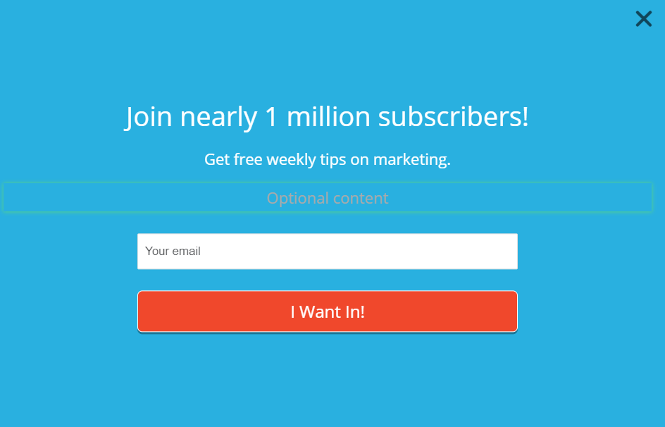
Newsletter Subscription
If you just want people to sign up for your email newsletter, an exit intent popup will get it done. You can decide whether to offer an incentive or use social proof to persuade abandoning visitors.
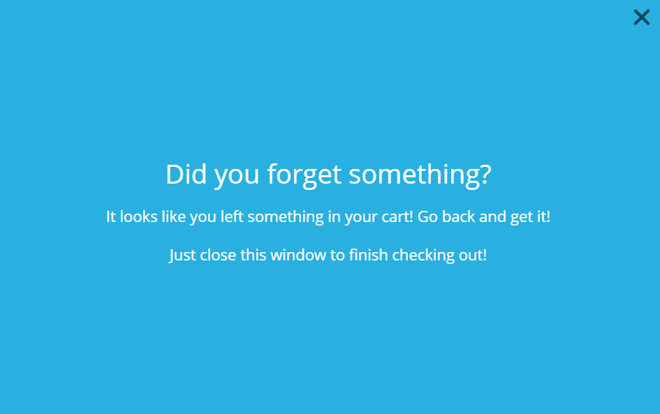
Cart Abandonment
Another great use of exit popups is to remind consumers they have items in their shopping carts. You can reduce cart abandonment rates with this reminder because, in many cases, they’ll go back to complete the checkout process.
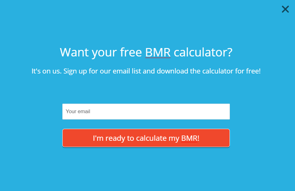
Lead Magnet
Let’s say you have a small email list. Have no fear! Instead of using social proof, incentivize signups with a lead magnet. If people want to get your insanely valuable asset, they’ll have to fork over their email addresses.
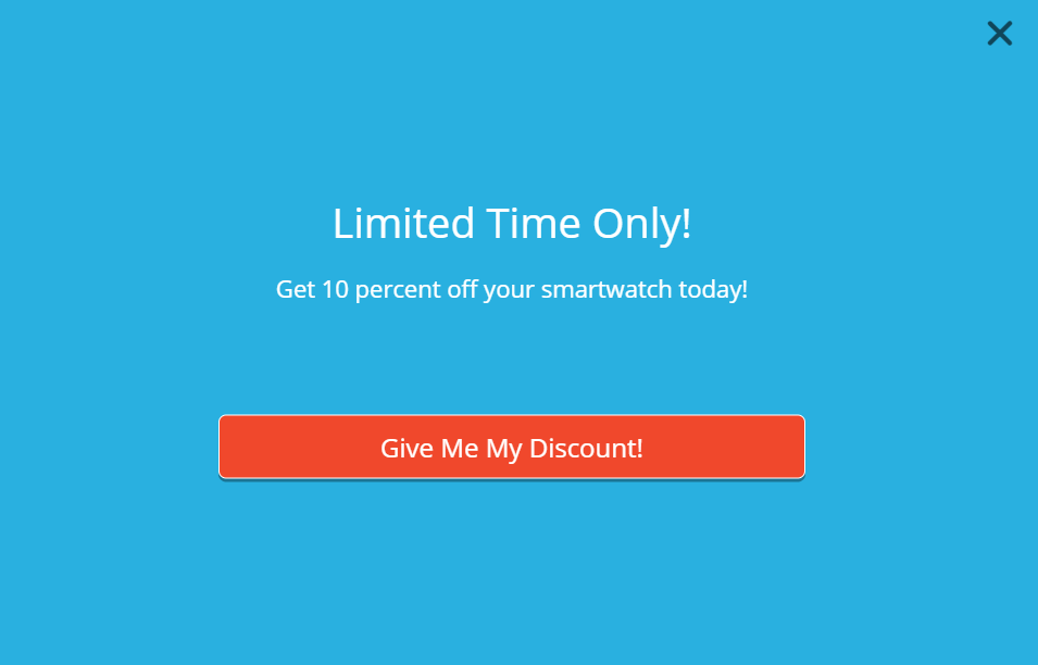
Free Shipping or Discount For Ecommerce Stores
If you run an ecommerce store, you don’t want to miss out on sales because people click away too quickly. Maybe your customer isn’t sure about the price. Offer a discount to bring him or her back around.
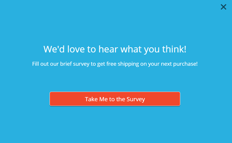
Ask Visitors to Take a Survey Or Quiz
Surveys and quizzes provide valuable insights into what’s going on in your visitor’s head—what are their wants, needs, and pain points? Use your exit intent popups to direct visitors to your survey or quiz. To get more participants, include an incentive as well.
Social Media Follow Buttons
We talk a lot on this blog about how to leverage existing website traffic to direct consumers to different platforms. If someone visits your website, you probably want them to follow you on social media, too.
The more immersed a consumer gets in your brand, the more likely he or she becomes to buy from you. Plus, social media likes can spread your brand message to hundreds of other audiences, depending on how many people click.
Use an exit intent popup to encourage Facebook likes. On Hello Bar, you can fill in which URL you want the visitor to like.
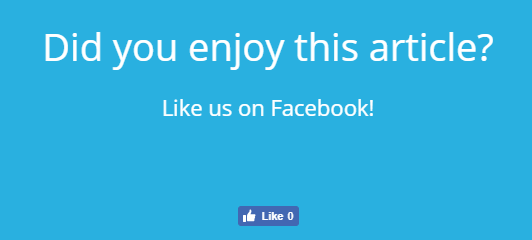
As you can see, it’s very simple. Plus, everyone recognizes that little icon, so they’re likely to click. People who are active on social media have become conditioned to recognize those social icons and engage with them.
Content Upgrade
A content upgrade is an opportunity for a website visitor to download or otherwise access an extended form of the content on the page. There’s a great example over on BuzzBlogger.
The author lists the top 10 Fiverr gigs in the article. That’s great value, right?
But here’s the kicker. She included a content upgrade at the end.

If you click on the CTA, you’ll get a popup that allows you to input your email address and receive the entire article. In other words, you get double the content — for free.
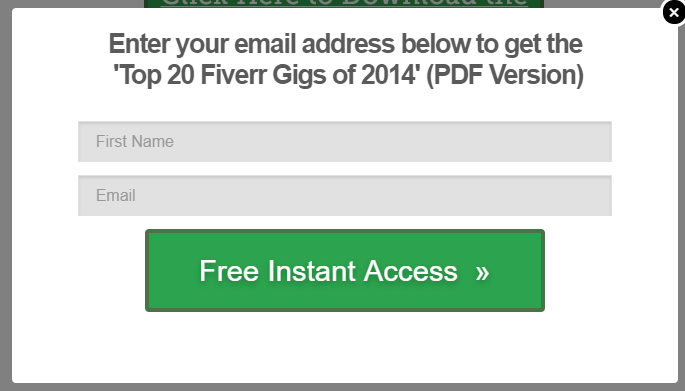
You can use an exit intent popup to achieve the same results. Write a value-driven article on your site, but only offer half (or some other portion) on the site itself.
If readers want the full month, they have to provide their email addresses and get it by direct download.
FAQs
Q1. What tools are necessary to set up an exit intent popup quickly?
To set up an exit intent popup quickly, you’ll need a user-friendly tool like Hello Bar. These tools often provide templates and easy customization options.
You’ll also need access to your website’s backend to install the necessary code. Basic design skills can be helpful, but many tools offer drag-and-drop interfaces that don’t require coding knowledge.
Q2. How can you design an exit-intent popup to maximize engagement within five minutes?
To design an engaging exit intent popup quickly:
- Choose a pre-made template that matches your brand.
- Use a clear, compelling headline.
- Keep your message concise and focused on one main offer.
- Use a strong call-to-action button with contrasting colors.
- Add a striking image if relevant.
Q3. What are the most crucial elements to include in an effective exit intent popup?
The most important elements are:
- An attention-grabbing headline
- A clear value proposition or offer
- A strong call-to-action
- Minimal form fields (if collecting information)
- Branding elements for consistency
Q4. How can you ensure your exit intent popup does not negatively impact the user experience?
To maintain a positive user experience:
- Time your popup correctly; don’t show it too soon.
- Make sure the popup is easy to close.
- Limit the frequency of popups for returning visitors.
- Ensure the popup doesn’t slow down your site.
- Make the popup mobile-responsive.
- Use targeted messaging to show relevant offers to different user segments.
Q5. What are some quick tips for testing and optimizing your exit intent popup after setup?
To test and optimize your popup:
- Use A/B testing to compare different headlines, offers, or designs.
- Monitor your conversion rates and adjust accordingly.
- Analyze user behavior to understand when and why visitors are leaving.
- Collect user feedback about the popup experience.
- Regularly update your offer to keep it fresh and relevant.
Conclusion
That’s a lot of information, right? You probably never expected you could do so much with something as simple as an exit popup.
It’s a great way to supercharge your conversion rate optimization strategy and get more leads, sales, and brand advocates. After all, you have nothing to lose. The visitor is ready to leave.
If you present the right exit intent popup at the right time, you’ll convince those visitors to stick around.
Use exit intent popups for ecommerce optimization, list building, lead generation, audience feedback, and more. Most importantly, A/B test your offers to see which ones have the greatest impact on your audience.
You might be surprised by the results.
What’s your best tip for creating slam-dunk exit intent popups? Inquiring minds want to know.


