Different Types of CTAs and How to Use Them Effectively

I hope you enjoy this blog post. If you want Hello Bar to grow your leads, click here.
Author:
Ryan Bettencourt
Published
August 5, 2024

Most marketing professionals spend seconds creating different types of CTAs (calls to action).
You just need to write something short, snappy, and direct, right?
Well, it’s not so easy.
According to a VWO case study, Open Mile increased its lead generation rate by 232% by redesigning its CTA and surrounding visual elements.
Yep, even minor details could significantly impact the efficacy of a humble call to action.
So, what kind of CTAs would be most effective for your different marketing strategies?
And how can you use them to nurture leads and improve your conversion rates?
We’ve compiled a handy guide below to answer these questions (and more).
First Things First: What is a Call to Action (CTA)?
If you’re feeling a little confused about the meaning and purpose of a CTA, don’t fret; you’re certainly not alone.
Put simply, a call to action is a written command encouraging people to engage in a positive action (e.g., signing up for a newsletter or purchasing a product). It’s a crucial component of your overall brand strategy.
CTAs can take several forms, including website buttons, text hyperlinks, or plain text.
They’re often short and snappy, encouraging people to “Buy now” or “Find out more,” although they can be much longer. A CTA button typically looks like this:

CTAs also appear across various channels, including social media platforms, company web pages, paid ads, blog posts, and many more. In fact, each web page should have at least one CTA to guide users through your site.
Tailoring your CTAs to specific channels, target audiences, or purposes is the trick to driving the most engagement.
For example, asking potential customers to signup for a subscription service may require a little more persuasion than asking them to read an article. This is where a compelling CTA becomes crucial to your marketing strategy.
Why Are Calls to Action Important?
Before we explore the different types of CTAs, let’s discuss five key reasons CTAs are important for marketers and businesses.
1. CTAs Drive Action
CTAs help direct visitors exactly what to do next. Without them, people might visit your site, read your content, and then leave without taking any action. That’s a missed opportunity to generate potential leads.
For example, a “Buy Now” CTA button on your product pages can boost sales if you run an online store. However, HubSpot found that personalized CTAs perform 202% better than basic ones.
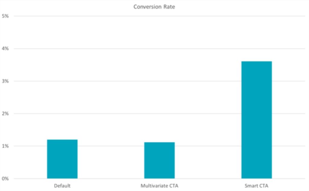
Image via HubSpot
2. CTAs Improve User Experience
Good CTAs improve your website’s user experience. They show visitors where to click to get what they want, creating a user-led customer journey.
The different types of CTAs are fundamental on mobile devices, where screen space is limited. Think about how frustrated you feel when you can’t figure out how to signup for a service you want. Clear and visible CTAs can solve this problem.
3. CTAs Help You Measure Success
Different types of CTAs let you track and optimize your marketing strategy. You can see which buttons people click and which ones they ignore. For instance, if you’re running an email campaign, you can experiment with different text fonts or CTA button colors to test which appeals more to your target audience.
This information can help you improve your marketing efforts, measure your success and boost conversion rates.
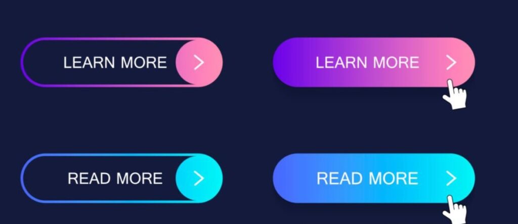
Image via iStock
4. CTAs Create a Sense of Urgency (FOMO)
The right call to action can make people feel they need to act now. Using power words like “Limited Time Offer” or “Only 5 Seats Left” can push people to make a decision faster.
This is especially useful for time-sensitive promotions or ticket sales. If you’re running a sale, a CTA like “Shop Now—Sale Ends Tonight!” can boost your sales by triggering an air of urgency and exclusivity around that product.
5. CTAs Guide the Customer Journey
Different types of CTAs can help you lead customers through your sales funnel. You might use a “Learn More” CTA at the top of the funnel, a signup CTA like “Signup for a Free Trial” in the middle, and a “Buy Now” at the bottom.
This HelloBar signup CTA is a good visual explanation.
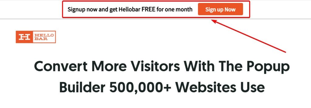
This step-by-step approach works well for complex products or services and helps in lead nurturing.
You May Also Like:
- Ways to Use Calls to Action (CTAs) in Your Marketing Strategy
- Different Kinds of CTAs and How to Use Them Effectively
9 Types of CTA (And How to Use Them)
Here are a few CTA ideas you may wish to use across your marketing campaigns:
1. Lead Generation CTA
Generating leads is important for building a loyal customer base and growing your business.
Fortunately, a well-crafted CTA helps incentivize users to provide their contact details with little fuss. These lead magnets are a crucial part of your lead nurturing process.
Lead generation CTAs are best placed in highly visible parts of your website that attract new visitors. For example, you can place them as a sidebar, floating banner, popup, or at the end of a blog post.
Let’s say, you want people to signup for your new newsletter about beauty and wellness. Your lead-generation CTA might say, “Signup today for beauty news you won’t find anywhere else,” or simply, “Subscribe today!”
For maximum success, you’ll need to make the CTA eye-catching. For instance, TapClicks uses social proof to make this lead generation CTA more catchy.
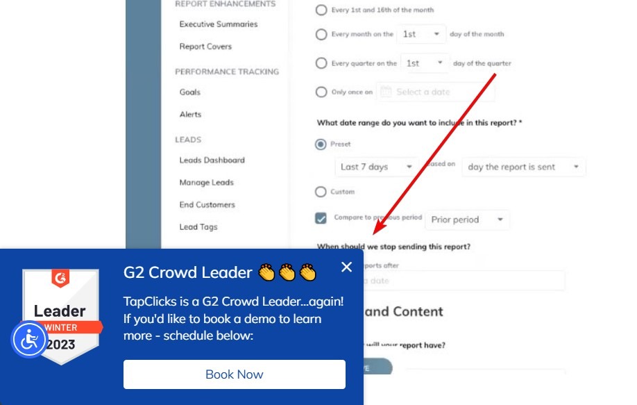
Image via TapClicks
With help from a service like HelloBar You could use a colorful button or insert a stunning popup. These banner CTAs can be particularly effective on your home page.
2. Social Sharing Buttons
Creating viral content is a great way to boost site visitors, leads, and conversions.
Social sharing CTAs prompt visitors to show your content to their friends and followers, increasing your chances of going viral.
Social sharing buttons are commonplace across most branded blogs and websites. Place hyperlinked logos to sites such as Twitter and Facebook at the end, top, or bottom of the page like this.

Image via TapClicks
You could add a line that says, “Enjoying our content? Why not spread the love?” This social sharing call can significantly increase your content’s reach.
3. Purchase CTAs
If you run an e-commerce site, encouraging people to purchase your goods and services via CTAs could significantly improve your revenues. These sales-focused CTAs are crucial for your bottom line.
Examples of effective purchase CTAs include:
- “Add to cart” buttons for individual product pages or even paid ads
- Long-form sales pages containing a single CTA for a subscription service—for example, “Signup now and enjoy your first month free!”
- A page containing different subscription plans and a CTA for each (this is particularly common among companies offering software as a service)
If you run a subscription-based service, you could make the CTAs bigger or brighter to nudge people toward more expensive packages.
Adding star ratings just above a “Buy now” button for physical goods could boost faith in your brand and drive sales. It could say “Add to Bag” like this Glossier CTA.
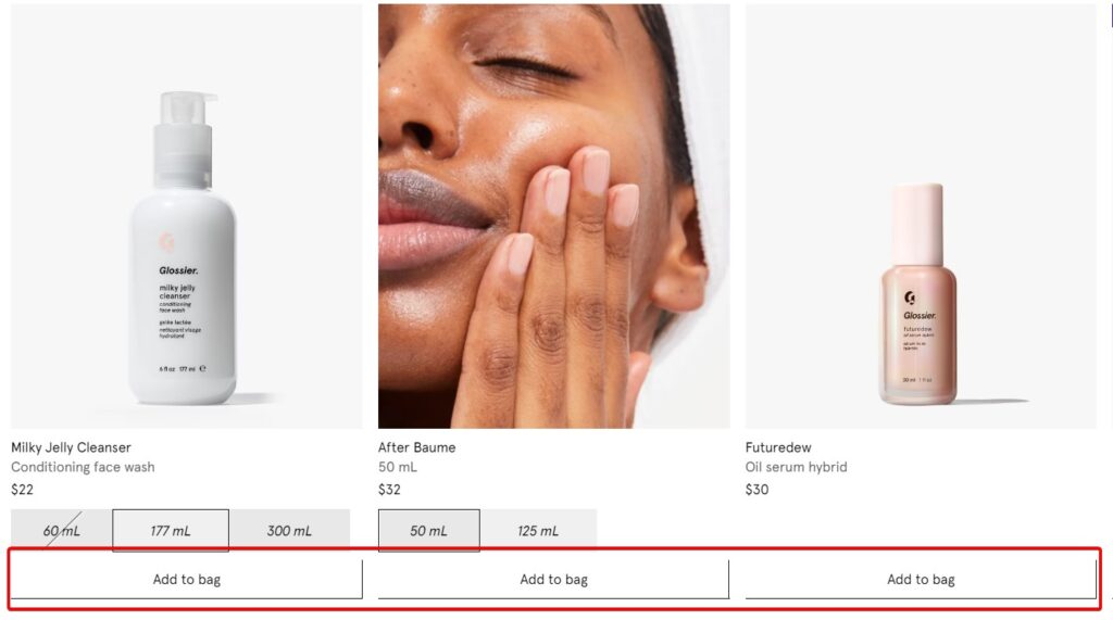
Image via Glossier
4. Online Forms
Online forms are contact CTAs. You can use them for various reasons, including:
- Free trials
- Online demos
- Webinars
- Consultations
- To request a callback
Encouraging people to hand over personal information may prove a little trickier than asking them to share content on social media.
As such, you should include a couple of sentences in the CTA reassuring potential customers of your trustworthiness and ability to handle data appropriately.
For example, you could add “No hidden fees or extra costs,” “Cancel any time,” or “Book a call.”
You May Also Like:
- Email Copywriting: 19 Proven Formulas to Use on Your Next Campaign
- Copywriting Tips: 23 Ultra Effective Steps to Increase Conversions

Image via Survicate
5. Email CTAs
Did you know that the average return on investment (ROI) for email marketing is over $36 for every $1 spent?
With such impressive stats, you’d be a fool not to send compelling emails with lead-nurturing CTAs to your mailing lists.
But what kind of CTAs should you be sending?
Well, abandoned cart emails could help you re-engage customers who’ve displayed an interest in your brand.
Alternatively, you could send a discount code to email subscribers, thereby driving sales and building brand loyalty.
Feel free to experiment and remember to include links to your site.
Here’s a good example of an effective email CTA that is also optimized for mobile devices.
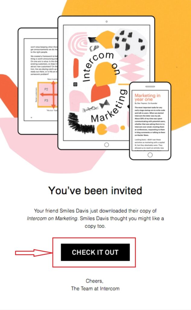
Image via Really Good Emails
6. Read More CTAs
“Read More” CTAs are types of CTAs that encourage users to dive deeper into your content. You’ll often see these at the end of blog post snippets or article summaries. They’re great for keeping readers engaged and boosting your page views.
For example, if you have a cooking blog, you might use a “Read More” CTA at the end of a recipe preview to invite readers to view the full recipe and instructions.
These types of CTAs work well for:
- News websites
- Blogs
- Online magazines
- Any site with long-form content
Here’s a great “Read More” CTA example from ReadNow.

Image via ReadNow
7. Free Trial/Subscription CTAs
Free trial or subscription CTAs are types of CTAs that encourage users to try out a service or subscribe to content for free or at a discounted rate. These CTAs are particularly effective for software-as-a-service (SaaS) companies, online publications, and subscription-based businesses.
This IMPACT+ subscription CTA is a great example of this type of call to action.

Image via IMPACT+
You can make your free trial/subscription CTAs more effective by:
- Clearly stating the trial duration or subscription terms
- Highlighting the value proposition
- Using action-oriented language that creates a sense of immediacy
8. Event Promotion CTAs
Event promotion CTAs are essential when organizing webinars, conferences, or workshops. The aim of these types of CTAs is to boost event registration.
Your CTA could say “Reserve Your Spot” or “Join the Webinar.” The key to crafting an effective event promotion CTA is to highlight the value of attending. For example, if you’re hosting a marketing workshop, your CTA could be “Learn to Double Your Sales—Register Now!” Take a look at this “Save My Seat” event promotion CTA.
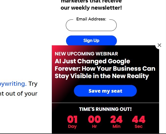
Image via WordStream
9. Feedback CTAs
“We value your opinion!” Sounds familiar? Well, these feedback CTAs are ideal for businesses looking to improve their products, services, or overall customer experience.
They give you a direct line to the customer’s thoughts, feelings, and experiences. For example, “Share Your Thoughts” or “Take Our Quick Survey.” The key is to make the CTA easy and appealing for people to give feedback.
These CTAs can help you gather crucial data to optimize CTAs and other aspects of your business. You can even gather feedback from offline sources through a QR code with a powerful CTA.
Here’s a look at the feedback CTA in action in an email.
You May Also Like:
- What Is Bounce Rate and How To Reduce It Successfully?
- Learn How to Calculate Lead Conversion Rate to Measure ROI

Image via Really Good Emails
Components of Call to Action
A successful call to action (CTA) is more than just a button or a link. It’s a carefully crafted message that guides visitors to take the next step. To create effective CTAs, you need to understand their key components.
1. Action-Oriented Text
At the heart of your CTA is its text. Use strong verbs that tell people what to do. Instead of vague phrases like “Download,” try specific actions like “Download Your Free Guide.”
Why does this matter?
The action-oriented text clearly explains what will happen when someone clicks your CTA, which can boost click-through rates.
2. Value Proposition
Your CTA should answer, “What’s in it for me?” Highlight the benefit your visitors will get by clicking. For instance, “Save 50% Today” is more compelling than “Buy Now.”
3. Sense of Urgency
Creating urgency can prompt immediate action. Use words like “Now,” “Today,” or “Limited Time” in your CTAs. Urgency works because it taps into people’s fear of missing out (FOMO).
4. Design Elements
The visual aspects of your CTA are just as important as the text. This includes:
- Button shape and size: Make your CTA button large enough to be noticeable but not so big that it overwhelms the page.
- Color: Use a contrasting color to make your CTA stand out.
- White space: Surround your CTA with white space to attract attention.
Best Practices for Creating CTAs
Still feeling a little unsure about how to write a CTA? Here’s a fool-proof checklist to follow:
- Be direct and make your intentions clear
- Make sure your CTA button is bold and not surrounded by visual clutter. A great way to achieve this is via popups and banner CTAs
- Use second-person commands such as ‘Try,’ ‘Get,’ ‘Learn,’ ‘Subscribe’, etc.
- Use clickable CTA buttons for landing pages to help users navigate your website
- Try to keep the CTA copy as brief and informative as possible
- Remember to test the efficacy of your CTAs using analytics tools and A/B testing
- Consider adding more than one CTA button to your landing pages to drive conversions
Of course, there’s no one-size-fits-all formula for a winning CTA, so remember to tailor your message for key audiences and channels.
You May Also Like:
- 23 Email Marketing Statistics To Highly Increase Your Conversions
- Best 43 Call-to-Action Phrases Proven To Increase Clicks and Leads
FAQs
Q1. How can the visual design and placement of CTAs impact their effectiveness on a webpage?
Visual design and placement are crucial for CTA effectiveness. Using contrasting colors, ample white space, and making CTAs look like buttons can significantly boost engagement.
Q2. How can A/B testing be utilized to determine the most effective CTAs for a particular audience?
A/B testing helps compare different call-to-action variations to see which performs best. Test elements like button color, text, placement, and design. Track metrics like CTR and conversion rates to determine the most effective version for your audience.
Q3. What role do personalized CTAs play in increasing user engagement and conversions?
Personalized CTAs tailor the message to the user’s interests or behavior, making the CTA more relevant and appealing. This relevance significantly boosts engagement and conversions. The HubSpot report we cited in this post found that personalized CTAs convert 202% better than default versions.
Q4. What are the most common types of CTAs and where should they be placed?
This post discusses nine common types of CTAs and their typical placements:
- Lead generation CTAs (sidebars)
- Social sharing CTAs (top or bottom of content pages)
- Purchase CTAs (product pages)
- Online form CTAs (dedicated landing pages for sign-ups)
- Email CTAs (within email content)
Q5. How can CTAs be optimized for mobile users to ensure high click-through rates?
For mobile CTAs, use large, easily tappable buttons (at least 44×44 pixels) and place them where thumbs can reach easily. Also, ensure your design is responsive and adapts to different screen sizes. Likewise, use short, compelling text that clearly states the benefit of clicking.
Drive Conversions With Popup CTAs
Understanding different types of CTAs is crucial for marketing success. From lead generation to feedback collection, each CTA type guides your audience through your sales funnel.
The key to effective CTAs is choosing the right type, strategic CTA placement, compelling copy, and eye-catching design. Don’t hesitate to experiment with various CTA types and use A/B testing to find what works best for your audience.
HelloBar is always here to help you create CTAs that drive results.
To learn more about different types of CTAs, contact us today or create a free account!


