What Is Bounce Rate and How To Reduce It Successfully?

I hope you enjoy this blog post. If you want Hello Bar to grow your leads, click here.
Author:
Ryan Bettencourt
Published
July 31, 2024

You’ve got great ranking on Google, and people are coming to your site in droves.
However, this begs the question: are they staying?
High web page views on search engines don’t mean a lot if you have a high bounce rate. If people are leaving your site, that means they’re not converting.
You might ask yourself — I have great content and amazing products. Why aren’t people staying?
Well, it could be your user experience. If your site is confusing, complicated, or messy, there’s a higher likelihood that people will leave.
In this post, we’ll cover some common UX problems and how to fix them. First, let’s talk about bounce rate and exactly what that means.
What Is Bounce Rate?
A lot of people think that when someone comes to your site and leaves quickly, it counts as a bounce, but that’s only partially true.
Google considers single-page sessions, where a visitor does nothing else but leave, as a bounce. Time on page registers as zero seconds because the visitor has taken no other action that would signal Google’s bots to help it record a time.
So, how is the bounce rate calculated?
The bounce rate for your web page (or your entire site) is the total single-page visits divided by all visits.
Let’s say a particular landing page was visited 200 times in a day. Of those 200 visits, 50 took another action on your site. They clicked on your CTA, played a video, signed up for a newsletter, or clicked on something in your navigation bar.
That means the other 150 left without doing anything, leaving you with an average bounce rate of 75%.
Depending on your industry and the purpose of your site, that could be a pretty high bounce rate — or it could be about average.
What Constitutes a Good and Bad Bounce Rate?
Like we said, a good bounce rate means different things to different companies. It also depends on what you want to get out of your site or a particular page.
As of September 2023, the overall average bounce rate for various ecommerce industries worldwide is 38.7%.
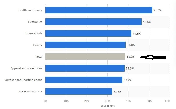
Image via Statista
Statista further broke down the average bounce rate into industry categories. Sadly, the health and beauty sector took the lead with a 51.6% bounce rate. Electronics and home goods followed closely behind with a 46.6% and 41.6% average bounce rate, respectively.
You May Also Like:
- These UX Tactics Will Lower Your Bounce Rate
- 11 Benefits of Conversion Rate Optimization and Best Practices
Things That Make People Bounce
When it comes to people sticking around your site, user experience can be a huge factor.
Think about it: If your site visitors are unsure what they should do, can’t find what they’re looking for, or are distracted by too many other things on your page, they’re very likely to leave and seek answers elsewhere.
Let’s take a look at some of the UX issues that make people bounce or navigate away from your page too early.
1. Hard-to-Read Copy
Giant blocks of text, tiny text, video or carousel text that scrolls too fast, unconventional or ugly fonts (I’m looking at you, Comic Sans), too many cutesy gifs and emojis — all of these make text hard to read. This results in a negative user experience and high bounce rate.
Here’s an example of a website with content that people may struggle to read, especially on mobile phones.
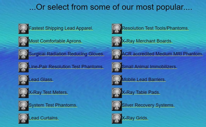
Image via Pacific Northwest X-Ray Inc.
Text should be broken up into small paragraphs of no more than two or three sentences. Wix recommends using no more than three sans serif fonts throughout a site (but not Comic Sans), and don’t make them any smaller than 16 pts.
2. Poor Landing Page Design
Website visitors frequently find landing pages through SEO or paid advertising services like Google Adwords.
Whether they move past the landing page to the rest of your site or click the Back button depends on how well the page is designed and how easy to locate your call to action is.
A cluttered design and unclear CTAs are a sure recipe for a high bounce rate. The best way to get people to stay on your site and convert is to get rid of distractions.
Take a look at Netflix’s clutter-free homepage that includes a clear CTA to guide readers on exactly what to do.
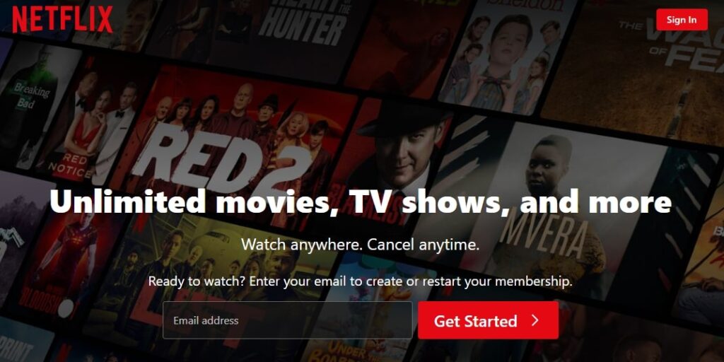
Image via Netflix
Their homepage serves as a landing page. It is set up to move people into the rest of the site by signing up for a free trial.
It has a button to sign up for a free trial and a reassurance that you can cancel anytime. There’s nothing to distract visitors at all.
3. Autoplay Video and Audio
In 2013, Facebook started pushing autoplay videos in feeds, and other sites followed suit. Sure, video views skyrocketed, but so did users’ annoyance.
By 2017, publications like Digiday were declaring the death of autoplay as a huge percentage of respondents had a negative view of it.
Autoplaying video or audio doesn’t make for a good user experience. It leaves your visitors scrambling for the mute button, or worse, the X on their browser. This definitely doesn’t spell good news for your bounce rate.
4. Links to External Pages
The more links you have to external pages, the more your visitors are going to click away. You’re basically increasing your bounce rate by leading your target audience to another site.
It doesn’t mean you shouldn’t have any external links. They are important in establishing the authority and trustworthiness requirements of Google’s EAT benchmark.
Minimize external links, remove unnecessary ones from pages, and place them below the fold to retain visitors on your site longer. These steps can potentially improve conversions. Alternatively, consider opening external links in a new tab or window.
5. Slow Loading Times
According to a survey by Portent, 86% of ecommerce websites load in under 5 seconds.
However, with waning patience levels and attention spans, this duration could still result in high bounce rates. Most website visitors will abandon your site if it takes too long to load.
The same study cites that a website that takes a second to load receives a 2.5x higher conversion rate compared to one that loads in 5 seconds.
Keep in mind: the longer your page takes to load, the more people you lose. As you can see below, the conversion rate for sites with slow loading times is significantly lower than those that load quickly:
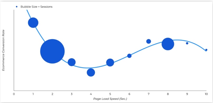
Image via Portent
6. Outdated Design
An up-to-date design makes your site look trustworthy. It’s a solid indicator that you are offering relevant information. It also helps visitors navigate your site.
Check out the two examples below. The first is how Nike.com appeared in 2000.
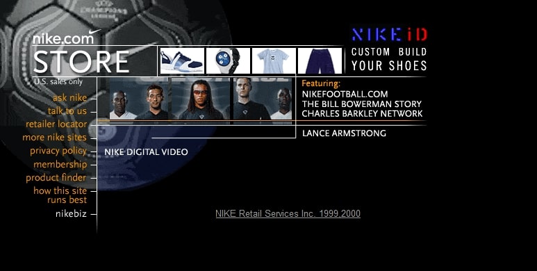
Image via Web Design Museum
This example gives you a good sense of how an outdated design can confuse and repel a visitor, resulting in high bounce rates.
The navigation is on the left rail, and it’s hard to read against the background image. There’s no obvious search functionality, and it’s not clear what the images along the top are for.
Now, here’s Nike’s current home page layout.

Image via Nike
Much better, right?
The navbar immediately directs you to Nike’s item categories. There’s a search field in the top right, where you expect it. A large hero image with a bold CTA is exactly what you expect, too.
7. Your Site Isn’t Mobile-Friendly
First of all, you need to know that before visitors even find you, your mobile site is being ranked by Google before your desktop site.
Why? Because by April 2024, there will be over 5.65 billion unique mobile users globally, according to the Hubspot marketing report. What’s more, 7.2 billion mobile connections are linked to smartphones.
No wonder Google is prioritizing mobile.
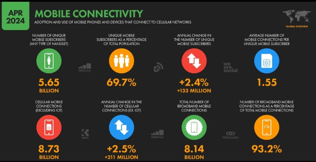
Image via Hubspot
If you’ve ever been to a site that isn’t optimized for mobile devices, you know how frustrating it can be. You’ll have to deal with cut-off text, elements that appear off the screen, and slow page load time.
In fact, Google says if visitors aren’t able to find what they’re looking for on your mobile site, more than half of them will leave, probably within the first five seconds.
To avoid this issue, it’s crucial to implement key principles for effective mobile app UX. This ensures a smooth and pleasant mobile user experience for your visitors.
7 Best Practices To Lower Your Bounce Rate
As you’re looking to improve your website’s user experience, consider these strategies to reduce your bounce rate:
1. Keep Your Navigation Straightforward
Make sure your navigation is simple and intuitive, and place it where people expect it to be. This will help visitors find what they’re looking for and reduce your bounce rate.
You’ll notice a lot of sites, particularly retail sites, use the same website design and layout for the most part.
This well-built website by Polar Seltzer Water is a good example of a straightforward navbar:

Image via Polar Seltzer
They’ve put their navbar where you’d expect it: running along the top, under their logo. And they’ve kept their browsing options simple.
That’s not to say you can’t tinker with your navigation bar to meet the needs of your audience. Take this Education.com website for example.

Image via Education.com
We’ve worked in the ed tech space and talked to a lot of teachers. We can tell you the number one thing teachers search for online is printable worksheets.
Education.com knows that, too. That’s why it has placed worksheets in a place of honor: at the top left, in the nav bar. It’s followed by online games and lesson plans, two other very popular categories.
Rather than giving teachers a list of subjects or grades in its nav bar, which would be pretty standard, Education.com has broken out their most popular categories to save teachers time from clicking through categories and subcategories.
2. Make the Search Bar Obvious and Easy to Use
No matter how intuitive your navigation is, you’re still going to get a few people who can’t find what they’re looking for. If you don’t want to lose those visitors and increase your bounce rate, you must make sure that your search functionality:
- Is prominent on all your pages
- Is easy to use
- Gives your visitors the most relevant results possible
We used Digiday to do some research for this article. Its search function is in that sweet spot again, the top left. It features the very simple, but very standard, magnifying glass icon, and it appears in the same place on every page.

Image via Digiday
Pro Tip: We really love it when a site’s blog has a separate search functionality, so we can easily comb through the blog for relevant content.
3. Speed Up Your Load Time
If your pages are slow to load, there are a number of things you can do to speed them up.
Firstly, take a look at the images you’re uploading to your site. Hi-resolution images and large files slow down your page load time.
Image resolution for the web is usually about 72 ppi, and image size runs between 800 and 1200 pixels.
You can also reduce page load time by minimizing the number of elements per page. The more elements (images, gifs, videos, etc.), the more http requests your site has to make, which slows down your pages.
Another way to speed up load time and reduce bounce rates is by leveraging browser caching. It improves your site’s speed by storing some resources on users’ devices.
4. Use Clear Calls to Action
Look back at the Netflix landing page. Notice that its CTA is big, red, and centered. It doesn’t say “Click here,” “Go,” or even “Start your free trial.” It tells you exactly what you’re going to do: Watch Netflix for free for 30 days.
If people know exactly what you want them to do, they’re more likely to stay on your site and take the desired step. This proper use of a CTA will result in a lower bounce rate and a higher conversion rate.
5. Incorporate Captivating Visuals
Reading through countless pages of text can be pretty boring even for avid readers. Now, picture a potential customer reading blocks of text on a busy morning or after a long, tiring day.
We know they might not make it, which translates into a higher bounce rate.
Break down huge blocks of text by adding captivating visuals. This can draw readers’ attention and encourage them to stay on your website longer.
High-quality images, infographics, and videos not only break up the monotony of text but also engage visitors by providing visual explanations and entertainment.
However, don’t use just any visuals. They have to be relevant to what you’re discussing and resonate with your audience.
In the example below, Salesforce uses interactive infographics to explain complex business solutions in a visually captivating way.
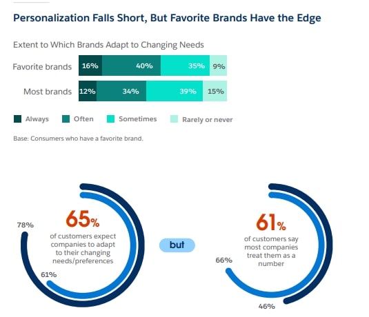
Image via Salesforce
6. Improve Your Internal Linking Structure
Did you know that internal links are not only great for SEO lead generation, but they can also reduce your website’s bounce rate? They guide both search engine crawlers and website visitors through your site, helping them discover relevant content.
The more your visitors discover useful content, the more likely they are to remain on your website longer. This is good news for your engagement, bounce rate, and lead generation efforts.
However, too many or irrelevant links can overwhelm users and actually increase your bounce rate.
So, limit the number of links and only link to pages that are truly relevant to the current page’s topic. For instance, a blog post on mold prevention could link to posts about mold removal and testing.
7. Use Exit Popups to Your Advantage
Exit intent popups are triggered when a user is about to leave your site. You can use them to capture the visitor’s attention one last time and encourage them to stay or take a specific action.
All you have to do is trigger the exit popup at the right moment. Too early and you risk annoying them and increasing your website’s bounce rate. Keep the design simple and visually appealing like this exit popup design by Omsom.
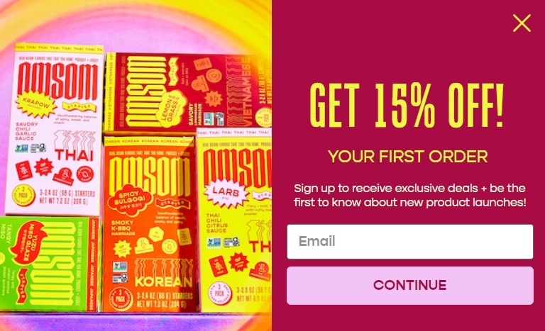
Image via Omsom
Here are a few tips for setting up your exit intent popup:
- Offer a discount or special deal to encourage the user to make a purchase.
- Provide access to exclusive content, such as an email newsletter, ebook or a webinar.
- Ask for feedback on why they’re leaving or how you can improve.
You May Also Like:
- 22 Ecommerce Optimization Tips to Greatly Increase Conversion Rates
- Email Popups – 13 Best Practices to Insanely Grow Your Conversions
Strategies to Create a Good User Experience
We’ve provided some great suggestions for lowering your site’s bounce rate through UX. But how do you know where your website visitors are getting stuck, and how to fix it?
There are tools to help you do that. We’ll discuss them below.
Heatmaps and Scrollmaps
A heatmap shows you where your visitors are clicking most. Red indicates areas clicked frequently, while blue indicates elements that are clicked on very rarely.
You can find out whether elements like a hello bar, email collection popup, or signup form are gaining engagement.
A heatmap will even show you if static elements are receiving clicks.
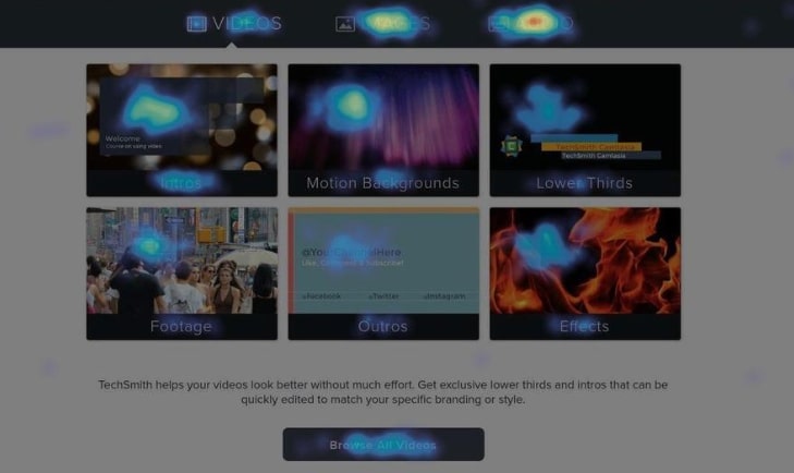
Image via Hotjar
Examine a page that has a high bounce rate. Where are people clicking? This could give you some insights into how to reduce bounce rates and convert website visitors to leads.
If your navbar is blue, people may be confused by the categories. If they’re clicking on static elements, remove them or add a link to help them explore your website further.
Meanwhile, a scroll map shows you where people are paying the most attention on a page and where they’re losing interest.
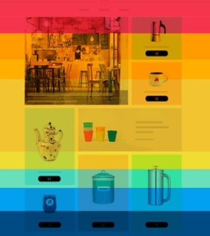
Image via Hotjar
You can discover whether your CTA is in the right place, or if people are seeing something important like an email collection or lead capture form.
Recordings
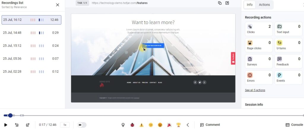
Image via Hotjar
Website session recordings will let you dig deeper into user behavior. You can watch how an actual visitor navigates an individual page or your entire site. You can see where people are going before they leave a particular page or the site as a whole.
That will help you pinpoint the places that are confusing or frustrating visitors before they bounce.
A/B Testing
Once you’re ready to make some changes to your site to improve its UX, you can implement the best A/B testing tactics to increase conversions. For example, use an A/B testing tool to run a new version of a page against the old page.
You’ll be able to see if the new page is performing better, worse, or about the same as the old page at helping people achieve your most important business goals (like a signup or a purchase).
You May Also Like:
- Optimize Your Site: 12 Things to Delete Right Now
- SEO For Lead Generation: How To Skyrocket Organic Leads
FAQs
Q1. How do you analyze bounce rate?
Analyzing bounce rate goes beyond just calculating the raw percentage of visitors who land on your website and leave without interacting further.
Here’s how to go about it:
- Traffic source: Break down your bounce rate by different sources, such as social media, organic web traffic, and email marketing.
- Device type: Analyze bounce rates for desktop, mobile, and tablet users separately using tools like Google Analytics.
- Web pages: Examine bounce rates for product pages, blog posts, contact forms, or other pages.
Q2. What would contribute to a low bounce rate?
Factors that contribute to a low bounce rate include:
- Relevant and high-quality content that meets the needs and expectations of visitors
- User-friendly navigation that helps visitors find what they’re looking for quickly
- Pages that load quickly to keep visitors from getting frustrated and leaving
- Clear and compelling CTAs that guide users to take the next step
- A website that’s fully optimized for mobile devices
- Using high-quality images, videos, and infographics that keep visitors engaged
Q3. What is a good bounce rate KPI?
A good bounce rate KPI depends on your website’s goals and industry. Here are the general rates:
- 26-40% is excellent
- 40-55% is average
- 56-70% may be higher than desired
- Over 70% indicate issues that need attention
Q4. Does bounce rate affect SEO?
Yes, bounce rate can indirectly affect SEO. While bounce rate itself isn’t a direct ranking factor, it reflects user engagement rate and satisfaction. High bounce rates might indicate poor user experience, which can lead to lower rankings on search results.
Q5. Why reduce bounce rate?
Reducing bounce rate is important for several reasons:
- Improves user engagement rate
- Increases conversions
- Improves user experience
- Enhances SEO
- Boosts ROI
Conclusion
For visitors to stay on your site, they have to know how it works. If they’re confused, lost, or can’t find what they need, they’re going to leave.
Check your site for these common issues and see if certain improvements can lower your bounce rate.


