Best 43 Call-to-Action Phrases Proven To Increase Clicks and Leads

I hope you enjoy this blog post. If you want Hello Bar to grow your leads, click here.
Author:
Ryan Bettencourt
Published
July 29, 2024

You can’t understate the relevance of call to action phrases in digital marketing. These phrases are vital in turning website visitors into leads and customers.
A lead has connected with your business in some way, such as signing up for your email list. On the other hand, a customer has gone a step further and made a purchase, investing in your product or service.
While having website traffic and ever-increasing engagement are excellent, conversions are what truly drive success in your customer journey. That’s why you must think carefully about your call to action phrases.
Call to Action Statistics and Curious Facts
Before discussing the tips and strategies, let’s explore a few call to action facts and statistics that show how important CTAs have become:
- Embedding CTAs within videos can boost click-through rates by a whopping 380%.
- Personalizing CTAs can boost their performance by 202% compared to basic CTAs.
- Calls to action with more white space and less visual clutter can boost conversion rates by up to 232%.
- Including an arrow to your CTA button can increase click-through rates by 20%.
With those facts in mind, how do you choose the best call to action phrases for your content?
What Does a Call to Action Mean?
A CTA, or call to action, refers to a prompt or instruction intended to elicit an immediate response or encourage immediate action from the audience.
Calls to action are usually used in sales and marketing to guide users toward an action that benefits a business.
It might be signing up for your email list, buying a product, or following you on social media.
In most cases, CTAs come as text on a button. That way, they call attention to themselves and incorporate the anchor text in the link.
You May Also Like
Leverage CTA Tools to Drive Better Results
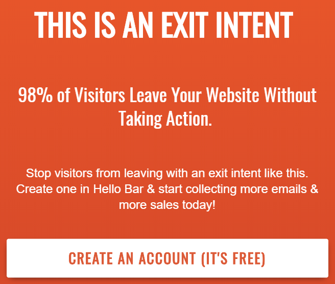
Utilizing the right call to action tools improves the effectiveness of your marketing campaigns.
AI-powered CTA generators, such as Writesonic, Jasper, and Copy.ai, provide advanced features to help you craft compelling and optimized CTAs that resonate with your audience.
These tools analyze user behavior and preferences to suggest high-converting call to action phrases tailored to your goals. Implementing CTAs into your website becomes even easier with call to action software like Hello Bar.
With Hello Bar, you can automate your marketing efforts and convert leads and customers while not actively working.
Hello Bar also allows you to create floating bars and exit-intent popups and leverage other dynamic assets that can help capture visitor attention and increase conversion rates.
You May Also Like
- Hello Bar Inline: A New Tool to Add CTAs to Blog Posts
- Ways to Use Calls to Action (CTAs) in Your Marketing Strategy
Best 43 Call to Action Phrases Proven to Increase Clicks and Leads
Now, let’s get to the good stuff. What call to action phrases perform best based on research? We’ve been implementing and A/B testing CTAs, so we’ve got many suggestions to share.
1. Click Here to Find out All the Details
Sometimes, plain and simple says it best. You’ll increase conversions if you tell your readers the benefits of clicking the CTA button.
There aren’t any surprises or hidden meanings. What you see is what you get.
You can customize your call to action phrase, of course. Examples might include the following:
- Click here to find out how we did it (revealing your secret sauce)
- Click here to read our FAQ (answers to all prospects’ questions)
- Click here to get the lowdown (similar to the primary example, but less formal)
Play with different options to see which works best with your audience.
2. Download now
This is another simple but powerful call to action phrase. It tells the visitor exactly what happens when they click the CTA button.
Use this CTA when offering a free or paid download, such as a lead magnet. You could also put it on your landing pages for a specific product or purpose. The link would take potential customers to the checkout, sales, or product pages.
Here’s an example of a CTA button with the phrase “Download Now.”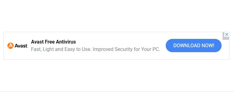
Image via Download
You May Also Like
- How To Create a Lead Magnet: 15 Effective Tips and Examples
- How to Generate Leads from Email Marketing: 11 Ways
3. Immediate Download Here
Action verbs can promote urgency and encourage click-throughs. Adding the word “immediate” to this CTA phrase encourages the prospect to hurry up and follow through on the action.
You can also flip this around: “Download here immediately.” Alternatively, you could use a different phrase to suggest urgency: “Download here right now.”
Whatever you decide, consider other adjectives that might help you convey urgency and get people to click through.
4. Reply Today and Get…
This is an example of a cause-and-effect CTA. It’s a powerful way to balance out the equation.
It’s like a transaction. I’ll give you $10, and you’ll give me a premium font. I’ll give you $40,000, and you’ll give me a car.
However, this case has far less risk than with a purchase. You’re asking your audience to reply to your message via email or social platforms to get something of value.
It could be an e-book, a free sample, a calculator, or a template. Just make sure it’s relevant to your audience.
5. Try It Free Now
Who doesn’t love the word “free”? Many don’t trust it, but we can overcome that obstacle through compelling copy.
Instead of asking a prospect to buy your product, you’re offering a test drive. The user can kick the tires, so to speak, and make a more informed decision. You’re willing to let prospects discover what you’re offering without payment. It also shows confidence and helps establish the ecommerce business as credible.
Check out how Hulu’s CTA button stands out in the email example below. By offering a one-month free trial, they’ve presented themselves as a credible brand that cares about customers’ experiences.
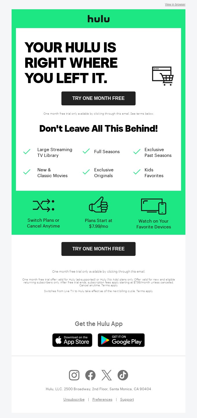
Image via Really Good Emails
You May Also Like
- Ecommerce Marketing Essentials: 12 Actionable Ideas to Drive More Sales
- Ecommerce Email Marketing – 20 Tips to Increase Sales
6. Start Your Free Trial Now
Here; we have a variation on the previous call to action phrase. For instance, free trial is a phrase most people are familiar with. So, beginning your CTA with “Start” can have many advantages. It suggests embarking upon an adventure, discovering something new, and turning over a new leaf.
Language plays a huge part in nailing the best CTA phrases. Using the right words can impact your conversion rate.
Here’s an example of a good CTA by BigCommerce that can compel the site users to attempt to use the platform.
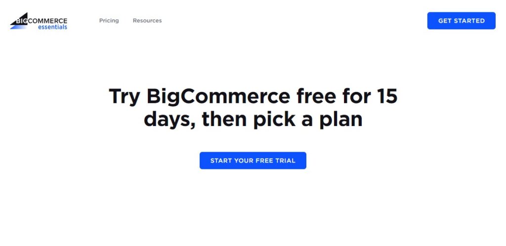
Image via BigCommerce
7. Sign up for Your Free Trial Immediately
You can combine these CTA phrasing tips to make your call to action even more compelling:
- Sign up: This is the command. You’re instructing your visitor to sign up with your business.
- Free trial: This is the other side of the scale. In exchange for signing up, you’re offering your prospect something of value.
- Immediately: This single word creates urgency.
When a CTA works on numerous levels, it’s pure gold.
8. Your Free Trial Is Just a Click Away
We like this type of CTA because it uses unusual language and suggests an easy process. The word “just” holds its weight here by communicating something simple and stress-free.
You could also use a word like “only.”
The offer can change as well:
- Your free download is just a click away
- Your membership is just a click away
- Your contest entry is just a click away
9. Join Now and Get…
You might have noticed that we use psychological principles to explain why these call to action phrases work. There’s a reason for that, and this example is no exception.
When you understand your prospect’s thoughts, you can better anticipate their reaction to a CTA.
In this case, we’re using the word “join.” It’s a powerful word that conveys acceptance, belonging, and community.
Think about high school. Did you join any clubs or teams? Did you apportion part of your identity to those groups? Of course, you did.
The same thing goes for online communities, whether it’s an email list, a webinar, or a membership site.
You May Also Like
- Email List Cleaning: Clean Your List Without Losing Conversions
- What is a Good Email Open Rate and 13 Tips to Improve Yours
10. Start Now to Get…
Here’s a variation on the last CTA. “Start now” tells your prospect that he or she is about to embark upon an exciting process — and the rest of the CTA tells the user how he or she will benefit.
The concept of balance is important in CTAs. You’re asking for something, but you want your prospect to know that you’re offering something in return.
11. Talk to an Expert Now
Credibility is currency. You can trade on it for your entire career.
If you tell your prospect immediately that you consider yourself and your team experts, they automatically feel safer in your hands. Of course, you shouldn’t say it unless it’s true.
This is a powerful call to action for an online chat opportunity or when you want the prospect to call. For instance, if you’re using the mobile function to dial your number automatically, you could implement this CTA on your landing page.
12. I Invite You To…
Everyone wants to feel wanted by friends, family members, and associates. You can foster that same sense of belonging by giving the impression that you’re personally inviting your prospect to perform an action.
Although you’re not delivering the invitation on cardstock and in gold-leaf print, it still seems special.
13. We’d Like to Hear From You
You see this call to action on contact pages often, but you don’t have to confine it to a single instance. If you want your prospects to call or email you, let them know — and use a link to do it.
You May Also Like
- Lead Capture Pages: Essential Guide and 5 Pro Tips to Get Leads
- What is a Good Email Open Rate and 13 Tips to Improve Yours
14. Just Hit Reply and We’ll Email You the Details Immediately
Email has never been easier. You don’t have to include any text if you have a dedicated email for one purpose.
For instance, maybe you have a dedicated email address like course@xyz.com, and it’s for people interested in taking your online course.
You know the sender wants information about your course if you receive an email with that email address, even with no text or subject line.
15. Sign up Online At…
CTAs don’t just belong on websites. You can use them in emails, social media platforms, and guest blog posts on other sites or forums.
Using this CTA tells the user the exact action to take to sign up. Include the full URL as the anchor text in case the user wants to copy/paste or type in the URL instead of clicking the link.
16. Learn More About Us At…
Prospects at the top of the sales funnel don’t always know what they want. They’re collecting information, learning about brands, and familiarizing themselves with your industry.
Using a call to action that invites people to learn more about your company can be very effective. It increases brand awareness and the chances of converting more visitors into customers.
When potential customers are ready to compare or buy a product, they’ll most likely remember your business’s name.
17. Order Now While There’s Still Time
Remember how we discussed creating a sense of urgency earlier? It’s often key in call to action phrases.
This CTA suggests either limited product quantities or time to take advantage of a deal. Either way, you’re pressuring consumers to act now rather than ignore or wait until opportunity passes them by.
The “Order Now” call to action button below by Starbucks is an excellent example of an effective CTA phrase. It’s short, simple, and straight to the point.
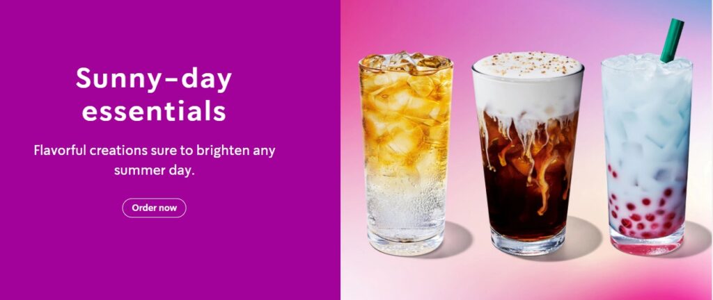
Image via Starbucks
18. Place Your Order Now While Everything Is Still in Front of You
Shopping cart abandonment has become a problem for businesses, especially in the ecommerce market. You can use a CTA like this to encourage prospective customers to complete the checkout process.
If they leave the site, they may lose items in their cart or forget about items they wanted. The CTA comes across as a friendly reminder.
You May Also Like
- 29 Best Abandoned Cart Email Examples: Increase Sales Today
- 18 Fantastic Abandoned Cart Email Tips to Increase Your Conversions
19. In a Hurry? Call…
Customers, not businesses, feel a sense of urgency in certain industries. For instance, if you own a home with a leaky pipe, you want a plumber to visit your house ASAP.
Call to action phrases with action verbs like this one let the consumer know you’re willing to respond to their needs immediately. Maybe you offer after-hours or emergency services, or perhaps you have a faster than usual customer service department.
20. For Even Faster Service, Call…
The same goes for this powerful call to action. It tells the consumer that you act fast when someone gets in touch.
21. Mail Your Order Today by Clicking Here
If you want your prospect to send you something via postal mail, this is an excellent CTA. You can also substitute the first verb with “Email” if it applies.
22. Send in Your Application Today
The word “application” can have many connotations. This CTA would work well for a university, career page, internship program, or any other situation in which you’re seeking applicants.
Here’s an example of a CTA button with the phrase “application.”

Image via Common App
23. We’re Waiting for Your Call
If you’ve ever watched late-night infomercials, you recognize this language. It’s used on television all the time, but it can work just as well in text on a website or social media page.
As mentioned earlier, people want to feel wanted. Creating a welcoming atmosphere and expressing your interest in connecting increases the chances of people reaching out.
You May Also Like
- Getting More Leads from Your Blog Traffic (Steps Included)
- Optimize Your Site: 12 Things to Delete Right Now
24. Click Here to Use This Convenient Coupon Today
People are more likely to click on your CTA if you suggest some incentive. In other words, consumers need a “payoff” for a click.
When you mention in your CTA that you’re offering a coupon, you might convince more people to click through and see whether they’re interested in your offer. You can also mention the specific coupon, such as $10 off or a 20% discount.
25. For More Details, Call…
Some business models are more complicated than others. Crazy Egg, for instance, requires some explanation for prospective customers to understand its value. For that reason, sales professionals speak with prospects directly to answer their questions and onboard them.
If your business requires communication via a phone system, use this call to action phrase. It lets people know you’re willing to take the time necessary to allay any fears and explain your product or service.
26. Please Don’t Hesitate to Call Us
CTAs belong on every page of your website — even those devoted to customer support or your help desk. Today’s consumers often feel like they have to get answers via FAQs, support forums, or email. Let your customers know you don’t mind offering phone service.
Use this powerful call to action so people can call you directly or discover your phone number.
Here’s an example of a Contact Us page with the “call us” CTA phrase. The CTA buttons are visible and contain the right action words to compel a customer to either call or email the brand.
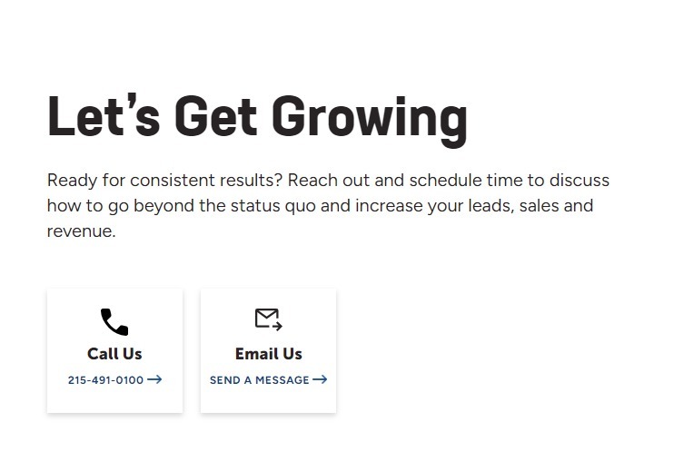
Image via Square2
27. Why Not Give Us a Call to Find out All the Details?
Questions often work better as CTAs than definitive statements. They inspire customers to really think about the question: “Why shouldn’t I give them a call?”
And that’s a good thing.
28. Call Us This Week to Schedule an Appointment
Maybe you engage in face-to-face business interactions. A CTA like this one is perfect. You can also use it to schedule a telephone interview or sales call.
29. It’s Very Important That You Respond Promptly
We’re discussing urgency again because it’s extremely important. You’ve heard of impulse buys before, right? That’s the same psychology you want to work through online marketing.
You’re telling the prospect they might lose out on something if they don’t respond to the calls to action immediately. They will want to avoid that loss and get in touch, even if they don’t buy anything.
You May Also Like
- Headline Writing: 15 Great Tips That Will Skyrocket Your Conversions
- 650+ Power Words List to Insanely Boost Conversions and Sales
30. Offer Expires Very Soon
This tells the customer that they should take advantage of the offer urgently. This creates a sense of urgency and is a powerful way to get people to take action.
31. For a Short Time Only
Every consumer understands the concept of a sale or clearance. We know they don’t last forever; otherwise, they would be the regular price.
Since it’s a universally understood concept, you can use it to your advantage. There’s a chance to buy a limited-edition product, take advantage of a big discount, or get some other benefit. But only if you act now.
32. Order Now and Receive a Free Gift
Businesses use the gift-with-purchase incentive to convince consumers to buy. It works just as well online as it does offline. If you can entice prospects with a free gift, they’re more likely to buy the original product.
A free gift doesn’t have to be physical. It could be a discount on a future purchase, a downloadable asset, or free access to a membership site. Use your imagination. You can even create a QR code that leads to any of these.
33. See It in Action
This variation on a CTA encourages consumers to start a free trial or tour. It’s more creative and might give prospects more confidence.
You could also use this CTA for a car dealership or similar business. You’re inviting people to visit your business place and take a vehicle for a test drive, watch a product demonstration, or something else.
34. Get Yours Now
We love this call to action phrase because it’s personal and relatable. It tells the consumer that you want them to have something valuable — something other people might want.
For instance, marketers in the fashion and beauty industries often play to a consumer’s vanity. This CTA works perfectly in that circumstance. You’re subtly saying, “Get what’s yours before someone else beats you to the punch.”
Here’s an example of such as call to action phrase.
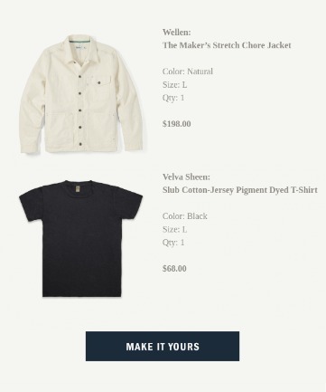
Image via Really Good Emails
You May Also Like
- Email Pop Ups – 11 Best Practices to Insanely Grow Your Conversions
- Why Customer Retention Should Be Your Primary Focus
35. Request Your Free Quote Today
A free quote doesn’t cost anything but time, and there’s no obligation to buy. The benefits speak loudly to consumers’ desires to protect themselves and to make informed decisions.
For instance, Ensurem, a company that brokers health and life insurance products, uses the “Get Quote” CTA throughout its site.
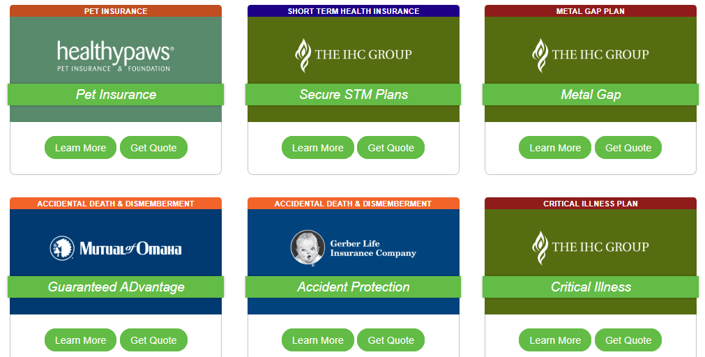
Not only is this CTA specific and actionable, but it’s also easily recognized in specific industries, such as insurance.
36. Click Here to Get FREE Shipping
One of the chief barriers to buying products online is shipping costs. Consumers would rather drive across town to pick up something in person than pay for shipping and wait for the product to arrive.
However, many consumers will suffer that wait as long as they don’t have to pay for the privilege. That’s why companies like Refine Packaging, a maker of custom boxes, offer free shipping on all orders over a certain dollar amount.
37. Money-Back Guarantee Offer Here
A sure thing. It’s a rarity in life but becomes a reality when a company is willing to stand behind its products or services. When you offer a money-back guarantee, consumers feel more confident trying out your product or service.
Most people won’t avail themselves of this protection. It takes time and effort, so they often won’t initiate the return process even if they aren’t completely satisfied. Those who do will appreciate that your company stands behind its promises.
38. Best Value Today Only
This is the urgency concept at its most potent. You’re telling your consumers that an offer will expire after the day ends. Act now before it’s too late.
39. Limited Availability
Limited availability is a great CTA for two reasons:
- It creates urgency (yes, that again).
- It suggests that your product is highly popular.
After all, you wouldn’t have a limited product that isn’t flying off the virtual shelves. Using this CTA serves as a form of social proof as well as an incentive to act quickly.
You May Also Like
- 7 Ecommerce Lead Generation Tactics for 2024
- Data-Driven? How To Calculate Your Lead Conversion Rate
40. Expires at Midnight Tonight
This is a more specific version of the “today only” CTA. It gives a definitely end point to the sale, so your consumers know the clock is ticking.
41. Act Quickly or You Might Lose It
Loss-aversion is a common psychological principle. In the 2016 election, for instance, many people reported voting against one candidate rather than for the other. Constituents didn’t want to lose something valuable, so they voted against the candidate they felt would bring about said loss.
You can use this principle in marketing. Tell consumers they might lose something valuable if they don’t act now. You can even name what they would miss out on in the CTA rather than using the more ambiguous “it.”
42. Reserve Your Spot Now
Limited quantities don’t just apply to products and licenses. They also apply to events. If you only have 32 spots open for a webinar or an in-person seminar, for instance, let your audience know it.
If they don’t sign up and reserve their spots, they run the risk of waiting until all spots are filled.
Check out this popup by Search Engine Journal. They use this CTA phrase to invite prospects to share their contact details and reserve a seat for this webinar.

Image via Search Engine Journal
43. Sign Up Now While You Still Can
Here, we’re playing with the consumer’s desire to avoid loss and to act quickly. It doesn’t matter what the prospect is signing up for — it can work with your email list, a webinar, an event, or a product launch.
The powerful call to action phrase in the image below compels the customer to sign up and join the subscriber list.
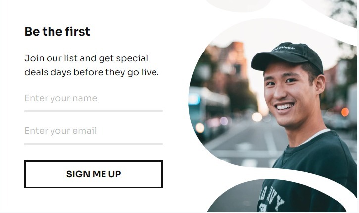
Image via Pinterest
How Do You Write a Call to Action?
The best CTAs start with the desired action. What do you want your prospect to do next?
Write it down in whatever language sounds natural to you. For example, you might write, “I want people to sign up for my email list.”
From there, figure out how you can incentivize that action. You could say, “I want to offer a lead magnet to encourage people to sign up for my email list.”
Now you have cause and effect.
All that’s left is to craft your CTA into a compelling, palatable format. You want people to take action right away, so your copy needs to be highly persuasive.
Use the templates above combined with the two exercises you completed to craft your CTA.
Best Call to Action Phrase Building Tips
- Include a possessive determiner, such as “your” or “mine” in your call to action phrase.
- Briefly outline the benefit of the content into your call to action phrase.
- Use action words and urgency to encourage clicks.
- Use words that evoke emotion or enthusiasm in your call to action phrase.
- Use the best software in the market to put these call-to-action tips into practice.
Bonus Action Phrases Examples
There are also lots of specific call-to-action phrases you can use for certain circumstances. In fact, the more specific, the better.
Call To Action Phrases for Events
When it comes to events, you can use either an inclusive or an exclusive CTA. In other words, do you want people to feel as though they need to meet certain qualifications or possess certain skills to attend? Or do you want to make everyone feel welcome?
For an exclusive CTA, you could use one of the following:
- Headline: Care to join us? CTA: See if You Qualify!
- Headline: Want to join an elite group of experts? CTA: Find Out if You’re Eligible
- Headline: The event of the year is next Saturday. CTA: Will You Qualify to Attend?
For an inclusive CTA, you could use one of the following:
- Headline: Come one, come all! CTA: Sign up to attend now!
- Headline: Want to join your fellow professionals? CTA: Attend our event next weekend!
- Headline: We’d love you to join us! CTA: Register here!
You can adjust those CTAs with specifics, such as dates, times, types of events, and more.
Call To Action Phrases for Realtors and Real Estate

When you work in commercial real estate, you want your CTAs to reference the properties you sell and buy. A few good call to action phrases for buyers might include:
- Inquire about this property before it goes off the market.
- Schedule your tour immediately.
- Snatch this property before it disappears.
- Get the best possible bargain.
If you’re targeting sellers:
- List with us today!
- We’ll get you the best deal on your home!
- Talk to an agent right now!
Hello Bar Call to Action Options
Two things matter when creating a call to action button:
- Button Design: What the button looks like and how it stands out.
- Button Text: The compelling copy that convinces consumers to click.
On Quicksprout, for instance, we use green as the primary CTA color.
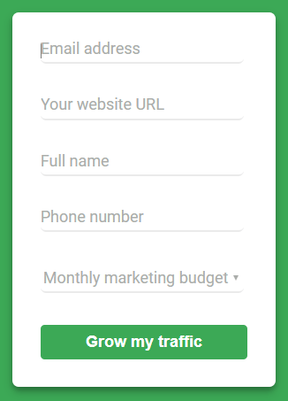
It references the color of the Quicksprout logo, which makes it more consistent.
You can use these same principles in your Hello Bar CTAs. For instance, let’s say that the primary colors on your website are grey, black, and pale blue. You could use a bold blue for your CTA button:

It’ll stand out on the page because it contrasts with everything else.
However, maybe dark blue isn’t the right way to go. You could A/B test this Hello Bar against an identical one with a different color to see which performs best.

Orange is a complementary color to blue, so it plays well with it. However, it’s different enough that you can capture your audience’s attention.
FAQs
Q1. Why are CTA phrases important in digital marketing?
Call to action phrases are crucial because they guide users toward desired actions, such as purchasing or subscribing to a newsletter. Therefore, they can increase engagement and conversion rates by indicating what step to take next.
Q2. How can I make my calls to action phrases more effective?
You can employ several strategies to ensure your CTA phrases are effective and reach your target audience:
- Use an action word, such as “Get” or “Join.”
- Draw attention with phrases that imply urgency.
- Use contrasting colors, bold fonts, and sufficient white space around the CTAs.
Q3. What are some common mistakes to avoid with CTAs?
Let’s explore the common mistakes you should avoid when designing and creating your calls to action:
- Using generic phrases like “Click Here” or “Submit.”
- Lack of urgency.
- Overloading a web page with several CTA phrases.
- Not providing relevant information.
Q4: How often should I update my CTA phrases?
Updating your CTA phrases monthly is advisable as it allows you to incorporate insights from recent performance data and any new marketing campaigns.
Q5: How can I customize my CTA for each campaign?
Below are the top strategies to help you tailor your CTAs to fit each campaign effectively:
- Understand your target audience.
- Define your campaign goals and tailor your CTAs to these goals.
- Use action words that encourage instant action.
- Offer value and incentives in your copy.
Conclusion
CTAs are one of the most important considerations when designing any page on your website. You want it to stand out and convince people to click.
Too often, marketers use generic text like “Click Here,” or worse, “Submit.”
Those don’t invite clicks.
However, it’s not just about your call-to-action phrases. You also need an aesthetically pleasing design.
Use Hello Bar to test all of these call-to-action phrases. Conduct A/B tests to figure out which ones are most persuasive among your audience.
What’s your favorite CTA phrase?


