How To Create The Perfect Popup Messages For Your Website

I hope you enjoy this blog post. If you want Hello Bar to grow your leads, click here.
Author:
Mansi
Published
April 28, 2025

Table of Contents
When a visitor lands on your website, you have a small window to guide them toward taking an action—whether that’s signing up, buying something, or even just staying a little longer.
Popup messages can make that happen.
popup messages, pop up messages, popup notice
But only if they’re done right.
A good popup notice isn’t just about throwing a big box in someone’s face. It’s about catching the right person, at the right moment, with the right message.
In this blog, we’ll break down, step-by-step, how you can create popup messages that actually work — not the annoying ones people can’t close fast enough. We’ll also talk about real strategies businesses use, what separates a good popup from a bad one, and how to actually measure if your pop up messages are doing their job.
No jargon, no hype. Just clear, useful advice that you can apply today.
What Exactly Are Popup Messages?
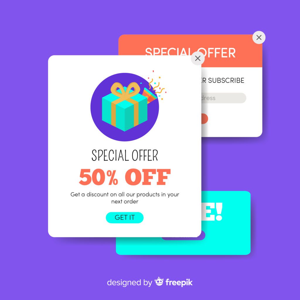
Popup messages (or pop up messages, or popup notices — different words, same idea) are small windows that appear on top of your webpage content. They’re used to grab attention and encourage visitors to do something.
Common goals of a popup notice might be:
- Signing up for a newsletter
- Grabbing a discount
- Completing a purchase
- Learning about a new offer
- Giving feedback
They can show up in different formats:
A full-screen notice, a little box in the corner, a slide-in banner, or even a quick “hello” after a few seconds on the site.
When done well, popup messages help people take action without feeling pushed or annoyed.
Why Popup Messages Matter for Your Website

No matter how beautiful your website is, or how great your product is, most visitors won’t automatically do what you hope they’ll do.
Popup messages are your gentle nudge.
They matter because they:
- Catch attention before someone leaves
- Give you a second chance if someone’s about to bounce
- Help you collect emails for future marketing
- Increase conversions without needing more traffic
- Offer visitors value exactly when they’re most open to it
In short, pop up messages are like small signposts that can steer your visitors in the right direction—when used thoughtfully.
And here’s why it matters even more:
According to the Baymard Institute, about 70.19% of online shopping carts are abandoned before completing the checkout.
That’s a huge lost opportunity — and popup notices like exit-intent popups can help recover part of that lost revenue by catching visitors before they leave.
5 Things That Make a Popup Message Work (And Not Annoy People)
Before you even start designing your popup, you need to get a few basics right.
Here’s what you must focus on:
1. Timing
Don’t hit people with a popup notice the second they arrive.
Give them a few seconds to breathe.
Good popup messages show up based on user behavior:
- After 10–20 seconds
- After scrolling halfway down the page
- Right before they leave (exit intent)
- After clicking on a specific link or button
Right timing = higher chances they’ll actually read it instead of immediately closing it.
2. Relevance
Popup notices must match what the visitor is doing.
Example:
If someone is reading a blog about winter jackets, offering them a discount on swimwear will feel random and annoying.
Offer them a coupon for winter clothing instead.
The closer your popup message matches their behavior or interest, the more natural it feels.
3. Clarity
Get to the point fast.
No one wants to read a long story inside a popup notice.
Good pop up messages say things like:
- “Get 10% off your first order. Join our email list.”
- “Leaving already? Grab free shipping before you go.”
- “Want early access to our next sale? Sign up now.”
Short. Clear. Obvious value.
4. Design Simplicity
Your popup message design should look like it belongs on your website, not like it crashed from another planet.
Simple rules:
- Stick to your brand’s colors and fonts
- Keep enough white space to avoid clutter
- Use a clear “X” to close the popup easily
- Make call-to-action buttons (like “Subscribe” or “Get My Code”) easy to spot
Design shouldn’t overpower the message—it should support it.
5. Real Value
People will only act if there’s something real in it for them.
Don’t make your popup notice just about you.
Make it about them.
Real value = real results.
How To Write Popup Messages That Actually Convert
If you’re wondering what exactly should my popup notice say, here’s a simple formula you can use:
Headline: Grab attention with a benefit.
Subtext: Explain in one line why they should care.
Action button: Tell them exactly what to do next.
For example:
- Headline: “Want 10% Off Your First Order?”
- Subtext: “Sign up and we’ll send your discount code instantly.”
- Button: “Send My Code”
Keep words simple. Avoid corporate-sounding phrases like “maximize your potential” or “leverage this opportunity.”
Talk like a real person talks.
Different Types of Popups You Can Use (With Best Practices)

There’s no one-size-fits-all. Different types of pop up messages work better in different situations. Here are the main ones:
1. Welcome Popups
- Show after a few seconds when someone lands on the site
- Great for first-time visitors
- Offer something simple like a first-purchase discount or newsletter signup
Tip: Keep it light and welcoming. Don’t come on too strong.
2. Exit-Intent Popups
- Trigger when someone’s about to leave the page
- Good for saving abandoning carts or offering a last-minute deal
Tip: Offer a smaller commitment like a discount or ask for feedback.
3. Scroll-Based Popups
- Appear when someone scrolls halfway down a page
- They’ve shown interest by scrolling, so they’re more open to suggestions
Tip: Use scroll popup notices to offer content upgrades.
4. Timed Popups
- Appear after a set time (say, after 20–30 seconds)
- Useful for engaged visitors who didn’t act yet
Tip: Avoid interrupting people too quickly. Give them time to settle.
5. Gamified Popups (Like Spin-to-Win)
- Interactive pop up messages that make signup fun
- People can win discounts or prizes
Tip: Use sparingly. They can boost engagement but can also feel gimmicky if overused.
Popup Mistakes That Drive Visitors Away
Avoid these common mistakes:
- Showing too many popup messages at once
- No easy way to close a popup notice
- Forcing signups for basic browsing
- Over-promising and under-delivering
- Not making pop up messages mobile-friendly
How To Know If Your Popup Messages Are Working
Once your popup messages are live, track if they’re actually helping.
Here’s what you should watch:
- Popup Views: How many people saw it?
- Conversion Rate: How many people took the action you asked for?
- Time on Site: Are people sticking around longer?
- Bounce Rate: Are fewer people leaving?
You can use Google Analytics or any neutral popup tracking tool. Tweak your popup notice over time—small changes to timing, wording, or offers can make a big difference.
Real-World Popup Examples That Get It Right
Some brands are using popup messages in smart ways:
- Mystery discounts that spark curiosity
- Limited-time offers that create urgency
- Side popups that feel more natural and less intrusive
- Two-step pop up messages that start with a simple “yes/no” question
The best popup notices feel helpful, not desperate.
Conclusion
Popup messages work when they are timed well, offer real value, and feel like a natural part of the experience. Done thoughtfully, a simple popup notice can quietly lift your website results without shouting for attention.


