5 Pricing Page Design Examples That Actually Convert Visitors Into Customers
I hope you enjoy this blog post. If you want Hello Bar to grow your leads, click here.
Author:
mansi
Published
November 20, 2025
Your pricing page design can make or break a sale.
Think about it. A potential customer has spent time researching your product. They’ve clicked through your website, read your content, and now they’re on your pricing page. This is the moment they decide whether to buy or leave.
If your pricing page design confuses them or raises doubts, they’re gone. Probably forever. That’s lost revenue you can’t get back.
But here’s the good news: you can fix this. A well-designed pricing page doesn’t need tricks or gimmicks. It needs clarity, trust signals, and a layout that guides people toward action.
In this post, I’ll walk you through 5 real pricing page design examples from companies that get it right. Each one does something specific that pushes visitors closer to purchase. You’ll see what works, why it works, and how to apply these tactics to your own pricing page design.
What Makes a Pricing Page Design Actually Work?
Before we look at specific examples, let’s talk about what separates a good pricing page design from a bad one.
- Clear Pricing Structure
People need to understand what they’re paying without mental math. If someone has to scroll back and forth or open a calculator, you’ve already lost them.
- Strategic Call-to-Action Placement
Your buttons matter. “Buy Now,” “Get Started,” or “Start Free Trial” should stand out immediately. Bold colors. Clear text. No hunting required.
- Clean Visual Layout
Clutter kills conversions. A good pricing page design uses white space, clear typography, and organized sections. Your visitor’s eye should flow naturally from top to bottom.
- Social Validation
People trust other people. Reviews, testimonials, and user counts tell visitors they’re making a safe choice.
- Value Emphasis Over Cost
Don’t just show prices. Show what customers get for that money. Features matter. Benefits matter more.
- Limited Choice Architecture
Three pricing tiers work better than five or seven. Too many options freeze people up. They overthink it and leave.
- Trust Builders
Money-back promises, free trials, and transparent terms reduce purchase anxiety. They tell visitors you stand behind what you sell.
Now let’s see how real companies put these principles into action.
1. HelloFresh: Interactive Pricing Page Design That Adapts to User Needs
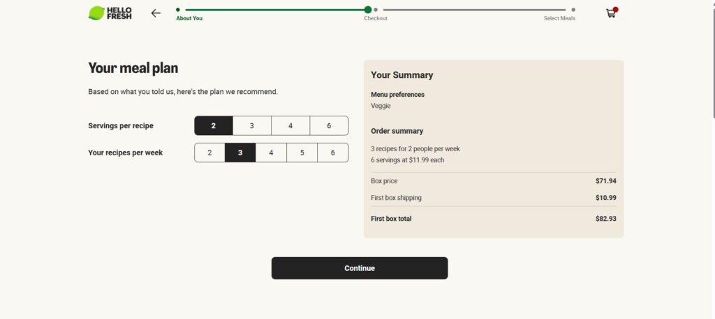
HelloFresh sells meal kits, and their pricing page design reflects how their product actually works.
When you land on their page, you don’t see a static price chart. You see options: meal types, serving sizes, weekly delivery frequency. As you make selections, the price updates in real time.
This interactive pricing page design works because it’s honest. Meal kit pricing varies based on what you order. Instead of hiding that complexity, HelloFresh embraces it. The interface lets people build their own plan and see exactly what they’ll pay.
Below the price calculator, you’ll find high-quality photos of actual meals. Not stock photos. Real food their customers receive. This visual proof answers the obvious question: “Is this food actually good?”
They also include an FAQ section right on the pricing page design. Common questions get answered immediately, without forcing visitors to email support or search for help docs.
What HelloFresh Gets Right:
Their pricing page design matches their product’s flexibility. Dynamic pricing could confuse people, but their clean interface makes it simple. The meal photos build appetite appeal while proving quality. And the FAQ section removes friction before objections even form.
If your product has variable pricing based on customer choices, take notes. Show the options clearly. Update prices in real time. Prove quality with visuals. Answer questions before they’re asked.
2. Groove: Competitive Comparison in Pricing Page Design
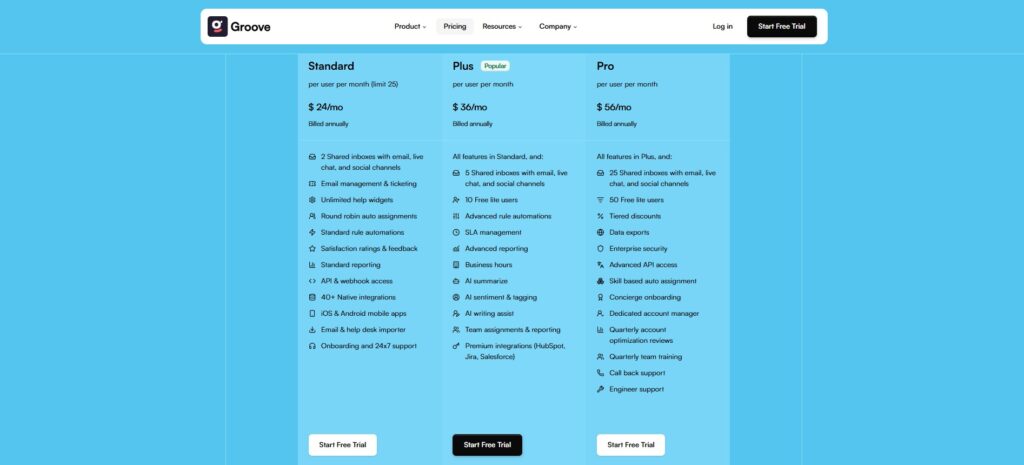
Groove provides customer support software, and their pricing page design takes a bold approach.
The top section looks standard: three pricing tiers, feature lists, highlighted popular plan. Nothing groundbreaking yet.
But scroll down and you hit something different. Groove shows a comparison table stacking their prices against direct competitors like HelpScout, Zendesk, and Front.
This pricing page design move serves one purpose: killing objections. When visitors see Groove costs less than alternatives they’re already considering, the decision becomes easier. The comparison does the selling for them.
Research shows 41.4% of startups use three pricing tiers. Groove follows this pattern because it works. Two tiers feel limiting. Four or more create choice paralysis. Three hits the sweet spot.
Further down their pricing page design, they add feature comparison charts, customer reviews with actual quotes, and another FAQ section. Everything a visitor might need to make a decision sits on one page.
Why This Pricing Page Design Works:
Groove doesn’t make you take their word for it. They show you the numbers against competitors. They prove value through direct comparison. And they load the page with enough information that visitors rarely need to look elsewhere.
If you compete in a crowded market, consider this tactic. Show how your pricing compares. Be confident about where you stand. Let the numbers tell the story.
3. HubSpot: Navigation-Based Pricing Page Design for Complex Products
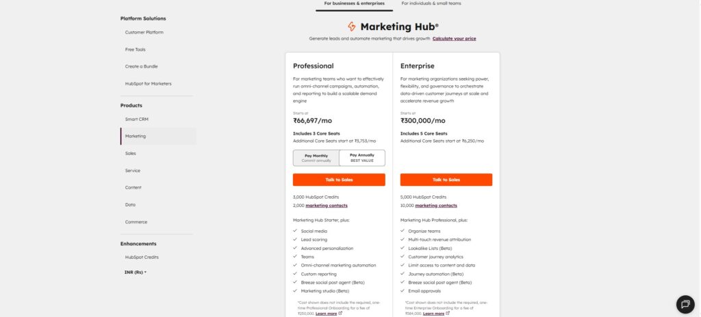
HubSpot sells multiple tools: marketing software, sales tools, customer service platforms, content management systems. Their product lineup is complicated.
Their pricing page design solves this through smart navigation. Instead of cramming everything onto one overwhelming page, they use a sidebar menu. Visitors click which tool they want to see, and the pricing for that specific product appears.
This pricing page design approach keeps things manageable. If HubSpot tried showing all their pricing options simultaneously, visitors would drown in information. The navigation structure lets people focus on what matters to them.
Each product section maintains the same clean layout. Pricing tiers are clearly marked. Features are listed in digestible chunks. CTAs are visible and consistent.
What Makes This Pricing Page Design Smart:
HubSpot recognizes their complexity and builds around it. The sidebar navigation gives visitors control. They explore what’s relevant and ignore what isn’t. The design never feels overwhelming because you’re only seeing one product at a time.
If you sell multiple products or services, this pricing page design strategy could work. Give people a way to filter or navigate. Don’t force them to process everything at once. Let them drill down to what they actually need.
4. New York Times: Entry Price Strategy in Pricing Page Design
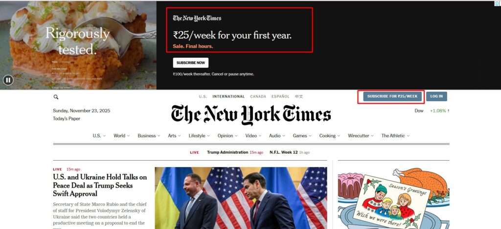
The New York Times uses an interesting pricing page design tactic for new subscribers.
When someone without an account visits their site, they see a prominent button: “Subscribe for $1/Week.” Click it, and you land on a welcome offer page.
New subscribers get full digital access for $1 per week for six months. After that, the price jumps to $25 every four weeks for the same all-access plan.
This pricing page design strategy is deliberate. NYT knows that once people get used to having complete access, they won’t want to downgrade. The low entry price removes the barrier. The six-month period creates habit. And when the trial ends, customers are already hooked on the premium experience.
Why This Pricing Page Design Approach Works:
The initial offer feels like no risk. One dollar is impulse-buy territory. But NYT isn’t giving away their basic tier. They’re giving the full product. When trial users see what they’ll lose by downgrading, most stick with the premium plan.
If you offer trials or introductory pricing, consider this approach. Give access to your best features, not your most limited ones. Let people experience the full value. They’ll be more likely to convert to paid plans afterward.
5. Second Nature: Customized Pricing Page Design Based on Customer Input
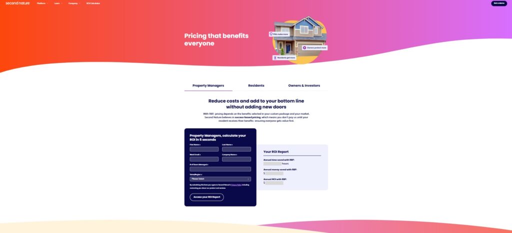
Second Nature (previously called FilterEasy) delivers air filters on subscription. Their pricing page design starts with questions.
Visitors select how many air filters they need and what size. The pricing page design then shows three subscription options based on filter quality: basic, premium, and highest-grade.
Each tier clearly states what type of filtration it provides and who it’s best for. The price updates based on the initial selections, so everyone sees personalized options.
This pricing page design works because air filter needs vary dramatically. An apartment needs different quantities than a house. Someone with allergies needs better filtration than someone who doesn’t. By collecting this information upfront, Second Nature shows only relevant options.
What Second Nature’s Pricing Page Design Does Well:
They don’t guess what customers need. They ask. Then they show pricing that matches those specific needs. The three quality tiers give choice without overload. And each tier clearly explains its purpose, making the decision easier.
If your product has variables that affect pricing, build those questions into your pricing page design. Get the necessary information early. Then show customized options that make sense for each visitor.
What All These Pricing Page Design Examples Share
Look across these five examples and you’ll see patterns.
Clarity wins. None of these companies hide their prices or make people dig for information. Everything is upfront.
Trust matters. Whether through reviews, comparisons, or generous trials, each pricing page design includes elements that reduce risk.
Choice is controlled. Three tiers appear repeatedly. When there are more options, navigation or customization keeps things manageable.
CTAs are obvious. You never have to hunt for the “buy” button on these pages.
Design serves function. These aren’t pretty pages first and functional pages second. The design choices all serve conversion goals.
Your pricing page design will look different from these examples. Your product is different. Your customers are different. But the principles stay the same.
Make pricing clear. Build trust. Control choice. Make action obvious. Design with purpose.
Also read our guide on Different Types of CTAs and How to Use Them Effectively
Final Thought
Your pricing page design isn’t decoration. It’s a sales tool. Every element should push visitors toward a decision. If something on your page doesn’t serve that purpose, it probably shouldn’t be there. Keep it simple, keep it clear, and give people what they need to say yes.


